
 Why is my website conversion rate so low or nonexistent?
This is the most common problem we hear from companies that attempt a foray into the world of inbound marketing.
Companies launch websites with lofty goals and big expectations, often spurred by web developers who promise the moon and back. But when rubber meets road, these companies find that things aren’t as straightforward as they believed.
“The website is live, but it’s not converting the way we were promised.”
“The traffic is there, but they don’t engage the way we want.”
We hear these things often.
What’s to blame?
Finding the problem
“Is the web design turning users off? Are our prices too high? Is our SEO lagging behind our competitors’? Should we dump more money into paid ads?”
These are the problems that modern inbound marketing presents. It’s a complex machine with many moving parts, and when site elements don’t perform as they should, it’s hard to know what to blame. Companies tend to blame the usual suspects (like poor SEO) without understanding the effect of each element of their website.
Make no mistake: your website is a powerful conversion tool, but it works only when you organize everything well. Your user interface (UI), user experience (UX), conversion pathways, and strategies for ongoing improvement all have a role to play in conversion potential.
In our view, the coordination of these elements is the “secret sauce”—your recipe for turning a your business website into a conversion-generating machine.
Below, we review the following topics as they pertain to website conversion, offer definitions, best practices, ways you may go wrong, and examples of how they can be done well:
- Establish early-stage sitemaps and information architecture
- The role of the inbound methodology on conversions
- Effective web design and UI choices
- How to build a UX design that drives users toward conversion
- Build powerful landing page and calls-to-action (CTA) across your site
- The importance of regular testing and optimization
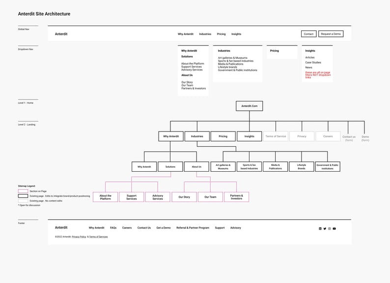
Sitemap Architecture
What Is Sitemap Architecture?
Sitemaps are files that provide markup information about your website and everything included therein: web pages, images, video, etc. This markup labels each page and provides details about the page’s structure, functionality, and goals, all organized in a hierarchical list from most important to least important.
A quality sitemap ensures that search engine crawlers can understand and index your website correctly.
Typically, these documents are built by users (either by hand or through automated tools) and submitted to Google Search Console, Bing Webmaster Tools, or whichever search engine you’d like to appear on.
But it’s not just about search visibility. Sitemaps are kind of like blueprints for your website that help you plan out everything ahead of time. They provide crucial design specifications for your web design and development teams, and they’re a best practice to establish a clear information architecture that supports both SEO and your user base. You must give your users a quality UX (UX design) and this requires a well-organized website that’s laid out clearly, is easy to understand, and is supportive of your goals.
These goals help users access the information they want in the fewest number of clicks and gather information to support your larger marketing goals. As such, effective site maps are built with your buyer personas in mind. They define and guide each of your personas along your desired path of conversion. There’s no better way to turn customers into prospects and prospects into sales-ready leads (lead generation).
Key Elements of Sitemap Architecture
There are two primary types of sitemaps:
- HTML Sitemaps
- XML Sitemaps
Most site owners prioritize the second type: XML sitemaps.
HTML sitemaps are user-facing roadmaps that help visitors navigate around your site. They list out each of your pages and subpages, and are found in the footer of most websites:
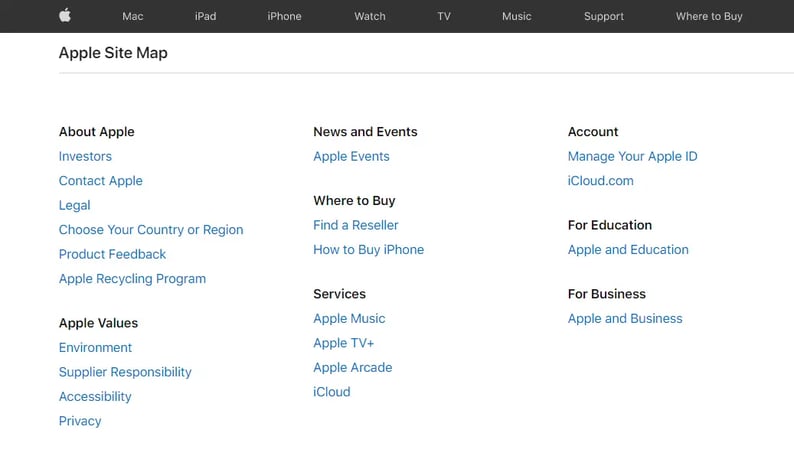 An HTML sitemap
\HTML sitemaps are useful for several reasons. Most importantly for the purposes of conversion, they help your users. When users cannot easily find what they're seeking - they provide an organized, hierarchical option for them to browse. In terms of SEO, they offer the opportunity to highlight your site's most important pages, add important anchor links and incorporate your business's most important keywords.
So, what about XML sitemaps?
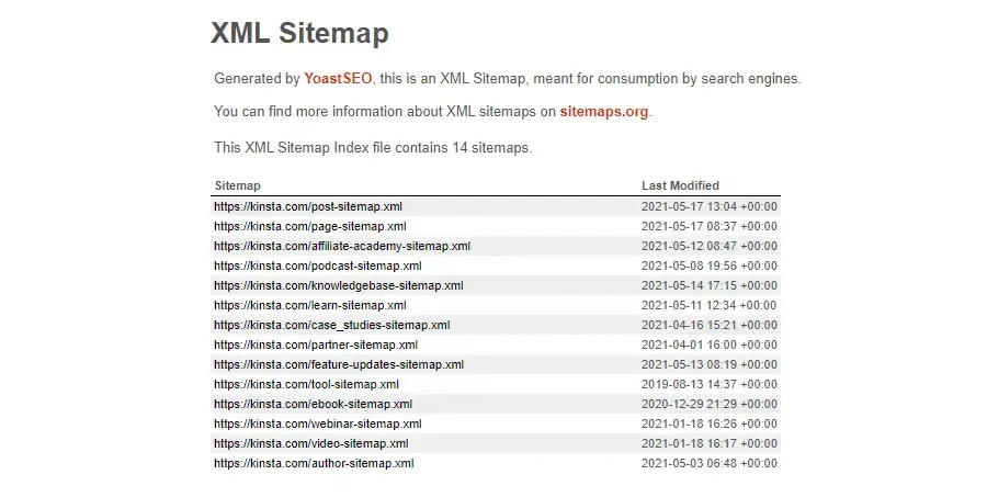 An XML sitemap
These are a modern tool that communicates with search engines and describes which website pages are most important. They’re an essential element of SEO and help your pages achieve the highest possible spot in the search engine results pages (SERPs). The biggest difference between XML and HTML is one is created primary for the end user, while XML is a backend directory for search engine bot crawlers.
The XML sitemap will include markup for each aspect of your webpage:
- URL
- Image
- Video
- News content
- Alternate language versions of the page
- Dates of modification
- Change frequency
- Priority level
Additionally, XML sitemaps can be built specifically for different use cases, such as one of these four styles:
- Image
- Video
- News
- Mobile
Image
Image sitemaps are helpful for sites that feature substantial photo, imagery, and visual content elements (most websites these days.) These sitemaps help crawlers index your images in the most efficient way, including those tricky images your site accesses through JavaScript coding. It also helps your site rank better in Google Images and image-centric search services that users love.
Video
You might build a video-specific sitemap when your website features a large amount of multimedia content. By nature, this type of content lacks keyword and text content, which can make it trickier to index. Dedicated video sitemaps can be indexed with more efficiency to make sure your page gets included on Google Video and other video-specific services.
News
News sitemaps are best for websites that want to get breaking news stories and articles featured in Google News or Top Stories. They enhance visibility in these areas but lack substantial SEO value otherwise, which makes them a niche tool that many sites won’t bother with.
Mobile
Mobile sitemaps are only necessary when you have a specific version of your site, such as for feature-phones that use WAP/WML markup, but this is quite rare. A responsive website is all you need to ensure your mobile site version is indexed appropriately, so most site owners don’t need to worry about this.
A Final Note About Sitemaps
Within each of your sitemaps, certain pages will be dubbed “canonical,” which means that they’re the primary version of the page when multiple variations exist (different languages for international users, etc.). This prevents problems with duplicate content and ensures that the most important pages are ranked the highest.
If you have multiple sitemaps to deploy, be sure to create a sitemap index file with links to each sitemap in use. This will keep things organized and allow you to submit all of your sitemaps to search engines at one time.
Related Reading: What is Growth-Driven Design and How to Apply it to Your Website
How Effective Sitemapping Supports Lead Generation
Although they’re an early step in the web design process, sitemaps have a huge impact on your website’s overall conversion potential.
First and foremost, sitemaps support your SEO goals by making sure that search crawlers can read and index each of your pages, which gives you your due place in the SERPs.
Sitemaps also act as the foundation for your UI and UX. They lay the bedrock for your bigger website goals. You can’t hope to achieve steady conversions without a well-planned and organized hierarchy that leads visitors from one step to the next. At its most basic, your sitemaps help users find what they need, when they need it, and make them an essential part of your conversion funnel.
Best Practices for Establishing Conversion-Friendly Sitemap Architecture
If you fail to plan, then you plan to fail. First, outline your goals and what you want your site to achieve. Consider your target audience and the buyer personas you’re working on. (You are working on your buyer personas, aren’t you?) What pain points does your audience have? What can you offer them through your website to soothe these pains?
For maximum SEO potential, be sure to begin keyword research and incorporate your findings into the sitemapping process. If certain keyword queries generate massive traffic in your niche, they may warrant their own pages or subpages in your wireframes.
Next, keep in mind that sitemapping is complicated! Especially for larger website builds, you’ll have tons of data to work with, and none of us has the time to put things together by hand.
Bigger projects and custom websites should lean on professional web development services to walk them through the details. For smaller, template-based builds, DIY platforms like WordPress offer automatic sitemap generator tools that can save time and prevent errors throughout the process.
Deploy your sitemap through one of the above channels, but keep in mind that your sitemap will evolve over time. Perform regular maintenance checks to keep your sitemap up to date, and be aware that some site pages may not perform the way you originally planned. Regular A/B testing over time can help you iron out issues in website structure and create a seamless flow for your users.
Read More: https://www.thecreativemomentum.com/blog/how-to-balance-information-architecture-with-seo
Ways You May Go Wrong Developing Sitemaps
As the foundational part of your website design process, it’s important to recognize what could go wrong.
Sitemap Constraints
- Limit the number of URLs to 50,000 in your sitemap. (Most sites will never reach this limit—but if yours does, Google may not index the site. You’ll need to submit multiple sitemaps at this point.)
- Alongside the above, keep an eye on sitemap file size. Google recommends a max 50MB uncompressed file size.
- Include no more than 1,000 images per URL.
Crawl Issues
- Don’t index utility pages, which usually include privacy policies, wish lists, and navigational elements.
- Avoid too many redirects.
- Don’t include error pages other than 404.
- Don’t include JavaScript and CSS that are blocked by search engines.
- Don’t include URLs that require logins, ones that are password protected, or any blocked by robots.txt.
- Do set priority levels for content to support more efficient crawling (labeled between 0 and 1. If you don’t set one, Google defaults the priority to 0.5).
Maintenance Issues
- Don’t forget to update your sitemap as you include new content or after major site redesigns.
- Do not duplicate content (pages that are identical or near-identical to other site pages).
- Above all, don’t forget to test and retest your sitemap once complete. This will identify potential problems.
The Inbound Methodology and Its Relationship to Conversions
The Inbound Methodology Defined
Inbound methodology is a phrase that was developed by HubSpot founders. It refers to what most people consider the most common form of modern consumer discovery—relying on the internet to find goods or services. Rather than advertise to prospects directly, you build online resources that make them want to come to you.
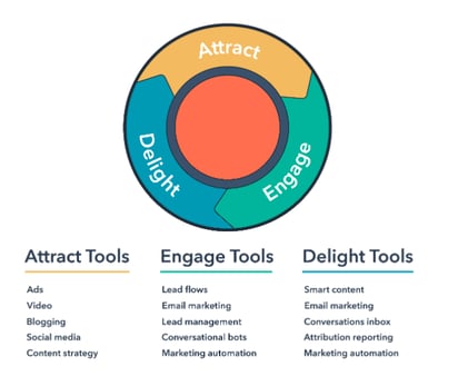
But to fully understand and leverage the inbound methodology premise, you need to understand the three pillars associated with it: attract, engage, and delight.
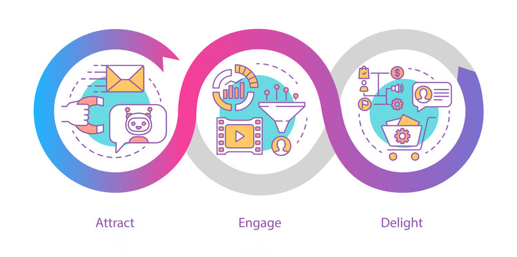 The three pillars of inbound marketing: attract, engage, delight.
Attract
Attraction may seem self-explanatory, but it’s not just about enticing people to your website. It's about identifying that segment of consumers who are most likely to visit your website and then convert them from visitors into shoppers. To attract quality traffic, you must offer something of quality once they arrive on your homepage. Position your business or brand as trustworthy and a leader within your industry.
Engage
Engagement is more than conversing with your target audience. To build engagement, you must develop audience personas. These allow you to identify why a person arrives at your website and what content, products, or services would be most useful to them.
For example, a homeowner who visits a landscaping business in the early spring is less interested in the company picnic you hosted last summer and more interested in how to prep his lawn for the spring and summer months. So, make sure that your business website highlights relevant information regarding lawn services and include a link to a “best practices” article for warm-weather lawn preparation.
Delight
This stage goes beyond customers’ expectations and maintains relationships with them over time. The delight stage refers to post-purchase outreach in which a business checks in with customers, makes sure their needs are met, and offers additional support or services, all for a remarkable experience.
Source: HubSpot
Inbound Methodology vs. Traditional Marketing Methods
While the theory behind inbound methodology seems like common sense, it’s quite different from pre-internet marketing tactics. Inbound methodology requires identification of targeted consumer personas and the creation of relevant opportunities that align with those identities.
Historical marketing focused solely on generic messages. Rather than determine what specific features or factors would influence consumers to take an action, traditional marketing used classic methods like broadcast advertisements on radio and television or advertisements in print media.
The Benefits of Inbound Marketing
One of the biggest benefits of inbound marketing is that it can provide a much higher conversion rate than outbound advertising and with less cost and effort. This is because the methodology improves traffic quality. It also builds brand trust. Consider that 86% of people ignore television ads and don’t read their junk mail, so traditional marketing methods are not as effective as they once were.
Also, lead generation funnels that are tied to inbound marketing have significantly higher success rates, with a closing rate of 14.6% compared to 1.7% for classic outbound tactics. And if that’s not enough, inbound marketing is significantly cheaper to deploy. It costs about 62% less than outbound marketing strategies.
Read More: How to Attract and Engage Website Visitors Using Inbound Marketing
General Components of Inbound Marketing
To roll out an effective inbound marketing campaign, you have to understand your customers and where they are in the buyer journey.
Buyer Personas

First, determine what types of people you’re trying to market to and what they need. Think back to the example of the landscaping company. If you owned that company, you could assume that only people curious about landscaping services will land on your homepage.
And within this category, the user could be a facility services manager for a group of apartment complexes or a single residential homeowner. In this scenario, you would need at least two personas—one for residential customers and one for commercial customers.
Depending on which silo they belong to, how you approach these two personas will differ. A commercial property owner might care only about basic groundskeeping while a residential customer may want landscaping design.
The Three Stages of the Buyer’s Journey Defined
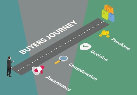
Buyers are usually in one of three stages of their journey: awareness, consideration, and decision. “Awareness” refers to someone at the beginning of the journey while “decision” means they’re ready to become a customer.
Awareness
For buyers in the awareness stage, you need to attract their attention and guide them to your website for more information. This may include traffic generation tactics like social media posts, pay-per-click (PPC) ads, and SEO.
Consideration
Meanwhile, the second stage, “consideration,” requires that you focus on website content that differentiates your product or service offering from those of the competition. This includes on-site materials like blogs, case studies, or other forms of social proof.
Decision
Finally, in the decision stage, your buyer has narrowed the field of options and is ready to pull the trigger. While this can center on price, it can also include features that make your product more appealing, industry credentials, and valuable offers like product demos or free service trials that convey your brand as the forerunner.
How Does Web Design and the UI Influence The Conversion Rate?
Web design, by definition, is the process of designing elements for your website or web pages. In practice, web design includes all of the frontend-facing elements of your website. A user interface (UI) is similar (and interchangeable in many cases), in that your UI encapsulates all of the elements that are presented to a visitor on a given webpage or website.
|
|
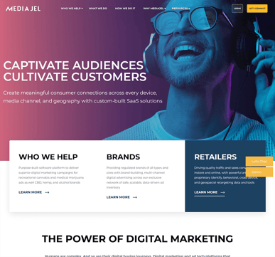
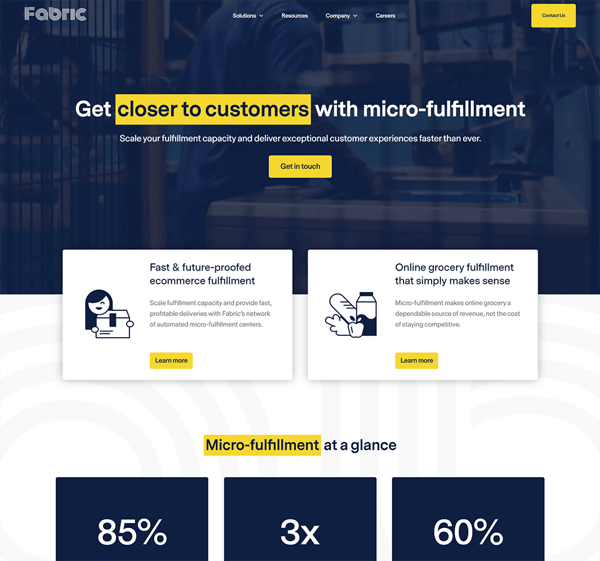
If your website isn't converting, make sure you have an intuitive UI. Two client website UI's (Mediajel and Fabric)
Components that influence your web design and user interface include:
- Site mapping and architecture
- Landing pages
- Form fields
- Content offers and calls-to-action
- Mobile optimization
- Simple yet professional fonts
- Spacing for optimized readabilityd
- Visual aesthetics
- Responsiveness
- User-friendly structure
Strategic use of web design elements and the user interface make for a satisfying user experience (UX). As a result, users can achieve the goals that bring them to your website.
Key Elements for Web Design and User Interface Success
Every webpage, on its surface, includes several key elements. These key elements affect how users interact with your content. The magic of good web design is all about mixing and matching these key elements to create a strong, satisfying user experience.
Input Controls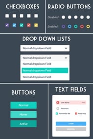
Input controls are elements that influence how users engage with your content to achieve a desired goal:
- Text fields
- Checkboxes
- Dropdown lists
- Buttons
- Combo boxes
- Radio buttons
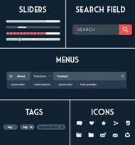 Navigational Components
Navigational components assist users as they navigate through your webpages. Without navigational components, users would be stuck on whichever landing page an external link brought them to. Common navigational components include:
- Sliders
- Menus
- Search bars
- Breadcrumb links
- Icons
- Tabs
Informational Elements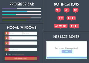
Informational elements provide information to users about the progression of certain processes and tasks. These contribute to an intuitive user experience, often represented by the following:
- Progress bars
- Pop-up notifications
- Modal windows
- “Spinning wheel” load graphics
Containers
Containers are elements that house important information on the webpage. Different containers enhance the user interface. Containers may include:
- Accordions
- Drop-downs
- Carousels
- Image boxes
- Headers and footers
These key elements, together, can be altered in ways that either enhance the UX or destroy it. A satisfying user experience is dependent on an artful, tactful use of these elements
Related Reading: Essential Elements of UI Design
How Web Design and UI Support Conversion Rates
Web design and the user interface influence how users interact with and navigate through your website. They dictate which elements users will see and what options are available to them at a glance.
As a result, well-designed websites approach the process with specific goals in mind. Smart web designers ask themselves what action a user intends to take, and then they implement design elements to encourage users to follow through.
Successful web design should guide users through a desired browsing experience. To achieve this, use strategic elements that create a focused, fluid user experience. A savvy web designer knows how to structure a webpage for maximum appeal and an optimized conversion path.
Tips for optimizing your conversion path through UI design include:
- Use directional cues
- Decide where and how to establish information-capture and lead-capture tools
- Create compelling copy and engaging content
- Implement strong, action-based calls-to-action
Successful web design incorporates big-picture decisions long before your site launches. These will help nail down exactly how a site should look and operate. Decide which pages go where (site mapping), what elements you need, and what elements enhance or detract from the user experience (UX design).
Lastly, web design with conversion as the end goal includes choices around how small, “insignificant” elements are implemented. Be sure to consider:
- Navigation options and placement
- The design and number of form fields
- Look, placement and copy of calls-to-action
- Color choice(s)
- Text font and size
- Negative space
Minor adjustments to peripheral design elements can have a lasting impact on users.
Related Reading: Designing the Ideal Navigation Menu
Best Practices for Conversion-Friendly Web Design
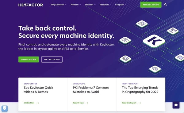
Keyfactor's website is designed to convert. Above we see above the fold content on the homepage. The color palette is pleasing and complementary, and the design is uncluttered with plenty of open space. Six tasteful and compelling CTAs cater to users at every stage of the buyer's funnel.
It’s easy to recognize whether a company has put time and resources into its web design. Savvy consumers are quick to judge your business based on how its website functions.
According to the Nielsen Norman Group, users often leave web pages after just twenty seconds of screen time. Fortunately, pages with a clear value proposition can hold people's attention for much longer. That’s why it’s imperative to make a great first impression.
To do this, you can employ several web-design and user-interface best practices:
1. Offer System Status Visibility
Your web design should always keep users informed about what’s going on. Implement design choices that offer appropriate feedback within a reasonable amount of time.
2. Match Between System and the Real World
Your design should speak a user’s language. Use words, phrases, and concepts that are familiar to your users, and don’t alienate them with jargon that’s only significant to you as a web designer. Relay information in a natural and logical way.
3. Design Around User Controls and Freedom
Often, users make quick choices by mistake. They don’t want to navigate through a long maze of controls only to return to the previous page. Make sure your web design offers an easy way to back out of a choice made in haste.
4. Be Consistent
Stay consistent in the way you name elements and implement navigation. Users shouldn’t have to question whether a word or phrase means different things on different pages.
5. Implement Error Prevention Tactics
Error messages are frustrating at best. Instead of presenting an error message as your go-to web design tactic, design away any chance of error. Either eliminate error-prone conditions or present users with a confirmation option before they proceed.
6. Remember Recognition Over Recall
Make elements, actions, and options visible to minimize the amount of information a user needs to remember. Information necessary to use your design needs to be visible and retrievable.
7. Provide Help and Documentation
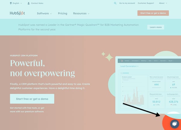
HubSpot's content optimization system is well-known for its thorough support documentation found in its knowledge base. Help is always a click away through a chat bubble in the bottom-right corner.
It may be necessary to provide tips or tutorials to help users understand how to complete a task. Make sure this information is accessible.
8. Keep Things Simple
Information overload is bad for business. Keep aesthetics, copy, calls-to-action (CTAs), etc. as simple as possible to create a comfortable-yet-comprehensive user experience.
9. Manage Your White Space
Don’t forget about your white space. Use it to complement the other design elements on the page. White space can be just as powerful as the text, buttons, and containers you use.
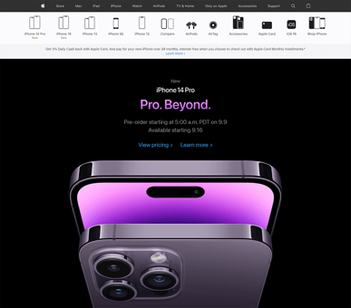
|
|
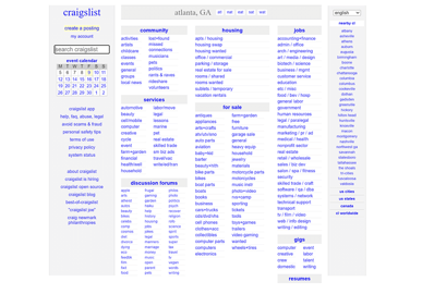
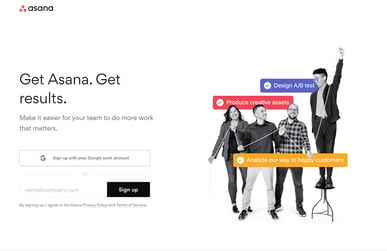
|

|
Tech giants Apple, Asana, Craigslist and Google demonstrate that using white space is an effective strategy to direct people where to look, nudging them down the funnel and increasing conversions.
10. Consider the Visual Hierarchy of Information
What comes first on a page and why? Think like a user, and arrange your visual hierarchy in a way that’s natural.
11. Balance On-Screen Colors and Contrasting Elements
Web design is as much art as it is science. Understand which colors go well together and which don’t, and use complementary colors and elements to create a pleasing visual aesthetic.
12. Optimize Your Headlines
Craft and make use of compelling headlines throughout your content to guide users one way or another. Headline cues can direct traffic toward an action and, ultimately, a conversion.
13. Format Your Elements
Be sure to format the whole design when you finalize it. Things like text font and button size play a big part in how a user views and interacts with your web pages. Don’t assault their senses, but do remember to complement other elements on the page.
Not sure your on-screen elements are as impactful and pleasing as they can be? Test them out. Often, companies will design and roll out different UI elements to see which ones please the eye and compel a user to stick around.
The overarching goal of your web design is to establish a clear direction and an intention for each web page. When you design a page, repeat the mantra “what’s the next step?” to understand how a user might navigate that particular page.
Minimize the effort needed by a user to make decisions and pursue a desired path. You want your user interface to be as clear, defined, and intuitive as possible.
Common Web Design Missteps
Everyone would have a world-class website if it was easy.
That’s not to say web design is hard, but knowing where, why, and how to best implement elements on the page is a practiced skill. Common web design missteps include:
- Failure to plan appropriately from early site-mapping stages
- Functional problems (parts of the website not actually working - images not loading, checkout errors, broken links)
- Responsive design issues
- Clutter and/or disorganization
- A confused conversion flow
- Non intuitive navigation
- Trying to achieve too many goals on one page
- Poorly designed UI elements that don’t capture attention and/or aren’t intuitive
- Too much focus on design and not enough on backend (slow load speed for example)
- Technical mistakes
- Not considering file types, image sizes, dimensions, or page load times
- Overcrowding of page with content (not enough white space)
- Poor font choice or size, which affects readability
It’s important to understand where web design can go wrong, whether you’re a veteran web designer or someone just getting started.
Best Web Design Examples
- 34 of the Best Website Designs to Inspire You in 2022
- The 47 Best Website Designs of 2022
- 40 Amazing Examples of Ecommerce Website Design
- 8 Great Examples of Awesome Website UI Design
- 15 Examples of Great Mobile Website Design
How Does the User Experience (UX) Increase Conversion Rate?
User experience is just as important as functionality in a website and can impact how well your pages perform as lead generation tools.
What Is the User Experience (UX)?

Aren't we always this happy when using technology?
User experience (UX) refers to how easily visitors can interact with and navigate your website. This means they can intuit how to shift between pages and follow predetermined pathways that encourage them to continue down your marketing funnel.
The UX can include:
- Information architecture (how your website is structured - discussed above)
- Navigation
- Visual features such as fonts, colors, design elements, and more
- User interface
Regarding information architecture, this can vary depending on your target audience and the conversion goal (such as signing up for a mailing list, subscribing to a blog, or downloading a demo).
Regardless of your conversion goal, your UX should be intuitive for anyone who lands on your website. Whether they’re a B2B buyer or a general consumer, the purpose of your website should be obvious, as well as the next steps for your conversion pathway. When these elements confuse the user, conversions suffer.
Key Elements of a Good UX Design
While UX refers to how easily a person can interact with your website, the reality is that good UX relies heavily on UI plus a properly-structured and optimized backend.
1. UI Elements
Information architecture and navigation are critical for a website that serves as a lead generation tool. Your website should be easy to navigate and not overwhelm consumers with too much information. The goal is to follow Hick’s Law: a psychological principle that applies to web design. It states that if you present a person with too many choices, the person becomes overwhelmed. He or she will take longer to make a choice or may opt out altogether.

Hick’s Law applies to web design in numerous ways, such as streamlining the landing page to prevent inaction. For example, a B2B managed-service provider for IT with a large list of services wouldn’t list every available cybersecurity offering on the landing page. This would overwhelm prospects and make them wonder what they’ll get when they click the CTA.
High-quality images vs. Text. Also keep in mind that vivid, high-quality images can capture attention faster than text. However, they need to be used in moderation unless your business is in a field where visuals are more important than text.
Go light on interactive elements. Along the same lines, don’t overload your website with interactive elements. While they’re nice and can be a great hook to keep someone on a page, they are bandwidth-heavy. This means slower load times and decreased performance that may contribute to higher bounce rates.
White space. Don’t forget spacing! Break dense content into digestible segments and leverage a balance between imagery and relevant text. Similarly, ensure that you use fonts that display properly across all devices and browser systems, and pick a font size and color (especially for larger portions of text) that are easy on the eyes.
2. Backend Elements That Affect Usage
UI often focuses on what web visitors can see, but backend website elements play a very important role in whether or not people view your website as user-friendly. Your goal is to build a website that’s agile, responsive, and quick to load.
A mobile-first approach and responsive design are two critical factors that impact both site accessibility for users and SEO value with browsing giants like Google.
Responsive design ensures that no matter the device used to access your website, consumers will have the same—or a similar—browsing experience. While there might be slight variations in how your site appears for desktop versus mobile or tablet users, the functionality and visual interface aren’t a stripped-down version of the desktop version.
- On the one hand, they can boost the functionality of social media content or agile translations for international visitors.
- On the other hand, they can slow down your website’s load time. And in extreme cases—such as with many WordPress plugins, they can risk data security and increase the potential for a data breach.
How a Quality UX Supports Conversion
Good UX implementation reduces the friction that prevents a consumer from taking the next step to fulfill a CTA. This means that from the minute a person lands on your target page (whether the homepage or a directed page through PPC ads), they know what’s expected and can move to the next step in the buyer journey.
 Most important, good UX makes your website effortless to use and creates a comfortable browsing experience that reduces the risk of page abandonment. It doesn’t leave users confused about next steps or how to navigate between pages.
Related reading: Five UX Design Tips to Maximize Long Form Content
Best Practices to Establish a Quality UX Design
While UX focuses on the on-screen experience, remember that you can’t worry about design elements until you’ve solidified the website’s structure. Consider which pages you’ll use and how many you’re going to need. Likewise, ask how the information will be presented and structured.
Be sure to develop your wireframe before you focus on design elements. To do this well, you must know your target customers and how to address their needs:
Discover Your Target Audience
If you’re already in business and planning a web development project or redesigning an existing website, you should already have a good idea of the types of customers you’re targeting. But this might not mean that you fully understand how your existing website aligns with their needs.
You could engage in market research to interact with your target audience. You can opt for unmoderated surveys or moderated focus groups to get real responses from your audience. If you already have a website, you can leverage features like heat maps to discover which pages need to be revamped and which ones shouldn’t be touched because they’re converting properly. Either way, the goal is to understand all the ways that people come to your website, the needs that must be met, and where you might be missing the mark.
Structure Your Sitemap to Correspond With Audience Personas
Once you have a better picture of your target audience, create a sitemap structure that encourages those personas to not just navigate but to move through the buyer journey to complete the CTA.
To optimize performance, you’ll want to test these new designs to see how they perform and then tweak the results along the way. Rather than get too attached to one design, try to A/B test different options and employ usability tests to make sure that a design is user-friendly and functional.
Ways You Might Go Wrong Developing a UX
Even if you think you’re adhering to best practices, it’s easy to make mistakes that’ll detract from the user experience.
Not Paying Attention to Your Target Audience
It’s common for business owners and web developers to fail to build for their target audience. Sometimes you can be too close to a project to see a glaring issue that’s obvious to a fresh pair of eyes. What seems intuitive to you can be clunky or confusing to a neutral target market.
Don’t Use “Dark UX” Strategies
Dark UX falls into the realm of implementing design elements that seem helpful in theory but negatively impact the usability of your website. For example, auto-play videos on the landing page might seem like a great idea until you realize that those videos slow down page load times and can crash the page entirely.
This is why we encourage designers to use elements like animations sparingly. While pretty to look at, in most cases they’re not necessary to carry your message to the masses. And more likely than not, they detract in unexpected ways that can hurt the overall UX.
Poor Website Readability
Fonts. So much more important than you might think. We can’t stress this enough, when selecting your fonts, ask yourself these questions:
- whether fonts render properly across all devices and browsers
- whether the font is legible when used for larger sections of text (think about users on their phones!)
- whether you’ve picked the right size and color so that it’s legible
Tiny font, a font color that fights with the background, or long sections of text that lack page breaks are all recipes for disaster. People don’t want to read walls of text, and no one wants their eyes accosted by a terrible color combination.
Related Reading: Poor Text Readability is Killing Your UX
Examples of the UX Done Well
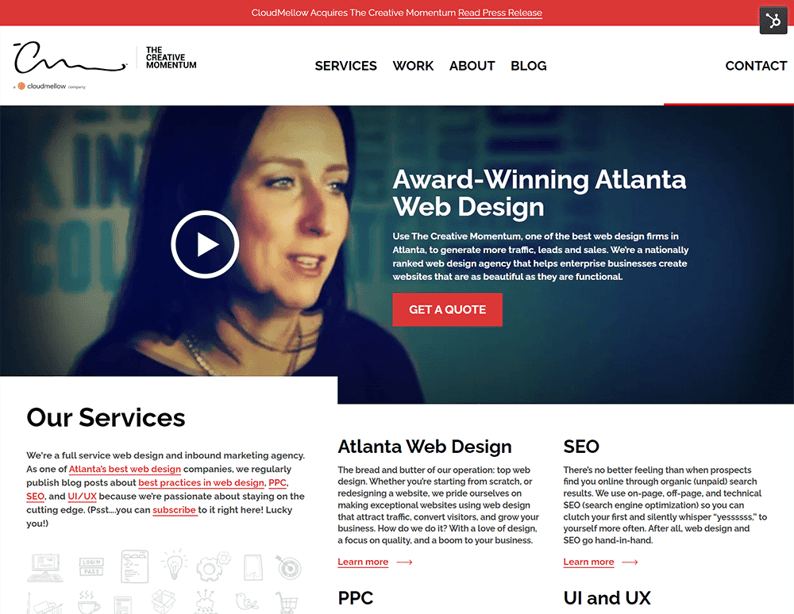 Example of good UX - The Creative Momentum website
Not to toot our own horn, but we’ve learned to balance content with a quality design that doesn’t detract from why our target audience comes to our website: to get support with web design and marketing best practices.
Text and visuals are balanced without sacrificing load speeds or relevance. Font sizes and colors are adjusted as needed to boost readability, while a simple color palette ensures that colors are used harmoniously and strategically. Finally, CTAs are accessible and relevant throughout each page to make it easy for visitors to take the next step.
Understanding Landing Pages and CTAs
What are landing pages?
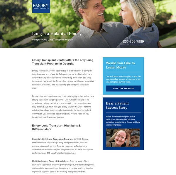
A landing page for Emory Transplant Center
Landing pages are dedicated web pages designed to support specific marketing goals and targeted calls-to-action. Landing pages are smaller in scope than other pages because they’re designed with one specific goal in mind. As such, web designers can improve the user experience with a narrower focus and optimized on-page content for maximum impact.
What are CTAs?

Your CTAs are call-outs that encourage users to interact with your website. CTAs are most often a solicitation for an exchange of information between a user and your company. Calls-to-action are meant to move prospects and leads deeper into your marketing and sales funnels. These can be implemented throughout your website, on your homepage, and on your landing pages.
Key Elements of Landing Pages and CTAs
Landing pages and calls-to-action work together to sharpen your marketing efforts and drive customers toward conversion. Both are composed of a few critical key elements.
Landing pages vary based on scope and campaign focus, but most of them make use of the following key elements:
- A focused value proposition and/or a unique selling proposition (USP)
- Descriptive, informative copy that highlights your USP
- Content that creates a sense of urgency and a need to act
- Supporting visuals
- Social proof/content that shows users you’re trustworthy and genuine
- A strong CTA that encourages some sort of targeted action
Calls-to-action are even more focused than landing pages. CTAs are used to compel direct, immediate action, and many employ the following key elements:
- Prominent page placement for maximum visual impact
- A short, focused offer or solicitation
- Action-based copy (i.e. Download our guide now, schedule a demo)
- Design elements that make the CTA stand out on the page
Your landing pages and calls-to-action need to be direct enough to eliminate any confusion, often, companies create different landing pages and CTAs that target different audiences.
Use a combination of the above-listed key elements to improve your landing pages and CTAs.
How Landing Pages and CTAs Influence Conversions
Landing pages and calls-to-action are important inbound marketing tactics that drive potential customers through your marketing and sales funnels. The end goal is to get these customers to convert.
Typically, landing pages and their calls-to-action minimize distractions so users will take a desired action.
Both landing pages and CTAs often offer data assets around which your company can gauge design element effectiveness. Many companies will even A/B test various design elements to sharpen content and maximize impact (which we’ll cover in detail in our testing and optimization rundown below).
Best Practices for Building Effective Landing Pages and CTAs
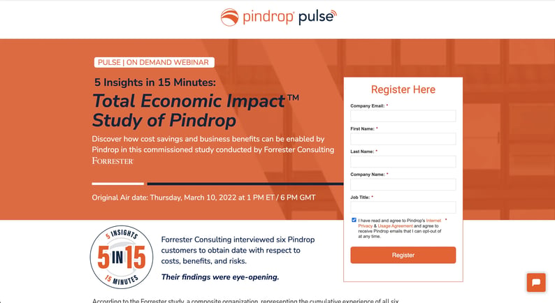
Effective landing pages minimize distractions, and include an offer, form, CTA, and value-oriented copy in order to drive conversions. (Client: Pindrop)
It’s your job to design and populate your landing pages with compelling content and calls-to-action that convert. You can use the following best practices to do so:
Landing Page Best Practices
- Draft simple, benefit-focused headlines and copy
- Support your copy with relevant visual content like images, videos, and graphics
- Create powerful, action-oriented calls-to-action
- Place your first CTA above the fold of the landing page
- Limit the amount of information you put on the page
- Remove website navigation elements and minimize distractions
- Optimize the landing page for search
Calls-to-Action Best Practices
- Create a focused offer that’s relevant to a specific buyer persona
- A/B test messaging to optimize multiple CTAs for different personas
- Speak to your reader directly using an active, first-person voice
- Align CTA copy with landing page messaging (if applicable)
- Create a strong value proposition that inspires direct, immediate action
- Place your CTA(s) in prominent locations on a web page or landing page
Remember, you don’t have to settle for just one landing page or CTA design. In fact, it can be wise to design and roll out multiple landing pages and varied CTAs aimed at different buyer personas.
Common Landing Page and CTA Mistakes
It’s easy to overwhelm users with a busy landing page or confuse them with a non-specific call-to-action. Fortunately, common landing page and CTA mistakes are just as easy to correct. Follow the above-listed best practices to avoid these common missteps:
1. Disorganized Landing Pages
Landing pages with a cluttered user interface (UI) and poor layouts do nothing to drive prospects deeper into your funnels. What’s more, poor CTA placement—either below the fold or buried in cluttered content—won’t compel users to act and ultimately convert.
You want to declutter your landing pages, optimize your content for readability and aesthetics, and focus your messaging around very specific action-oriented goals.
2. Too Much Information
UI clutter can hurt your marketing efforts, and so can too much information. An unfocused or bloated value proposition makes it unclear what users are getting if they pursue your CTAs. This kind of confusion often drives prospects away.
Again, you want your landing pages and CTAs to be as specific and targeted as possible. Declutter, sharpen, and focus your content for maximum impact.
3. Asking for Too Much
You also don’t want to ask too much of potential customers. If you require too much work or ask for too much information, you’ll see prospects abandon your landing pages.
Keep things simple. Ask only for essential information at the landing page and CTA stage of the funnel.
4. Mixed Messages
People don’t like to be misled. If a strong, specific call-to-action brings a user to a landing page, that landing page better have content on it that relates directly to the CTA breadcrumb. Mixed messages are just another way to clutter content and confuse customers.
Books have been written and seminars given about how to design and implement landing pages and calls-to-action for various effects. Avoid common mistakes like the ones listed above. Keep the message clear, and you’ll more likely drive prospects deeper into your funnels towards conversion.
Examples of Effective Landings Pages and CTAs
- 7 OF THE BEST LANDING PAGE EXAMPLES TO LEARN FROM
- 19 Great Landing Page Examples You'll Want to Copy in 2022
- 37 Best Landing Page Examples of 2022
- 20 Best CTA Examples You Can Use to Increase Engagement
- 50 Call-to-Action Examples You Can't Help But Click
- 35 Powerful Call to Action Button Examples 2022
Testing & Analytics for Conversion Optimization
Definition of Conversion Rate Optimization
No business process ends up perfect on the first attempt, no matter how much planning you do ahead of time. As your site launches, you may find that certain aspects of your marketing funnel don’t perform the way you expected—and that’s okay. These are common growing pains for every company.
But how do you tweak those elements to get your brand the attention it deserves?
Here, you can leverage testing and analytics as a conversion rate optimization (CRO) strategy.
CRO (Conversion Rate Optimization) involves structured testing on different marketing elements to get insight on how they perform. By doing so, you gain valuable data on how to structure your page for maximum conversion potential.
Common targets for CRO testing include CTAs across your site, home pages, landing pages, pricing pages, or your blog. Any area intended to capture user information for your marketing goals can be a target for CRO.
The idea behind CRO is simple. Conversion rates are defined as the percentage of visitors who complete a desired action on your site, measured by this basic formula:
- (# visitors converted / # total visitors) X 100
If you had 126 visitors on your blog homepage in a given month with 8 of those joining your mailing list, your conversion rate for that month would be 6.3%.
Note that conversion rates vary widely across use cases and industries, so comparing yourself to others shouldn’t be your goal. Instead, benchmark yourself over time and work toward incremental improvements.
You might find that you have chronically low conversion rates across your site, with many underperforming elements. If so, drill down to understand what’s going on. High visitor counts but low conversion rates may indicate issues with site usability or keyword targeting. Low visitor counts and low conversions may mean issues with SEO or getting found in the first place.
What matters is that you start keeping track of this essential data to gain visibility into performance. From there, you’ll know where you stand—and what kind of progress you can make with structured improvements to the conversion pathway.
Related reading: Increase Your Website Conversion Through Storytelling
Key Elements Included in Conversion Rate Analysis
 CRO takes many forms, depending on the area being assessed. As noted above, you’ll typically assess on-site elements such as headers, web content, supporting images, the CTA itself (across design, copy, and location), and the conversion pathway you’ve set up. For example, if you ask users to sign up for a paid plan before you prime them with free content or product demos, you’ll likely send them packing.
A/B Testing
A common first approach is to focus on your CTAs, as they’re relatively easy to compare, and they act as the gateway for conversion. Assessing conversion elements will be done through a process called split testing or A/B testing. A/B testing measures your conversion rate before and after a change is made to determine which of two options performs better. Based on the results of your tests, you’ll begin to get an idea of which workflow improvements could be made.
But A/B testing is only one tool among the many you’ll need to develop a comprehensive CRO strategy. Tools like Google Analytics, heat maps, and direct user feedback all have a role to play in conversion mastery.
The typical process sets a plan or conversion goal, identifies key elements to focus on for this specific test, performs the test itself, and tracks results over time. From there, you’ll fold in other behavioral data and analytic assessments to get a complete picture of how users interact with your site.
Why Testing & Analytic Reviews Are Essential for Conversion Optimization
Conversion achievement through structured inbound marketing channels is complicated. It can take months to plan out your conversion pathways and hire the best designers in the world to bring your site to life, but those won’t guarantee that users will actually interact with your content in the way you expect.
Testing and analytic reviews provide concrete data on site performance. These will inform you about your larger marketing strategy. Aside from earning more leads for your funnel, conversion optimization helps ensure that you attract the right kind of leads who will become paying customers. This concept is measured by your lead-to-MQL conversion rate, a broad projection of how many leads will continue down your established conversion pathway.
It’s a matter of efficiency. All marketers are familiar with the pitfalls of poor lead management and the associated costs to deal with unqualified leads with little sales potential. Insight into your conversion pathways supports a lean, efficient inbound marketing strategy that keeps customer acquisition costs lower while it earns the most leads for your trouble.
Top Metrics to Review
Of course, CRO depends on knowing which metrics are most valuable to your marketing goals and how to actually measure customer behaviors. There are many conversion-related metrics out there, and no marketer has the time to measure them all. Focus attention on the metrics that provide insight into customer behavior and campaign performance. Use these as your starting point.
- Conversion Rate: Naturally, conversion rate itself is the chief metric behind your CRO efforts, measured with the formula provided above.
- Leads Generated: The total number of leads captured divided by the total number of visitors for a specified channel.
- Time On-Site: A simple measure of how long a user spends on your webpage, measured by comparing the timestamp of when they arrive versus when they leave.
- Bounce Rate: Defined as how many users visit your site but leave without taking any additional actions, measured by dividing your number of single-page sessions by total sessions in a given period.
- Click-Through Rate: CTR details the number of times a link, or CTA, is clicked compared against the number of times visitors were exposed to that link (known as impressions). CTR can be measured by dividing click-through by impressions then multiplying that total by 100.
- Interactions Per Visit: This metric measures other actions a user takes on-site that aren’t directly related to conversion, including link clinks, adding items to carts, product views, and other interactions.
- Cost Per Acquisition: CPA details the total business cost associated with acquiring a paying customer through a specific channel, measured by dividing the total campaign cost by the number of conversions.
Best Practices for Conversion Optimization
First and foremost, tackle your conversion optimization efforts by creating a plan. It’s not something that can be done overnight. To get the most accurate sense of what’s happening, split test one element at a time over a set period and incorporate analytics from your dashboards to develop a holistic view of user behavior.
This process should be done on specific site elements like CTAs but also on the conversion flows you’ve established for each buyer persona or customer segment. For example, you might find that your enterprise-level buyers require more touchpoints before you consider them as true, qualified SQLs. If so, a push for commitment too early may harm your conversion rate.
Also, it’s good practice to keep your website and web assets up to date with timely stats and relevant information to ensure everything is relevant to your prospects. Nothing will turn a prospect off faster than broken links or outdated information, especially when they’re comparing your company against a shortlist of competitors.
Ways You May Go Wrong During CRO
CRO testing and analysis can be complicated. The most common mistake is to not define objectives before you initialize a CRO test. Companies often look at their data, see that their main service landing page isn’t performing the way they want, and make changes without knowing what they want to achieve. Goal-setting is paramount in CRO.
Of course, it’s equally important to examine the methodology you use to measure and achieve those goals. In other words, make sure you design your tests correctly.
Broadly, this means several things:
- Define a baseline from which you can work. This acts as your starting point.
- If possible, limit the scope of your testing to focus on one variable at a time.
- Run tests for long enough to generate meaningful data from the process. Just a few days won’t cut it.
- Be mindful of the fact that A/B testing is only one piece of the puzzle.
Multivariate testing can provide deeper insights and comparisons into key changes, and information from your Google Analytics dashboard will support testing with valuable context and behavioral data on the other key CRO metrics detailed above.
How to Implement Effective CRO Testing
Begin with a plan for what you want to achieve and what your most important targets are for a CRO implementation.
The PIE (Potential, Importance, Ease) framework can help you decide what to target first:
- Potential: how much improvement can be gained from an adjustment?
- Importance: how relevant is it to your goals?
- Ease: how easy will it be to adjust?
Start here and focus on your low-hanging fruit—tasks that will be easiest to adjust while they provide the most value. In general, testing individual site elements like CTA distribution and placement are easier targets than bigger tasks like developing a new whitepaper.
After you select a target, define your objective for the specific test. Are you trying to double click-through rates on a CTA? Increase page engagement? Improve ranking relative to target keywords?
Define your objective and gather baseline data on what you’re starting with. Apply your test and measure the results. From there, make incremental changes and adjustments until you reach your targets. It may take time. Your targets will inevitably change over time, but it’s a crucial process of optimization that ensures your site performs as it should.
Suggested Tools for CRO
Free Tools
- Google Analytics: One of the most comprehensive analytic review tools out there, GA is perfect for getting a rundown of marketing performance, especially with respect to Google’s suite of advertising and publishing tools. GA is free, but large enterprises can pay for Google Marketing platform to get access to the full range of tools.
- Google Optimize: As a sub-tool of Google Analytics, Optimize offers a dedicated platform to perform tests and measure results, backed by statistical modeling tools and advanced targeting features.
- Google PageSpeed Insights: PageSpeed is an easy tool that checks how fast your site runs and provides suggestions on how to improve when performance isn’t where it needs to be.
- Hotjar: Hotjar offers a great collection of heat mapping and visualization tools that provide insight into viewer behavior. The tool is available in both free and premium versions. Note that the free version caps data collection at 2,000 page views per day.
Subscription Tools
- Adobe Analytics: Adobe’s offering provides a full range of predictive analytics, reporting, attribution, and insight tools for full optimization of the customer journey.
- Unbounce: Unbounce provides AI-powered conversion tools, landing page builders, copywriting assistance, and A/B testing tools to help companies master their conversion funnels.
- VWO: VWO offers a big range of marketing tools, but its VWO Testing option will be of particular interest to businesses in need of a powerful marketing experimentation platform.
- Instapage: A dedicated landing page optimization tool, Instapage combines a combination of tools into a fully-featured testing and page deployment solution.
Website Conversion Wrap-Up: Summary & Final Thoughts
Armed with the above tools, strategies, and context, you’re well on your way to unlock your website’s maximum conversion potential. There’s a lot to know about the process, and there’s always more to learn. However, if you understand the above concepts and apply them to your web assets, you’ll see how these elements coordinate to create the “secret sauce” of powerful conversion-centric web design:
- Plan out a structured information architecture and sitemap that aligns with your goals for your target market
- Understand inbound marketing philosophy and the importance of making things simple for visitors who arrive on-site
- Structure your web design and UI choices to promote clarity and ease of use
- Condense your marketing goals into simple, easy-to-follow steps that users will intuitively understand for the best UX
- Build targeted landing pages and CTAs with clear value propositions for visitors
- Leverage regular testing and platform analytics to get an ongoing view of website performance and user behaviors