
Everyone wants a website that’s attractive. But having one that’s attractive AND and successfully nudges visitors down the conversion path is a different story. A website can be beautiful but ineffective. Remember that it must drive sales and leads. Before you plan a website redesign, incorporate these web design best practices into your strategy.
Why Universal Web Design Matters
If you’re not familiar with the concept of “universal web design,” you might be wondering what it is and how it impacts your website. Universal web design refers to maximizing a website's accessibility to the fullest extent possible regardless of a visitor's particular impairment or disability.
This includes fonts that are legible and in a size that’s easy on the eyes, as well as color and design elements that don’t distract or make a website hard to use.
Universal web design also incorporates accessibility features such as adding alternate text for images so that someone who is visually impaired can still enjoy your site. So, which universal web design features should be prioritized?
Embracing White Spaces
Once upon a time in the early days of the worldwide web, tacky websites with cluttered content were omnipresent. Back then, web design was limited to simplistic HTML markup, and there weren’t many rules. These days, the opposite is true, and the public doesn’t tolerate garish designs.
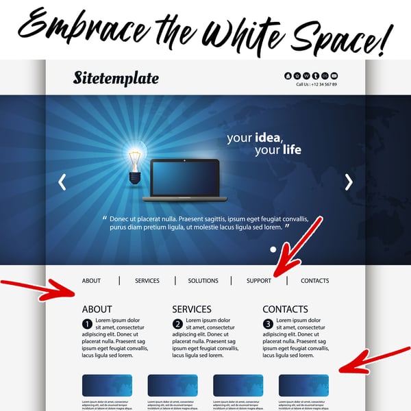
White space, also known as negative space, avoids splashy colors and leaves it white. Instead, you pick an easy-to-read color for your font such as black or dark gray. Maximize this design concept by pairing white spaces with legible text in a simple sans serif (without those little feet) font, and be sure to keep it at a size that most people can read.
Why It Matters
When used in moderation, a bold background color against a muted font face can be impactful and draw the reader’s attention to key aspects of a page, such as anchor text or a call-to-action (CTA). But when used in excess, it’s distracting. The reader doesn’t know where his or her eyes should go. Worse, it can make reading large blocks of text extremely difficult. All of this will lead to page abandonment and lost revenue.
Keep Your Color Palette Small
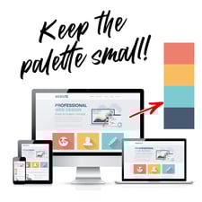
As with white space, you want a color palette for your website that’s balanced. Leverage colors from your existing brand or logo and incorporate them throughout your website. Your website should be an extension of your brand. It’s often the first impression a potential consumer will have of your business. So, a website that’s at odds with your logo and branding will confuse visitors.
However, because accessibility matters, don’t forget to consider how colorblindness might reinterpret the colors you pick. Roughly eight percent of all men and 0.5 percent of women have some form of colorblindness. Someone who’s colorblind might not be able to see green or red. In that case, if your website relies on those hues, your site could be difficult to read.
Leverage Visual Hierarchy
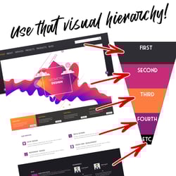 Visual hierarchy is exactly as it sounds. Through the use of size, color, and placement, you can guide your visitors through your website pages and encourage them to take an action. Visual hierarchy may sound complex, but it’s easy to put in place. Imagine you’re an online retailer that sells women’s clothing that falls under six main categories: tops, bottoms, shoes, accessories, dresses, and jumpers. Within each category, you could organize the clothing by prints, colors, or hem length.
As someone navigates through your menu, it’s more logical to have those primary six categories visible versus displaying every possible division at once. Once a user hovers or clicks on a category header, additional sub-categories would appear. This is a simplified concept of visual hierarchy, but it supports an accessible site with a positive user experience (UX) that makes navigating and shopping easier.
Prioritizing this concept is easier than you think. Take a look at your website and consider the following:
- What is the purpose of this website?
- Is it obvious what a customer should do on key pages?
- How are the design elements on this page supporting our overall goals?
- Are the most important action items properly prioritized?
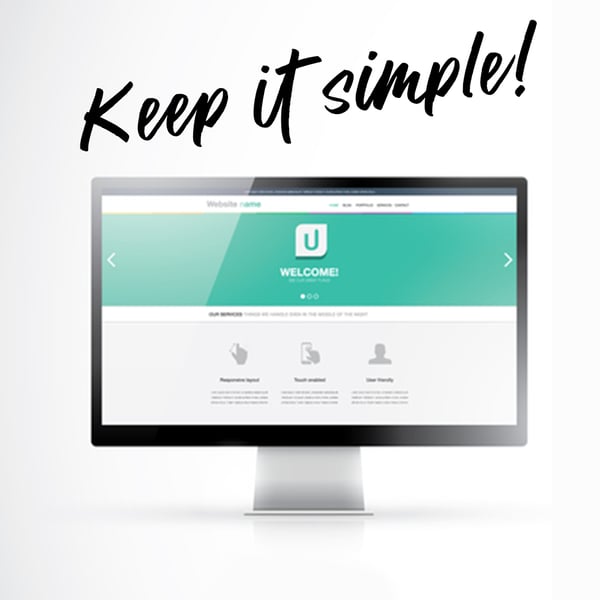 Keep Choices Simple
Depending on your website and the depth of your business portfolio, keeping choices simple can be a challenge. According to Hick’s Law, the more options you give people, the longer it takes them to make a decision. And in some cases, if the options are too plentiful, a person may choose nothing at all. But the solution isn’t to automatically limit choices on a page.
In some cases, such as our example of an e-commerce store, simply removing products to limit the total number of options may not be the best tactic. However, the way you lay that content out can be streamlined so that your customers have a more enjoyable browsing experience.
For example, an e-commerce store might want to limit additional design elements on product pages so that the product itself is the priority. They would see a page where the product image and description are the focal points. There might be a few suggested items in a row or column farther down the page, and the top header might include quick information about sales or a CTA for a discount code. In this scenario, the product pages are streamlined to make it easier for a customer to buy a product, and the retailer didn’t have to remove products to make the flow more agreeable.
Design with a Purpose
The best way to create a website that is both beautiful and functional is by using universal web design. It requires “designing with purpose,” and aside from making your website more accessible, it pays off with greater conversions. Your goal is to create a website that’s easy for your visitors to navigate and makes the path to the CTA easy to reach. If you need to revitalize your website using universal web design principles, contact the experienced team at The Creative Momentum.
