
![Understanding Information Architecture for Your Enterprise Website. [graphic] People work on an oversized screen - scaffold, gears, star reviews, etc.](https://www.thecreativemomentum.com/hs-fs/hubfs/2109-28-InfoArchitecture-image-h.jpg?width=600&name=2109-28-InfoArchitecture-image-h.jpg)
Regardless of your target audience, “usability” should always be a priority when you build a website. Your site should function smoothly with a structure that
- Makes sense
- Is easy for visitors to understand and
- Is pleasant for them to interact with
Make sure that when users arrive at your site, they can find what they need, can engage with the content, and perform actions without a struggle. The concept of creating an organized website that people just “get” is called information architecture (IA). So why do you need information architecture and what do you need to know for your corporate website? Let's discuss.
Why IA is Critical for Corporate Websites
IA matters for any website, whether you get a million visitors or just two people per month. But with enterprise and corporate websites, the assumption is that you’re working on a larger scale - whether it's site traffic, number of webpages, or assortment of content types (product page, blogs, resources, etc.). With all of that activity, a site that isn’t structurally sound is a disaster waiting to happen.
For this reason, experts recommend that user experience (UX) be prioritized over user interface (UI). UX refers to the functionality and structural layout while UI focuses more on the visual design components. While UX and UI go hand in hand, an attractive website that’s difficult to navigate won’t serve your business goals.
Leverage Hick’s Law

Hick’s Law states if people are presented with too many choices, they’ll either fail to make any choice or take significantly longer to make a decision. This happens when a website features too many options at once too early in the user flow.
For example, if you land on a website that sells clothing, and all 100 products in their catalog are presented on the home page, you would be overwhelmed. Which item should you click first? You might spend hours scrolling through all the images only to give up and close the window.
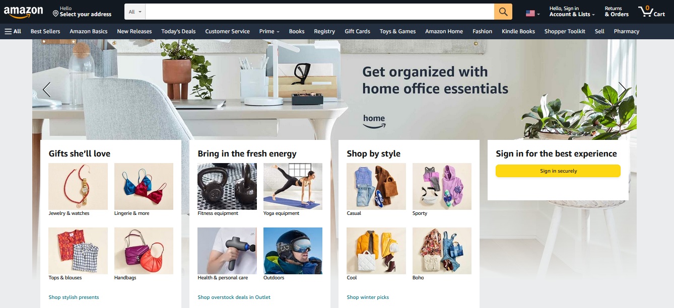
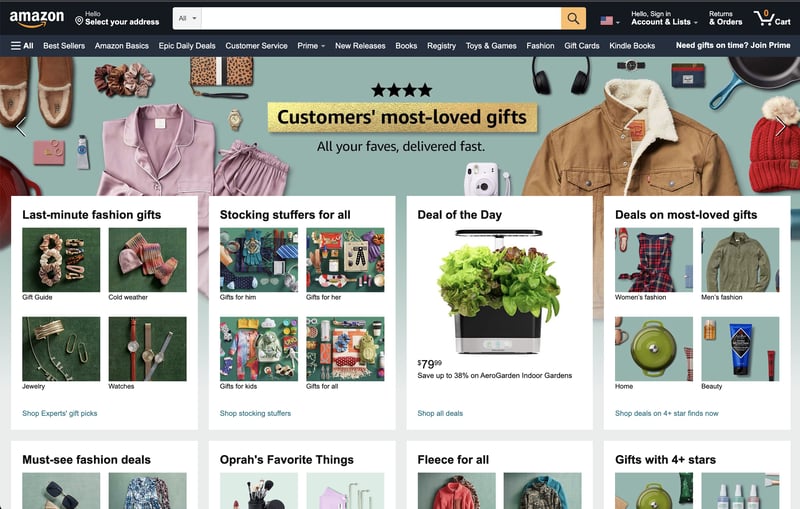 The king of information architecture? Amazon's intuitive, easy-to-find what you're looking for design is one of the biggest components behind their success.
Instead, pare down your homepage to feature just a few best-sellers—such as a popular jacket, a pair of shoes, and a dress—or even just product categories. With fewer options, it’s easier to make a choice. Meanwhile, you can create a structured navigation menu that allows browsers to drill down between overarching clothing categories, along with subcategories, and bypass options that aren’t relevant.
Consider Your Business Goals
Depending on your product or service, you’ll need to identify the best way to structure information. Most websites are designed around six core structural formats:
- Hierarchical
- Sequential
- Matrix
- Topic
- Chronological
- Audience
1. Hierarchical
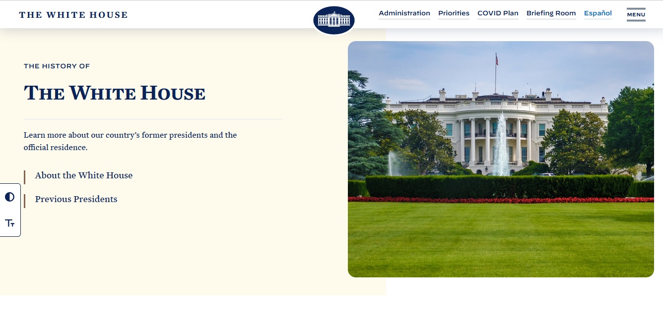
The White House
Hierarchical is a popular option that is reflected in our above clothing store example, as well as other prominent websites -- such as the White House's web page. This format involves placing the most critical information and site navigation elements near the top of the page, allowing visitors to take in essential page elements without needing to spend substantial time browsing.
2. Sequential
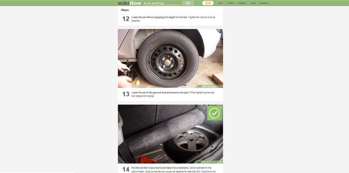
wikiHow
The sequential format involves guiding users through their browsing experience by creating a series of “steps” or action items to follow. You’ll typically see this type of format in explainer materials, how-to blogs, or other instructional resources. The key distinction between this format and others is that discovery is guided – users are encouraged to follow along rather than go off on their own.
3. Matrix
Amazon
For more complicated topics, the matrix format comes in handy. This system involves grouping content into different categories and allowing users to browse on their own terms. Typically, this format involves presenting readers with all options at once and allowing them to set specific search criteria to find what they need, most commonly seen in large ecommerce sites and pages with substantial amounts of products/content assets to organize. Sites like Amazon are a perfect example.
3. Topic
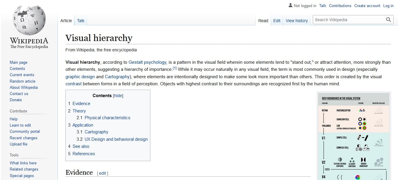
Wikipedia
Most of us are familiar with the topic format from sites like Wikipedia. This organizational structure groups relevant details into subsections that allow readers to hone in on the specific information they’re interested in. It’s a logical, easy-to-understand method of presenting information to readers.
4. Chronological
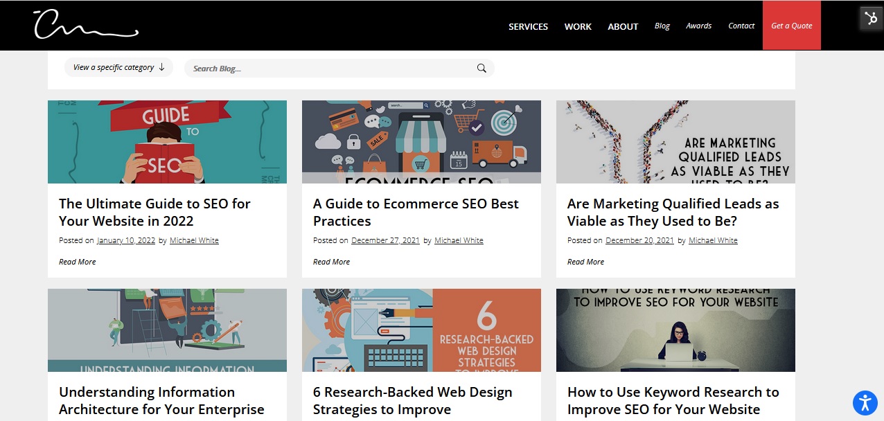
The Creative Momentum
Chronological refers to date-based organization and is a popular choice for blogs (such as ours!), news outlets, or any other content library that gets updated frequently. It places new posts front and center and makes it easy to stay on top of emerging news.
5. Audience
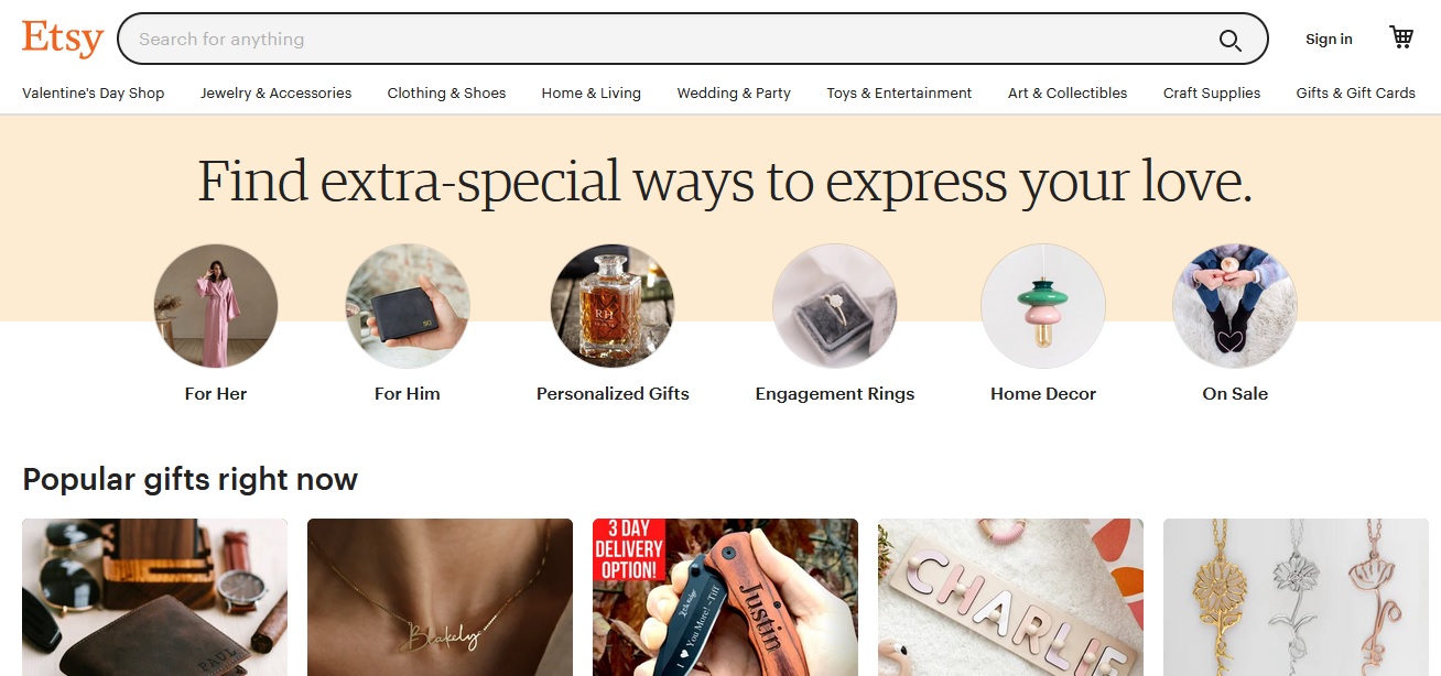
Etsy
For specific use cases, audience-based structures can be helpful. Consider how retailers like Etsy allow you to search for, say, clothing, based on user or demographic data – women’s clothes, kid’s shoes, men’s belts, etc. This style of organization is great when certain data sets are pertinent to one part of your target market but irrelevant to another.
Keep in mind that you can employ more than one structural format. For example, even though news outlets tend to prioritize breaking news at the top of the page, you’ll still see a hierarchical navigation menu that’s broken down by topics (e.g., politics, business, sports, entertainment, etc.). Along the same lines, retailers often use combinations of audience-based layouts, matrix-based layouts, and hierarchical formats to drive the most amount of sales.
6. Understand User Intent
One of the easiest ways to create a website that’s not functional is to design it according to your artistic tastes rather than the needs of your target audience. You are not your website’s target audience—even if you’re personally interested in what’s being offered. Your general navigation structure needs to be catered to the needs of your audience.
Figure out why people come to your website. There are three types of users (personas) who browse websites and each persona has a different goal:
- Informational users: on the hunt for specific details such as hours of operation or contact details.
- Educational users: looking for authoritative information.
- Transactional users: ready to take the plunge and follow through on a call to action (CTA).
Consider the service or product you offer and how it might align with these user personas. If you find that the bulk of your audience is comprised of transactional users, you’ll want to create a website that immediately channels people into the sales or contact flow, depending on the product. Informational and educational users need immediate access to information and knowledge.
Consider a Mobile-First Design

More than half of all internet searches worldwide originate on mobile devices, so you can’t afford to create a website that works on a desktop but does not work on a smartphone or tablet. Mobile search and browsing should be the priority, so make sure that your website offers a seamless experience regardless of what device a person uses.
While some behaviors will be modified, a mobile-first approach ensures that your website functions well on screens of all sizes. For the best results, use a responsive design plan in which your website’s backend is coded to automatically check and adjust to fit any screen size. Also, keep in mind that Google prioritizes mobile search results, so a mobile-first approach can help boost your SEO rank.
Focus on Structural Integrity
Along with building a functional website, avoid anything that will slow down your site and create headaches for your end-users. Complex coding can create beautiful websites, but they can slow download speeds or create unexpected glitches. Less is always more when it comes to web design, and a website that crawls through processes or page loads isn’t one that will attract a lot of traffic.
Structural integrity must prioritize cybersecurity. Even if you’re not a financial institution or don’t process payments, email addresses are still incredibly valuable and can be hacked in a data breach. Be proactive and integrate security protocols such as:
- Machine-learning algorithms that work to detect fraud
- Blockchain
- Hashing protocols
Design an Enterprise Website That Works
When people hear the word enterprise, they often think B2B. The truth is that even a consumer-focused website can be enterprise because the term defines quantity rather than type. Remember, Facebook (now Meta) qualifies as an enterprise website because of the volume of traffic it receives.
Building an enterprise website that’s functional and supports your business goals doesn’t have to be difficult, but it does require an understanding of key web-design principles—namely, information architecture. This is where The Creative Momentum can help merge your business goals with web development best practices that will make sure your website can work at scale and provide a premium experience to your target audience.