
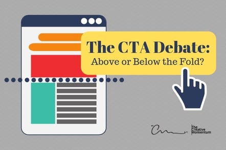
Some time ago, newspapers were the primary source of information for most people. Those newspapers typically were folded in half and stacked with the most important, eye-grabbing headline, photos, and graphics emblazoned at the top of the first page. That placement is an old print media term called “above the fold,” and it compelled interested readers to pick up a copy and read further.
The online world also has an above the fold location. That location is the viewable portion of a webpage after it loads and before the reader begins scrolling. Traditional thought suggests that the most important elements of a web page should appear above the fold, including a call to action (CTA). The idea is that readers see the appropriate CTA placement link right in front of them and are more likely to abide the call to action.
It makes sense that people react positively to a CTA placement that is above the fold rather than one below it. Online marketing reality, though, has proven that this is often not the case.
Motivated Readers Matter
When it comes to the effect of above-the-fold CTA placement, it helps to consider why newspaper publishers created the above-the-fold concept. The headlines and other content appearing above the fold encourage people to buy the newspapers. The stories always start on the front page and above the fold but always direct readers to other parts of the newspaper to complete the story. Those who are most motivated will buy a newspaper and follow the jump pages to the conclusions of the stories that interest them most.
Successful newspaper publishers harnessed the power of the fold to draw attention to stories and compel the most interested readers to buy a newspaper to learn more about what interests them most that day. They understood that motivated readers are the likeliest customers and did not concern themselves with the rest of the general population. In pure marketing terms, that is the power of the fold – most consumers will ignore the content. But a highly motivated few will seek additional information, and these are the ones most likely to follow through on a call to action.
Newspaper publishers know that most people scan headlines but ignore the content. So do savvy online marketers. When people take the time to seek out more information, they are likely to respond to CTA placement that is below the fold, rather than one that is above the fold.

Below-the-Fold CTA Placement Could Lure More Relevant Traffic
When you place a CTA above the fold, you're effectively removing space for compelling content that could reach more relevant consumers and translate into more online conversions. If an ineffective CTA placement occupies that space, you're missing the opportunity to direct highly-motivated consumers to seek out more information and subsequently follow through on the call to action.
When readers are unmotivated to follow a call to action, it doesn't matter where you put it. They won't bother with it, no matter how conspicuous or convenient it is. You need to lead your readers and visitors to the CTA by engaging them with compelling content.
Below Relevant Content Counts the Most
The best CTA placement is where readers will be the most motivated to follow through with the call to action.
Think of it this way: If a reader sees content that interests them and compels them to follow the content below the fold, a CTA placement above the fold would lead them away from the valuable content.
Once a reader scrolls toward the bottom, the above-the-fold call to action disappears. As an old saying goes: Out of sight, out of mind! Once the above-the-fold CTA disappears, the reader is far less likely to seek out the call to action by scrolling back up to the top.
The Fold’s Location Varies from Device to Device
How your visitor sees your site depends on what device is used to connect to it. A mobile phone has a much smaller screen and a different layout, so it will display your site differently from a desktop. Because website browsers vary greatly from one device to another, it makes device-specific website design (sometimes called responsive design) all the more important. You may not know how a specific person will connect to your site, but you can predict how s/he will see your site.
CTAs must be placed with the device in mind. Mobile users tend to be more rushed, and so they often miss CTAs buried below the fold or which require much scrolling. A desktop user sees more on a screen and tends to view all page content more frequently, so a below-the-fold placement can still work. For mobile? Above the fold takes on greater importance.
Where does a CTA go? It depends.
As we've shown, there is no single answer to this question because CTA placement depends on a variety of factors. Marketing is psychological at its core, and CTA placement is all about understanding who your user is, how that user interacts with you, and what you want to accomplish. It's why we spend so much time analyzing user profiles, target demographics, and use cases before designing a client's CTA and determining placement. But for all the time it might take, it's all worth it in the end—when the right decision leads to a boost in engagement.
