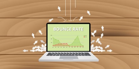
Bounce rate. It’s almost a dirty word in the web design world. For those unaware, bounce rate is a metric measuring the number of users who visit your website but leave after viewing only one page.
But why did they leave? It’s not easy to say because it’s not always your fault. Maybe they clicked your link by accident. Maybe their cat walked across their keyboard. On the other hand, maybe it was your fault. Bad web design is a common cause of high bounce rates. It’s possible they were so turned off by your landing page that they had no recourse but to bounce as soon as possible.
You can’t reduce your bounce rate to zero. However, through the use of creative web design focused on the user experience (UX), you can decrease the number of design-related bounces to the point where your biggest culprits will be errant mis-clicks and felonious felines.
UX Design
So, UX-focused design is one of the best ways to improve a high bounce rate, but what does it actually mean?
UX design involves structuring website elements (visuals, navigation, content, etc.) in a way that provides a quality user experience. And when reviewing bounce rates as they relate to the user experience, our assessment will be focused on your landing page. Given that this is the only page users see before they decide to bounce, this should be the first target in a UX design overhaul.
Landing Page Relevancy
First, ask yourself if your landing page is relevant to the needs of your target market. High bounce rates are often a result of a misalignment in marketing and sales—make sure your marketing outreach is bringing in the right kind of traffic if you want customers to stick around. For UX design, relevancy is a must.
Call to Action
Given that UX design revolves around placing the user first, it makes sense that your CTA should be easy to find. And while there’s plenty of debate about whether your CTA should go above or below the fold, in truth it doesn’t matter as long as its location is intuitive. If your CTA isn’t immediately visible to site visitors, use subheadings and directional clues to guide them there. If they can’t find it, conversions can’t happen.
Consumer Insight
The cause of bounce rates can be notoriously tricky to identify, and one of the most confounding aspects of web design is that it’s easy to lose the forest for the trees. Designers spend so long examining the minutiae of website design that they forget how the average user will view it. These factors combined make it difficult for website owners to determine what may be wrong with their page.
If possible, get feedback on your page from actual members of your target market. Get their unbiased opinions about your landing page. Is it confusing? Are they turned off by text-heavy paragraphs? Is there not enough text to capture their interest? Get detailed here, asking about subject matter complexity, tone, length of content, and use of visuals. This type of insight is the heart of UX design and provides data that can’t be measured with data analytics.
A/B Testing
And of course, web design is never truly finished. Regular A/B testing of new landing page copy, headlines, and designs may be essential to finding that UX sweet spot. Create several templates with the above considerations in mind and run focused testing to see which performs better with your market. A thorough evaluative process of each landing page element may be necessary to hone in on which aspects are turning users off.
Applying UX Design
During UX-focused landing page optimization, always keep your goal in mind. It’s not just to decrease your bounce rate or to gather more conversions. It’s to create a web experience that better aligns with the needs of your market and gives users a reason to keep coming back for more.


