
Mobile-optimized sites are nothing new. They’ve been around for as long as cell phones have had decent-sized screens. And every year, an increasing number of people are turning surfing the internet using their mobile devices.
To illustrate: in 2021, over half of all internet traffic was from a mobile device.
With the exponential growth in mobile online traffic, website designers are rethinking their priorities. If most people are using mobile devices to use the internet, shouldn’t they be building sites for mobile screen sizes first and adapting them to desktop later? This concept has had a big impact on website design and website design workflows.
Here’s what you need to know about the advantages and disadvantages of mobile-first design.
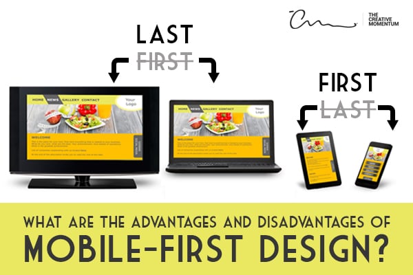
What Is Mobile-First Design?
Traditionally, web designers build a website that’s optimized for desktop, then take those design elements and shrink them down for mobile. This process is called graceful degradation—start big and downsize as needed.
Mobile-first design is called progressive enhancement. You start with the small and progressively add content to fit the appropriate screen size.
Put simply, mobile-first design is when you design the mobile version of a website before you design the desktop version.
It takes traditional website design and flips it on its head.
Advantages of Mobile-First Design
Like all things, there are advantages and disadvantages to mobile-first design. Let's start by taking a look at five big advantages.
 1. Appeal to a Majority of Users
Since the days of desktop superiority are over, the most important advantage of mobile-first design is that it appeals to the majority of users.Today, over 50% of internet users are on mobile devices. Rule number one of marketing is to know your audience in order to meet them where they are. Since mobile users now comprise the majority of internet traffic, it makes sense to start your design using mobile screen dimensions, reflecting and optimizing the site content based on consumer conventions.
2. Prioritized Content
Mobile-first design forces website designers to prioritize information. Since you don’t have much space, you need to pick and choose only the most important content to include. This helps you eliminate fluff that only bogs down your website and distracts users. It’ll make your website designs cleaner, more efficient, and more concise. In practice, mobile-first design makes you a better website designer.
3. Less Buggy
Mobile websites are simple. They use a simpler code and less of it. Desktop sites are complicated. They use a complex code for more styling options. When you start with a complicated desktop site and boil it down to a mobile site (desktop-first approach), all that complicated code needs to be reorganized to work on mobile. Do you know what that means? You should bring some mosquito spray because your mobile site will be full of bugs.
When you begin with the simple mobile code, it ensures all your design elements will work on mobile devices because that’s what it’s built for! You won’t have to worry about pesky bugs hurting the UX of your website. As you “progressively enhance,” you can add more content and complexities, but your simple mobile code stays the same.
4. More Responsive for Better UX
Users interact with mobile sites much differently than with desktop sites. When’s the last time you swiped your computer screen? When you build a website specifically for mobile, you can create a user experience that’s designed for mobile, not just adapted from desktop. The better the UX, the more likely users are to visit your website, and the higher your conversion rates will climb.
5. Faster Load Times (and Therefore SEO)
The more content you have on your website, the longer it’ll take to load. When you start with a desktop site, you cram in all the pictures, videos, long-form content, and graphics you can find to pretty it up. While that’s perfectly acceptable, it could hinder your mobile site’s performance.
After you “gracefully degrade,” all those beautiful pieces of content will still need to load on your mobile site, which will bog down load times—especially for mobile users who don’t have Wi-Fi access.
If you start with mobile design first, you can limit the content that appears on the page and speed up load times. Not only will faster load times help you earn more conversions (a one-second delay can reduce conversion rates by 7%), but it’ll also help you rank higher on Google. Page load time is a significant ranking factor!
Disadvantages of Mobile-First Design
Despite all its amazing benefits, there are actually some disadvantages to mobile-first design. Here are two of them.
1. Not Easy to Work With
Change means learning to do things in a different way. Starting with a mobile-first design has been described as “neither fun nor easy” by several website designers around the internet.
Taking a mobile-first approach requires a different way of thinking. You’ll have to take the time to learn the tricks, experiment on what works, and figure out new design methods if you really want to create a memorable mobile-first experience.
2. Restrictive for Both Space and Creativity

Obviously, mobile sites don’t have as much space as desktop sites. This means you’ll have to be selective with the content you include. Plus, it restricts many of the creative design elements you can use for desktop sites, which can be quite frustrating.
These limitations will take some getting used to. Mobile-first design is much more formulaic than it is creative, which is a major turnoff for many web designers, and requires that they develop a detailed plan before starting.
On the bright side, when you finish your more restrictive, mobile-first design, it’s all uphill! You’ll be able to expand your designs as you increase the size, making the final version of your website that much better.
Mobile-First Design is User-First Design
Mobile users already make up the majority of website visitor. As a website designer, it’s your job to cater to your audience. This means if they start with mobile, then you should start with mobile too.
Building a mobile-first website ensures that your site looks good, is bug free, and provides the optimal user experience for your visitors.