
Design trends always come and go. When it comes to websites, we’ve all but forgotten the era of busy page layouts from the turn of the century, and the Flash-enabled sites of the early 2000s are at best, a distant memory. Although those trends are gone, these "ancient" sites played an important role in establishing modern web element conventions that consistently convert website visitors.
If you want to know how to convert website visitors, look to the past and use these time-tested web design elements.
Simple Website Layouts
Simplicity is quite possibly the earliest website norm ever adopted. Of course, the website developers of the early 90s didn’t make simple layouts because they thought it looked nice. It was a matter of necessity.
While simplicity was essential for early website creation, it’s a design element that has survived the ages.
Modern technology allows for fancy, content-rich websites, but simplicity is still key to website design. Overwhelming web pages scare away potential customers and hurt your conversion rates. People judge websites as appealing or unappealing within 1/50th of a second. Websites cluttered with images and text are proven to be less appealing than simple, clean layouts.
Plus, research shows that website clutter may impact the number of visitors who stay on your site and convert:
- 57% of consumers say they wouldn’t recommend a business with a poorly designed website.
- 38% of users will stop engaging with a website if they find it unattractive.
- 46.1% of people consider a website’s design to be the top criterion for determining a company’s credibility.
- Users form an opinion of your website in about 50 milliseconds (0.05 seconds).
Keep your website designs simple and clutter-free. Include only elements that are essential to the message of the page, use plenty of white space, and make only one or two elements the main focus of each scroll depth. This means that no matter where a visitor scrolls on a page, there are only one or two things fighting for his/her attention.
White Space
Just like dark is the opposite of light, white space is the opposite of clutter. White space is any blank area on your website. Naturally, the more white space you have on your site, the clearer and simpler the text and images will be.
Website space is cheap, so don’t be afraid to use plenty of white space to simplify your site.
Visual Hierarchy
You’ve heard the saying, “the squeaky wheel gets the grease.” Well, it also goes for the elements on your webpage.
This is your visual hierarchy: the prominence of each website design element based on its arrangement by color, size, contrast, and other visual elements.
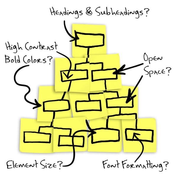
That might sound complicated, but it means that some elements are more obvious to visitors than others. For example, a huge bold headline at the top of the page will capture a visitor’s attention much better than a small font hidden at the bottom.
When building a web page, think about your goals. Which elements do you want people to see or interact with? Rank them from most important to least important and use visual hierarchy strategies to draw your users’ attention:
- Size – Large elements are more obvious than small ones.
- Position – Top-of-the-page elements are more visually prominent.
- Color – High-contrast elements draw users’ attention better than low-contrast elements.
- Format – Movement and videos capture attention best, images second best, and text the least.
- Spacing – Elements surrounded by whitespace are more prominent than ones surrounded by clutter.
Knowing what captures a reader’s attention, you can use visual hierarchy to guide visitors around your page in a specific path. You can show them the messages you want them to read in the order you choose. Once you give them all the information they need, guide them toward the call to action (CTA).
It’s not unheard of for companies to increase conversion rates by 35.6% by simply rearranging a few elements into a visual hierarchy. It’s a simple yet effective web design trick that really converts.
Bigger Elements Capture Attention
Bigger things get more attention. If there’s a piece of information, button, or picture you don’t want website visitors to ignore, make it big. Large, high contrast elements can often break typical scanning patterns and catch a user’s attention right away.
High Contrast and Bold Colors
You’ve used a highlighter before. Bright colors and stark contrast catch people’s attention. To really make elements stand out, put bright colors on a dark background. Nobody can miss a cue like that!
Font Weight and Formatting
If you want to emphasize specific text in a large block, you can’t just make a few words 100-point and bright red. It has to look cohesive with the rest of the text, with a little added oomph.
Use text formatting like bold, italics, underlines, or even font changes to make important text stand out without being overwhelming. This can help you establish a visual hierarchy within a text block.
Headings and Subheadings
Nobody reads websites in their entirety. Most users scan web pages to find the information they want. So, design your website with that in mind.
For text-based web pages, users tend to scan in an F-pattern. They start by reading the top of the page from left to right. Then, they go down the left side of the page to the next heading and read that. After determining what the page is about, they scan a vertical line down the page to find the specific information that interests them.
For those following along, the scanning pattern forms the shape of an “F.”
Knowing that people scan first, organize your information with headings and subheadings to create a clear, scannable visual hierarchy. If someone catches an interesting subheading while scanning down the stem of the “F,” they’re more likely to stop and read the information.
Creating the Perfect Headline
The headline is typically the first thing users see when they visit your webpage. Many businesses opt to say something clever to show off their personality. They think of it as a hook that might entice visitors to stay on the page.
In reality, though, clever but vague headlines confuse visitors and increase bounce rates. Internet users are looking for quick solutions to their problems. If they click on your site and can’t find what they’re looking for within a few seconds, they’ll go elsewhere.
Here are some tips to create clear headlines:
- Descriptive – Tell visitors exactly what the page is about.
- Relevant – Include a keyword or keyphrase that lets readers know the information is relevant to their needs.
- Top-of-page – Put your headline high up on the page (for high visual hierarchy), so nobody can miss it. You want it to be the first thing they see.
Visitors should be able to know exactly what the page is about within seconds of loading. The clearer you can make the headline, the better.
Open Space
Maybe big and bold isn’t your thing. Some brands, like Apple or Google, prefer to keep things minimal and clean. So, how do you establish a visual hierarchy without bright, bold elements? With more space.
If you surround elements with lots of white space, users will be drawn to the content. This establishes a clear, visual hierarchy.
Keep Choices to a Minimum – Hick’s Law
The more decisions available, the longer it’ll take for someone to act.
This is Hick’s Law. It was proposed in 1952, long before the internet was around, but it’s extremely applicable in web design and a fundamental element that has certainly stood the test of time.
Take Amazon for example. They offer millions of products, but everything isn’t listed all at once. Imagine how overwhelming that would be. The navigation breaks items into categories. When you click on a category, more filters appear to narrow the search even further.
In other words, it’s much better to offer three two-option choices than six choices all at once. If you want to know how to convert website visitors, apply Hick’s Law to your web design so that prospects can navigate down the sales funnel much faster and with less frustration.
Since your website’s purpose is to drive people to the conversion, your goal is to limit the decisions they'll need to make and offer them a quick path to conversion through:
- Navigation menus
- Calls to action
- Embedded links
According to research, 70% to 96% of the visitors who leave your page never come back. The fewer choices you offer visitors, the easier (and faster) their decisions become. Ideally, each page should have only one choice that leads them to the next stage of the buyer’s journey.
These Time-Tested Web Design Elements Will Convert More of Your Visitors
The best conversion strategies are the ones that prove themselves over and over again. Learn from the past and include these web design elements in your website for a timeless design that will generate conversions for years to come.