
Picture this: You’ve gone through the stress of building a beautiful website that tells your brand story and shows why customers should choose you over your competitors. Much to your joy, your website is getting plenty of traffic. Yet for some reason, people aren’t clicking through to buy a product, reserve a service, or request more information.
First of all, you’re not alone. Poor landing page performance is a common issue that many businesses face, and learning how to make the proper tweaks to improve performance can be a serious task. To turn your website into a lead generation machine, you need to understand why engagement rates fall once visitors arrive at your landing page.
Click-Through Rates Explained
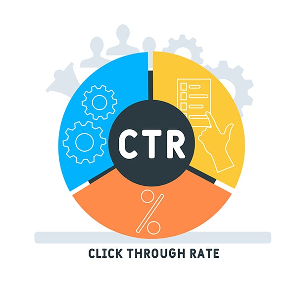
The marketing term for measuring page performance as a visitor moves through your web flow is called “click-through rates” (CTRs). Technically speaking, CTRs can measure any kind of website traffic generated by a source such as from ads, social media postings, and even SEO. But for this article, we’re focusing solely on what happens after someone arrives on your landing page.
How Do You Calculate a CTR?
If 1,000 people reach your landing page, but only 300 click a link to go to the target page where your offer is located, we divide the people who reached the target page by the total traffic the landing page received. In the above scenario, you have a 30% CTR.
Why CTR Matters
Depending on your industry, the product or service you're selling, and the associated price tag, a 30% CTR could be good, average, or bad. And CTR percentages alone shouldn’t be the basis to tinker with a website design. Extenuating circumstances must be examined.
When Low CTR Isn’t a Factor
There are times when a low CTR is irrelevant.
For example, a jewelry brand that sells engagement rings may find that consumers visit their website multiple times before pulling the trigger and complete a call to action (CTA) such as booking an appointment to look at rings. And a restaurant that has a website that accepts reservations—but doesn’t require them—could have a higher drop-off rate because consumers come to the landing page simply to find the address or phone number before going to the physical location. So, a low CTR in these scenarios doesn’t mean that the website isn’t properly optimized.
But if our original example is an online-only store that sells affordable handbags, that low CTR could be problematic. This means that 700 people came to the landing page, looked around, and changed their minds. And if that handbag brand has revenue goals that could have been met by getting more people from the drop-off group to take action, you need to figure out how to improve CTR.
Review Your Website for UI and UX Issues
When you own a website, optimizing it is always a priority. In the above scenario, a 30% CTR is contrasted by a 70% landing page abandonment figure. So the first thing you’d want to do is take a good objective look at your landing page to determine what’s causing it to underperform.
While some level of page abandonment is normal and expected (think of how often you or those you know are browsing around the internet for information vs. how often you go to a website and actually take an action), sometimes a poorly-designed website is to blame. Maybe your website is difficult to navigate, or you have a dead link attached to a CTA. This is a user interface (UI) issue.
On the other hand, maybe your landing page has a red background, and all of the copy that explains your business and key selling points is written in a lighter shade of red or pink. That’s difficult to read and leads to a poor user experience (UX).
Perform a Website Audit
Trying to review your website alone is difficult. You’re too close to the product, and more often than not, you might not notice glaring issues that a fresh set of eyes might. One of the best ways to create a website that’s optimized for your audience is to perform a website audit.
There are a variety of ways to do this. You could engage focus groups or use a monitoring system like heat maps. Focus groups are ideal because you can get thorough feedback from real users as they walk through every inch of your site. They might highlight issues you never noticed like a CTA that’s awkwardly placed and causes people to overlook it.
The only drawback of focus groups is that they often require users to spend more time on websites than they would in real life. This means that they’re not interacting with your website as people normally would.
In contrast, heat maps allow you to see where users in real life spend their time when they visit your landing page. Areas that are yellow to red show where people spend the most time with their mouse, trackpad, or fingers (for mobile devices) while blue and green areas have the fewest interactions. If your CTAs are in blue and green areas, consider moving them to areas that draw more attention.
Tips to Improve Landing Page CTR
Often, landing page performance can be improved through small changes that might not require an entire overhaul of your website design. Before making any changes permanent, consider using A/B testing as a way to try out new designs to determine impact before making the best selection.
Keep the Best Content and CTAs Above the Fold
“Above the fold” is a term that’s a holdover from newspaper publishing. It refers to putting the juiciest content on the upper half of a page that’s visible before it’s folded in half. In web design, “above the fold” refers to the visible area of a website without having to scroll.
Given that people arrive at websites using a variety of devices, this can get tricky. Relying on responsive design is one way to help ensure that critical information and CTA buttons don’t get hidden and require scrolling.
Make Customer Flows Simple
In marketing, the ruling belief is “keep it simple.” The more steps you try to force a customer to take, the more opportunities there are for page abandonment. If you haven’t already, take a fresh trip through the customer flow you’ve created and see if there’s room for improvement.
- Do you have to push through several pages before you reach a sign-up option?
- Are unnecessary pop-ups baked into the user flow?
- Are design elements bogging down load times on critical pages?
- Is something (a link, interaction, payment gateway) broken?
Remove anything that would qualify as a barrier to entry for your target audience. Remember, a slick and stylish website isn’t doing you any favors if customers don’t go beyond the landing page.
Get to the Point
Landing pages aren't the place for long-form content, like a dissertation on why you started your business or why your products are the best. While both topics can serve as part of an SEO strategy, attention spans are short, and the landing page should be reserved for your key money-making opportunities.
Put long-form content where it belongs—on your blog. People expect to read longer content elsewhere besides your homepage or product pages. Instead, keep descriptions and copy short, relevant, and to the point.
Balance Visuals and Copy
Along the same lines as keeping landing page copy snappy, take advantage of media like images and video that could sell your product or services better than the written word. Research continues to prove that people are visual creatures. So, if your landing page is a bit text-heavy, break that content up with impactful media that support the story.
But Don’t Go Crazy with Visual Clutter
Yes, visuals work, but you don’t want a landing page that’s so full of design elements that consumers can’t figure out the purpose of the page or where to go next. If they have to guess, they'll leave. Your website is not the place to add every cool design element you’ve ever seen online — unless your website is designed as a tribute to cool web design.
Just like with user flows, less is more. No matter how exciting a design element is, if it distracts visitors so they’re not sure which action to take, then its not supporting your business’s overall goals. A clean website is always preferred over one that’s difficult to navigate.
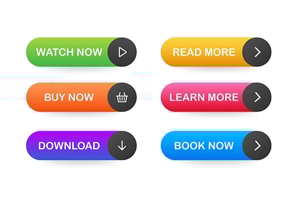
Use Buttons Instead of Hyperlinked Text for Important CTAs
For CTAs, button links are preferable to in-line text links. We’re not saying that people don’t read, but it’s easy for eyes to skip over text links—especially if the link is buried within a paragraph of text. In contrast, larger buttons with simple directives like “Sign Up” or “Shop Now” are straight to the point and leave little room for confusion.
Limit Choices (Follow Hick’s Law)
Research into user behavior shows that too many choices leads to inaction, and this is never truer than on websites. While choice can be a good thing since it can increase your potential target audience—like an online clothing retailer with a wide array of clothing—this doesn’t hold true for your landing page.
According to Hick’s Law, providing too many options at once, especially on websites, can leave visitors overwhelmed. Even if you have a large product catalog, everything shouldn’t be on display at once. Instead, this is where effective navigation comes into play.
Nest options in the navigation so that if people want to browse, they can. The goal is to keep your landing page functional. Keep things simple by showcasing a few items, or maybe just one. Pick your best sellers or your most popular service with a CTA that encourages users to buy or request more information.
The perceived absence of choice throughout the main body of your landing page makes it easier for potential customers to move through the user flow and avoids the potential that they’re crippled with indecision.
Don’t Forget the Backend
With all the fiddling going on to the visible portions of your website, it’s easy to forget about the backend. If your beautiful website features a "Contact Us" button that doesn't go anywhere, it's a big waste.
Attention spans are short, and websites that struggle to load in a few seconds are ripe for page abandonment. If that weren’t bad enough, poor load speeds now cause Google’s Page Experience algorithm to punish you.
So if you haven’t done so yet, use a tool like Google’s PageSpeed Insights to see how your website is performing. Along with providing you a load score, the page offers helpful tips to improve performance - even across devices.
A Landing Page That Converts
A website’s landing page is your business' online curb appeal; it needs to look good and invite people in. It’s the first thing that people see when they arrive at your domain, and it can create a positive or negative impression. Along with creating something visually pleasing, you want a functional landing page that supports your business goals, not detracts from them. We recommend trying out these ideas if you're seeing low conversions to make sure your site has the whole package.
The Creative Momentum has an expert team of web developers who know how to optimize your webpage to improve click-through rates, which can boost conversions and turn your website into a lead-generation powerhouse.
