
 Your landing page is the first impression of your business. It greets visitors and marks an important step in their buyer’s journey. If at any point visitors become frustrated or confused, they’re likely to leave without a second thought. Avoid these eight landing page design mistakes to create a better user experience and convert more of your traffic into sales.
1. Unorganized or Complicated Layouts
If there’s one rule you should keep in mind when it comes to website design, it’s that simplicity is key. The internet is all about efficiency, and if your landing page runs counter to that goal, nobody’s going to stick around to make a purchase.
No one wants to work too hard when they search the internet. That’s why easy, one-stop-shops like Amazon have had such success. Your landing page should follow the same idea. Avoid clutter and complicated layouts to make your landing page easy for visitors to scan. The less resistance customers feel as they flow through your sales funnel, the greater the chance they will make it to the bottom.
2. Avoid Overusing Gimmicky Marketing Tactics like Aggressive Pop-Ups, Preloaders and Push Notifications
Invasive design that forces interactions can overwhelm your website visitors and cause them to run for the hills. When it comes to any of these gimmick-y tactics, it’s best to keep them to a minimum.
Also, think of what other aspects could annoy visitors. Videos that automatically start playing at full volume is a great way to make people close the tab and never return. And, for everyone’s sake, don’t play music on your landing page. This isn’t Myspace!
3. Tricky Navigation Menus
 If the complicated layout and the gimmicks don’t drive custom`ers away, tricky navigation menus will. Customers want to find information about your brand and your products, so make it easy for them.
Most users will leave your website within 10-20 seconds. It’s your job to give them the information they want within that time frame. The easier it is for people to find the information they’re looking for, the deeper down the sales funnel they’ll go. Since everyone isn’t looking for the same information, having a clear, easy-to-use navigation menu is key.
For desktop sites, be sure to include a full navigation bar and not a “Hamburger Icon.” Hamburger icons are great for mobile sites where space is limited. But on desktop sites, where you have more page real estate to work with, they just add an extra step to find the information users want.
4. Bad User Flow
Think about the path your customers will take on your site and design your landing page to accommodate that path. This is a key strategy to lower website bounce rates. Think of your landing page as a funnel that guides visitors through the buyer’s journey. If you include a blurb about your last company picnic at the top of your landing page, this will confuse visitors and lead to an increased bounce rate. Plus, sorry to say, they just don’t care.
Make sure your landing page makes logical sense and includes only information relevant to the page’s main value proposition. Your company picnic might be interesting, but keep landing page details on a need-to-know basis.
5. Not Providing Enough Information
So far, everything about landing page design has been about simplicity, but remember— everything in moderation. It’s possible to go too far, not give out enough information, and decrease your odds of snagging a conversion.
People come to your site to learn about your brand, services, and products. The more times they have to click to find the information they want, the more likely they’ll leave for a more informative site. If a customer has to ask, “What do they do?” at any point while scrolling through your website, you’ve done something wrong.
Build your landing page for first-time visitors. Imagine they don’t know anything about your company. As concisely as possible, describe what you do right away so there’s no confusion. Having a well-written value proposition at the top of your landing page is an effective way to let visitors know what your company is all about. Place this value proposition in the page’s “hero text” above the fold and make sure it’s easy to understand at a glance.
6. Offering Too Much Information
Have you ever had that coworker who goes on and on about the cookout she went to over the weekend? You were interested for maybe the first couple sentences but probably started to zone out for the next dozen or so. Your website’s landing page works the same way.
Massive walls of text that ramble about your products and services aren’t inviting for potential customers. It might even scare them off before they can glance over the first sentence.
Break up information with headers, images, videos, and white space to make the content more manageable. Use bullet points to summarize information to help visitors scan content more quickly. You can always include more detailed information on other pages, but keep your landing page content simple and straightforward.
7. Poorly Designed CTA Buttons
Your landing page is designed to get potential customers to take the next step of the buyer’s journey. The best way to nudge them down the funnel is with a call to action (CTA), but not all CTAs are created equal.
You want your CTA button to stand out. Pick a color that doesn’t blend in with your website. Since every website looks different, there’s no specific button color that’s better than another; it all depends on your website. Just pick something bright that’s easy to see. Choosing the right button color can increase website actions by 21% or more! Perform A/B tests on landing pages to see which color(s) work best for your site.
Of course, color is just one feature you’ll want to validate. The size of your CTA buttons also plays a factor in conversions. You want them to be big enough for visitors to see but not so big that they overpower the rest of your content. Making your CTA button too large can hurt user experience, especially on mobile devices. Nobody wants a giant button in his face while he’s surfing the internet. Keep these factors in mind as you design and be ready to monitor your landing page analytics to see how each option performs.
8. Choosing the Wrong Color Scheme
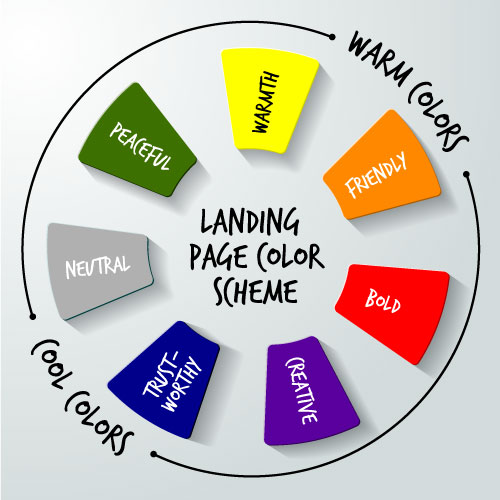 Color can have a huge impact on your customers’ emotions and attitudes. Choosing the right color scheme for your landing page design can have a lasting effect on your conversion rates.
To start, use a color that represents your brand personality:
- Yellow = clarity and warmth
- Orange = friendly and cheerful
- Red = bold and exciting
- Purple = creative and wise
- Blue = dependable and trustworthy
- Green = peaceful and healthy
- Gray = neutral
Next, choose a color scheme that suits your audience’s preferences. A color scheme that suits both your brand and your audience can increase conversion rates by up to 24%, so don’t write it off as a mere aesthetic issue.
Avoid Common Landing Page Design Mistakes and Create With Confidence
The key to building an effective landing page is simplicity. Design your landing page in a way that keeps your message clear without being overloaded with content, unnecessary features, or distracting layouts. Gently guide visitors down the sales funnel and make it easy for them to find the information they’re looking for. Do that, and you’ll be on your way to more conversions than you know what to do with!
