
Web design constantly evolves. As technology continues to improve, so do websites. Long gone are the early days of clunky, column-focused websites that were more structurally functional than appealing. And as mobile browsing continues to dominate, web design has similarly adapted: prioritizing mobile-first design while Google primarily indexes and ranks websites based on how well (or not) their mobile design works.
With all of that evolution, it's understandable that those looking to revamp or launch a website might be looking for examples of web design done correctly. While you should always make design choices based on the needs of your target audience, finding inspiration is always a good idea too. Let’s take a look at some great examples of brands and businesses that nailed it from some of the best web design companies.
1. Tech Companies that Love Minimalism Paired With Responsive Design
Examples: Apple and Facebook
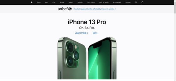
Source: Apple
One thing that some of the best web designs have in common is taking a less is more or minimalist approach to creating a compelling page that draws users in, rather than sending them running for the hills. Letting your service or product take center stage can do far more for you than data-heavy animations and a website that’s cluttered with design elements.
Tech companies in general have embraced minimalist design as a hallmark approach for their industry, perhaps none more so than Apple. Apple has made responsive, sleek design a core tenet of their business - throughout their products, and in their marketing materials. Some may even argue their penchant for minimalism goes too far at times: not including user manuals with their products, or most recently, neglecting to include an adaptor that would allow most consumers to charge their new devices from a conventional outlet.
A quick visit to Apple’s landing page lets you know that their products take center stage both in the navigation bar and as you scroll. While the website leverages visuals, they use clean design that showcases their hero product offerings. Meanwhile, the brand keeps choices simple as you browse the homepage. Your only options as you scroll are to learn more or buy a product.
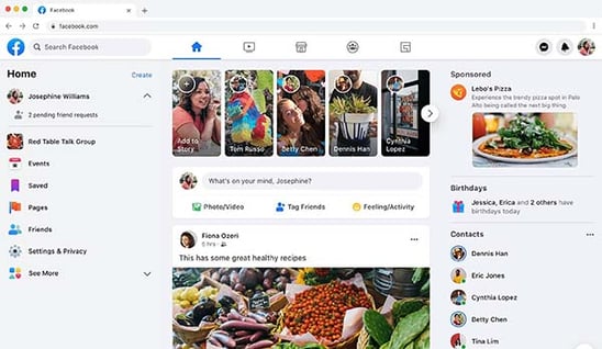
Facebook's website is another great example of minimalist design. No matter how you feel about the brand or their outsized influence on society, there’s no escaping that this social media behemoth has figured out how to create a simple website that seamlessly works regardless of which device you use. With one glance through your newsfeed, it’s very easy to grasp what Facebook is offering, navigate the website, or interact with people, businesses, pages, and groups. This holds across all devices and Facebook’s other acquisitions, making it a top web design.
More importantly, the animations that are present are simple and unobtrusive. Whether it’s reactions to posts, or logo design elements that celebrate specific days, these features don’t prevent Facebook’s audience from engaging with the website. Nor do they slow load times, or refresh annoyingly while you’re in the middle of posting a comment.
2. Dark Mode Design
Examples: McCormack and Morrison and Spotify
Source: McCormack and Morrison
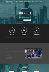
While most websites still prioritize a white or light-colored background, dark mode is gaining prominence. Essentially, dark mode allows users to switch the color palette view for a website from light to dark or inverted colors. There are plenty of reasons why dark mode would appeal to visitors but a few key factors include:
- Preferred viewing options in low-light conditions
- Dark mode can make text pop better
- Reduces battery consumption
Better still, dark mode doesn’t necessarily impact your SEO ranking, assuming that your website is still easy to navigate (mobile, mobile, mobile) and provides value. Some websites are designed with a dark mode aesthetic as the default or only option. But many brands also offer dark mode as an option, allowing users to decide which viewing mode is best for them.
McCormack and Morrison is a great example of web design using dark mode while not sacrificing quality. Their website doesn’t strictly use black as the primary backdrop color but incorporates plenty of darker or muted hues that are gentler on the eyes. There’s a healthy balance of vivid imagery contrasted against a darker background to build visual interest. To compensate for the known factor that dark mode can make blocks of text harder to read, the brand increased font size for textual components.
Dark Mode for Websites with Extended Sessions
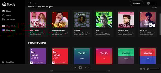 Source: Spotify
Dark mode design is especially ideal for websites with visitors that spend extended periods of time on the site. For example, Spotify defaults to dark mode, with a clean design that relies on negative space that allows album artwork to be the focus.
Meanwhile, headers are written in stark white but in an open sans font that works across browsers and devices. This web design makes it easy for people to browse and select channels. Additionally, the sidebar leaves unselected titles grayed so that users can easily determine which view is currently active.

3. Horizontal Layouts, Unconventional Scrolling and Dynamic Design
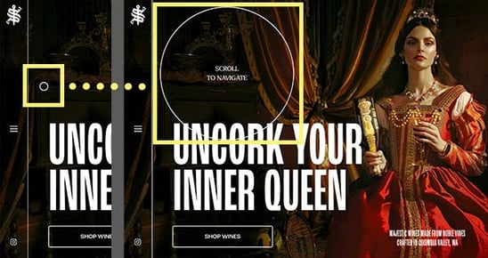 Source: Scepter and Sword
Examples: Scepter and Sword and Eugenia Durante
While “less is more” and “watch your animations” are smart tips that most brands would be wise to follow, there are other web design examples that demonstrate that going against the grain and being different is also a great strategy. Scepter and Sword is a winery that proves being unconventional can help you stand out against a very crowded field.
Rather than relying on the standard mouse arrow, the brand’s design incorporates a circle that widens when you hover over clickable areas. Similarly, their website employs a horizontal scrolling mechanism instead of the vertical version we’ve been trained to expect. But they smartly include scrolling instructions so potential consumers don’t get frustrated or lost on their website.
There are also dynamic visual elements that float into view as you continue to scroll through their website. Meanwhile, if you’re not a fan of horizontal scrolling, you can easily use the menu on the left side of the page to jump to a particular section. Best of all, Scepter and Sword wisely paired striking visuals with larger text to complement their dark mode design to build a strong brand story.
Horizontal Layout and Scrolling for Portfolios
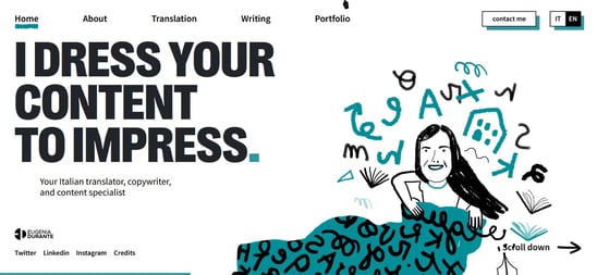
Source: Eugenia Durante
We've also see horizontal scrolling being used as a smart web design element to showcase creative work. Unless you’re in the market for an Italian translator, you probably haven’t heard of Eugenia Durante. However, her website manages to implement not only horizontal scrolling but a streamlined layout that makes it easy to navigate.
While horizontal scrolling is only used on the landing page, the unique format is so captivating that it instantly sets the site, and therefore the experience, apart. The addition of a pen nib that doubles as a mouse helps drive home the point that she’s a wordsmith. Rather than overloading the landing page with endless paragraphs to prove her capability, she redirects visitors to strategic links to a portfolio page where you can also book her services.
Other articles you might like 👀
The Top 11 Web Design Trends of 2022
6 Examples of Best B2B Web Designs
Balancing Expectations vs. Innovation in Web Design
4. Human-Centered Design
 Source: Forty Ninth Living
Examples: Forty Ninth Living and Supergreat
Regardless of how you design the visuals on your website, if it’s not functionally supportive for browsing and navigation, or doesn’t meet the needs of your target audience, you’ve failed. When in the web design process, don’t get so caught up in slick elements and accents that you ignore why your customers are coming to your website, and what information or actions are most important for them.
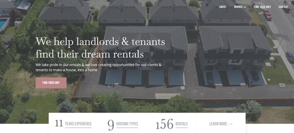
Forty Ninth Living is a platform that essentially acts as a matchmaking service between tenants and landlords, allowing them to find homes or happy renters. The website leverages a few relevant animations by way of a nearly fullscreen background video on the home screen. But this is paired with relevant information that someone seeking a new apartment, or a new tenant for their rental property, would want to know.
Without scrolling, you see that Forty Ninth Living has been in business for over a decade, and the number of types of housing rentals it has to offer. The website is clean and direct, allowing prospective tenants to immediately begin previewing potential rental units after scrolling below the initial landing frame. Their website is simple, easy to navigate, and doesn’t require visitors to jump through hoops to reach their desired goals. It gives the people what they want - that is human-centered design in a nutshell.
Source: Supergreat
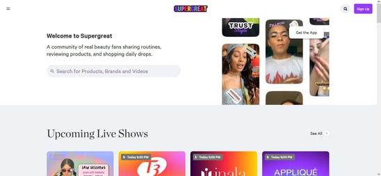
Supergreat is another site that keeps their personas central to their design. The beauty-only social media sharing platform also incorporates a shopping component. The brand focuses on real consumers sharing feedback on a wide array of beauty products and encourages members to not only post pre-recorded reviews but also host live shows and engage with their active audience.
The first thing you see when you reach their website or open their app is the lineup of current and upcoming live shows. The remaining layout varies slightly depending on whether you browse on a desktop or through the app, but both access points allow users to watch pre-recorded reviews, shop trending products, view popular brands or featured content creators, and click through to read long-form beauty articles or buying guides.
5. The Power of Visual Mediums
Examples: Bold Botanica and Scribe Media
Source: Bold Botanica
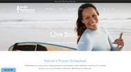 It’s no secret that people are visual learners. And in this modern age, high-resolution imagery captures attention better than walls of text. But incorporating iimagery that’s relevant — or at least compelling — can be tricky when it comes to web design. Bold Botanica is a supplement company that plays up its connection with nature through a looping fullscreen set of videos that play on the home page.
The fullscreen imagery draws you in, and help you immediately make the connection that they focus on health and wellness. A quick scroll reveals a few of their key product offerings, an emphasis on clean ingredients that are vegan-friendly, as well as the brand’s commitment to being eco-friendly and prioritizing a sustainable culture.
Using Simple Animations
Source: Scribe Media
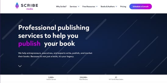
Moving visuals doesn’t always have to refer to a video. It can also be used to describe animations. Scribe Media is an agency that helps experts and professionals write, publish, and market books. And the minute you visit their website, you’re greeted by a simple yet striking animation that reinforces their position as a book publishing agency.
The words “write”, “publish”, and “market” rotate as they’re being typed on the screen in a vivid purple hue that helps them stand out from the remaining white text and navy blue background. While the animation isn’t large or complicated, it’s enough to engage a targeted audience. Meanwhile, the remainder of the landing page serves as a space for case studies highlighting the agency’s capabilities. Truly a great example of unique web design.
Designing for Your Audience
Before you start taking screenshots of various websites that caught your attention, take a step back. Think about your audience. Are they motivated by bold visuals and moving elements? Or, are they short on time and just need the essentials to make a decision or the desired action you want them to take?
Knowing who you’re trying to reach can save you and your web design team critical hours working on project aspects that might be irrelevant or miss the mark. But if web design isn’t your forte, The Creative Momentum has years of experience bringing brand visions to life with effective and visually striking websites that help to support overall business goals.