
User experience (UX) design continues to evolve as new technologies are introduced, algorithm updates are released, and the Internet of Things (IoT) expands. Sometimes, designers take a beat to review past trends and tactics in order to inform new UX design strategies. Why?
If you want to know the future, look at the past.
-Albert Einstein
A recent look at the last ten years of UX design from Strategy Analytics—titled “Towards Personalized Connected Experiences: Charting a Decade of UX Innovation”—attempts to consolidate UX advances over the past decade while it presents expectations and key trends for the coming decade.
The report revisits concepts and opportunities first examined by Strategy Analytics in their 2011 study, “Innovative Mobile Experiences Add Value and Support Differentiation.”
In 2011, notions like personalization, context awareness, and convergence were top-of-mind. The tech world was still reeling from the release of the first iPhone in 2007, and the same UX concepts that made the iPhone a best-seller would continue to influence design decisions in 2021 - even as interconnected IoT devices presented new UX challenges.
One thing is for sure: UX design has changed over the past ten years, but some foundational tenets have remained.
Here’s a look at how UX design has changed (and how it has stayed the same) over the last decade.
UX Design Ten Years Ago: Maybe Mobile and More Personal
 In the early 2010s, UX design was still adapting to the introduction and rising popularity of widespread smartphone and tablet use. The first iPhone made waves in 2007, and the first iPad was released in 2010. Responsive design was a new idea, and accessing social media via smartphone was rare(er).
Life for consumers a decade ago was a far cry from the mobile-first, get-it-now information overload we’re so used to today.
According to the Pew Research Center, 59% of American adults were accessing the internet wirelessly through laptops or cell phones in 2010, but access was limited. Only 11% of cell phone users had purchased a product with their phone, and only 20% had used their phone to watch a video. Compare that to today’s normal in which almost 50% of all internet traffic comes from mobile users.
Mobile devices were becoming part of a company’s UX strategy ten years ago, but mobile was still low on the priority list.
UX Design Strategy in 2011
Watercooler UX design talk a decade ago was about how providing an exceptional experience was the standard and not the exception. Designers were interested in the logistics of how users operated a smartphone or tablet—gestures like tapping, pinching, and scrolling with your fingers were still relatively new—and form factor and technical constraints surrounding hybrid (mobile/desktop) UX design were at the forefront.
Common elements you’d find in a UX strategy from 2011 might include:
- Web analytics
- Behavioral segmentation
- Consumer personas
- Usage scenarios
- Interaction modeling
- Features and functionality
- Social media
- Mobile design
In 2011, user experience designers were more focused on creating analytics-backed, behavior-driven features and functions than they were catering to mobile devices. Social media icons, personalized content, and a quicker, more efficient experience were top-of-mind tactics.
These sentiments were echoed by Robert Reimann, Lead Interaction Designer at Sonos, Inc. during a 2011 talk with UXmatters:
“The purpose of a UX vision, or strategy, is also its primary benefit: a human-centered approach, or roadmap, to a product or service that an entire enterprise—including marketing, development, sales, and executives—can rally around and work to achieve."
“Having a UX vision ensures that all customer or user touchpoints positively reinforce the brand and the customer or user experience, resulting in a more cohesive and coherent product and customer relationship.”
-Robert Reimann, Lead Interaction Designer at Sonos, Inc. and Past President of Interaction Design Association
UX design a decade ago was all about trying to adopt a human-centered strategy and creating a cohesive experience.
UX Design Tech and Trends Ten Years Ago
On the technical side, UX designers a decade ago were trying to incorporate design elements and languages that were becoming more popular. Things like QR codes, which Best Buy started using in stores in 2010 to enhance the shopping experience, and cloud-based services were still new-ish tools designers used to help create universal user experiences.
Design languages like HTML5 and CSS3 were just reaching widespread web browser support in 2011, which in turn fueled an increased focus on hybrid design. Tablets like the iPad presented an on-the-go option for consumers, and third-party apps were popping up in response. Just as a few years earlier, every business believed they needed a Facebook page, the rise of tablets and smartphones convinced many companies they needed a custom-designed mobile app.
Mobile and mobile app design trends from ten years ago included:
- Bold primary colors
- Focus on minimalism
- Gradients with minimal gloss
- Localized search and deal updates
- Textured and patterned backgrounds
- Rich footer content
- Shadows for depth
- Text-driven interfaces
- Magazine/newspaper layouts
- Thin sans serif fonts
- Oversized header images
The general consensus for UX design ten years ago was bold but simple. Everything got a little more complicated when smartphones and tablets entered the picture, and designers were doing their best to make the transition as seamless as possible. Complex, overcomplicated apps and designs lost out to attractive, user-friendly alternatives.
A decade ago, designers were still getting used to the idea of responsive design and a mobile-first mentality. Today, responsive design is the norm, and mobile-first is old news.
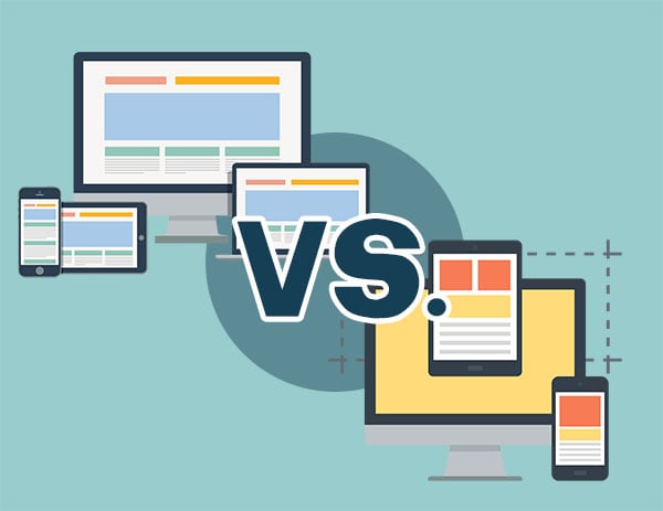 Responsive and Adaptive Design
UX designers in 2011 were just starting to explore concepts like responsive web design and adaptive web design, and it wasn’t uncommon for companies to have multiple interfaces designed for multiple platforms or devices.
Remember when users had the option to switch between mobile or desktop interfaces with the click of a button? Remember how awful those first mobile user experiences felt? Mobile options for early hybrid design adopters were clunky, jumpy, and unmanageable.
In response, two different UX and UI design strategies were introduced: responsive design and adaptive design.
Web designer Ethan Marcotte coined the term “responsive design” in 2010. Responsive design shifts images and text to work on different-sized screens instead of utilizing multiple layouts. UX designers have been using responsive design to help scale images, wrap text, and adjust website layouts for the last decade to accommodate any screen size. Responsive design was huge in how it changed the way designers approached creating a more modern user experience.
In 2011, web designer Aaron Gustafson released his book “Adaptive Web Design: Crafting Rich Experiences with Progressive Enhancement.” In the book, Gustafson presented the idea of “progressive enhancement” of a website and the notion of creating multiple fixed layouts that would respond to the available online real estate presented. If a website detected a certain-sized screen format (like a smartphone or tablet), the corresponding layout would be used.
At the time, both adaptive design and responsive design were solutions to UX design challenges. Each had its advantages, and both would become tools that modern UX designers still use today.
Pros and Cons of Responsive Design
- Seamless user experience
- Fewer maintenance tasks
- More budget-friendly
- Crawling and indexing efficiency
- Better for SEO
- Slower page loading
- Difficulty integrating advertisements
Pros and Cons of Adaptive Design
- Device-targeted design
- Faster load times
- Optimized for advertising
- Reusable
- Labor-intensive creation
- Harder to maintain
- More expensive
Responsive and adaptive UX design tactics and strategies have evolved over the last decade, but the underlying concepts forever changed how designers approach their craft. Today, UX designers utilize both to address specific business goals and foundational design decisions.
For example, adaptive design might be more appropriate for existing complex websites, and responsive design is ideal for new businesses. Responsive design is more budget-friendly than adaptive design, but adaptive design is better for a more targeted user experience.
Increased Usability Testing Thanks to More User Data
Fortunately, responsive and adaptive design weren’t the only elements that determined how targeted and successful UX design could be over the last decade. Today’s UX design tactics are more data-driven than ever before, and that’s thanks in large part to the popularity of mobile devices.
Smartphones and tablets brought with them a literal treasure trove of consumer data. Ten years ago, the amount of consumer data we enjoy now now was every company’s dream. Today, UX designers use this data to inform design decisions and create a more personalized, customized user experience.
A/B testing—the idea of rolling out multiple versions of the same product or campaign to test viability—wasn’t a new concept, but it became infinitely more accessible over the last decade. Product and design teams started to run constant A/B tests to improve UX and UI design. Everything from button color and text to content layout and formatting is now ripe for A/B testing.
Over the last ten years, increased usability testing capabilities for UX design has led to:
- Reduced bounce rates
- Increased conversion rates
- Improved content engagement
- Multi-functionality
- Ease of analysis
- Reduced risks
- Minimized cart abandonment
- Increased sales
- And more
Data, data, data—it’s as much a product and commodity these days as actual products and services. The more data you have, the wider your options for A/B testing, segmentation, and consumer targeting.
A/B usability testing and data gathering have become more widespread in the last decade. As a result, UX design trends are less “sticky” than they used to be. Meaning, designers are less tied to a handful of ideas and more open to adapting what works best for any given customer or customer group. If something isn't converting today, try something else and see if it sticks.
UX Design Tactics That Are Still Evolving in 2021
“New” foundational UX design tenets like increased personalization and context awareness have blossomed since adoption more than a decade ago. For some companies, personalized content and improved context awareness has always been part of their UX strategy. For others, the concepts are a new normal that simply makes sense.
But not every UX design tactic from the last decade that made sense bloomed to fruition. Some ideas that UX designers expected to take off are still evolving and growing.
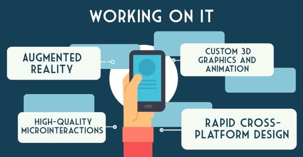
UX design tactics that emerged over the last ten years but haven’t quite realized their full potential are:
- Augmented reality: Utilizing smart devices to “augment” the real world to provide content, advertisements, and more. Some designers are convinced augmented reality (AR) is the future of design.
- Custom 3D graphics and animation: The ability to create and project lifelike images and video is dependent on technology. The more advanced technology gets, the more likely we are to see high-quality renderings and custom-created responsive content.
-
Cross-platform design: Efficient cross-platform design has always been a challenge for developers, but by deploying time-tested UX design concepts, developers ensure that accessibility and user engagement are baked into the application from the beginning. And with more users these days opting for mobile/tablet-based browsing, it’ll become even more important to accommodate experiential demands through responsive and adaptive design.
-
Microinteractions: Microinteractions are on-site elements that allow users to interact with your system, with each successful interaction represented by some sort of visual feedback. Think of scrollbars that move alongside your location on the page or tooltips that pop up when you hover over them with your cursor. Microinteractions like these are integrated throughout your UX to help users, gather system feedback, and create distinct branding appeal. They’re not a new tactic, but modern use cases look a little different than they used to: pull-to-refresh tools, or display integrations with digital voice assistants, for example. We expect microinteractions like these to continue to evolve over the coming years to empower users even further.
More personalized, more targeted, more engaging is the mantra for UX designers looking ahead to the next decade. Technologies like virtual/augmented reality and improved data collection platforms will continue to drive UX design evolution through the next few years, and smart designers will find ways to make these concepts and tactics work well.
UX Design Has Changed but Stays the Same
As is the case with most things UI/UX design, SEO, or advertising, many things have changed over time, but many have stayed relatively unchanged. Foundational UX pillars like usability and functionality still inform design decisions, and technologies change the way designers lay that foundation.
Mobile-first is still relevant, convoluted design is still frowned upon, and consumers still want a clear path to products and services. Our best advice is to create innovative (or at least seamless) experiences in a crowded smart device marketplace.
Today, we’re more connected than ever before, and IoT devices bring products and services to our homes at the press of a button or utterance of a phrase. It’s your job as a UX designer or team leader to recognize successful trends, discard outdated tactics, and shape a UX strategy that converts.