
Just like with any other industry, trends come and go in the world of web design.
Some things aren’t so much trendy as they are key tenets of just plain ole' good web design. For example, legible fonts and creative-yet-effective copy will never go out of style and should be incorporated into every web design strategy.
Other times, functions like animations, page layouts, and even user interface (UI) elements like scrolling can change with the times, especially on high-traffic pages like the homepage or landing page. So, if you’re planning a website refresh or are building a website from scratch, and you want it to look on-trend, what should you incorporate into your build strategy?
In our experience as a marketing and web design company, these 11 web design trends are set to be the most important in 2022.
1. Minimalist Web Design
It’s safe to say that over the past few years, minimalism has taken hold for web design across desktops and mobile devices. Many of our clients have come to us with inspirational sites and specifically voice a preference for minimalist design.
It's understandable; the clean aesthetic is easier on the eyes. A minimalist design often goes hand in hand with a streamlined navigation and user interface (UI) that makes these types of websites easier to use for even the most tech-averse. Here are some of the benefits of minimalist web design:
- The absence of excessive elements ensures that pages load faster, and items aren’t reloading and causing a disjointed experience.
- Clean websites reduce consumer distractions and ensure that visitors can reach their desired goals with few to no interruptions.
- With an absence of choice, it's easier to guide the user rather than overwhelm them with options causing them to abandon the site.
2. Dark Mode as an Option
Whether visitors are browsing your website in the middle of the night with the lights off or they prefer the starker contrast, dark mode continues to rise as a standard feature that internet users have embraced when it comes to web design. Not always the de facto viewing option, many brands are incorporating it as an option for consumers.
The only question is where to place your dark mode selection tool. Is it something that a user must toggle through settings to access? Or would you prefer to have the dark mode setting as a permanent option placed prominently on each page, including the homepage? Whichever you choose, just know that it’s a welcome alternative for many internet users.

3. Homepage / Landing Page Video
In 2022, expect to see plenty of websites leveraging homepage videos as a primary web design choice. The strategy itself isn’t new, but marketers are coming up with some interesting ways to combine homepage video with other marketing elements to boost time spent on-page and conversion rates.
Right off the bat, you can’t beat video for providing visual information to readers in an efficient manner. One minute of video is worth around 1.8 million words, meaning that a well-designed homepage or landing page video can telegraph far more information in a shorter time frame than simplistic drawings or basic hero text.
Additionally, homepage / landing page video can play into Hick’s Law by reducing the number of on-screen decisions a user will need to make. By using video as the primary focal point of the homepage or landing page, you’ll reduce clutter and create clearer navigational choices, especially when combined with mega navigation and other menu options.
We’ve also seen fullscreen video used alongside lead capture forms to entice and encourage conversions, a tactic that can potentially boost conversion rates between 38-43%, depending on its application and location within the video itself.
Here’s the bottom line – some consider homepage / landing page video an outdated tactic, and it’s certainly not appropriate for every business. Some companies cite increased page load times and high production costs as drawbacks, and there’s certainly an argument to be made there. But many companies (especially those that leverage real video footage of their products/services rather than stock reels) will benefit from giving readers a more engaging look at their products in action. The homepage is the first thing your audience sees, so all elements need to be taken into consideration.
4. Non-traditional Scrolling
Most people are used to scrolling up and down when browsing a website. But some websites scroll from right to left. Still other websites lead you to believe you're not scrolling in either direction but interactive elements appear as you are scrolling to tell a story that makes you keep scrolling. The nice thing about this web design trend is that it doesn’t have to be slick or disruptive. It’s a simple function that’s easy for a visitor to understand.
You don’t need slick animations, and very little of your content has to change to properly incorporate this trend. But the non-traditional scroll makes your brand stand out—in a subtle way.
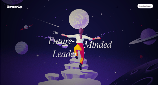
The BetterUp Future-Minded Leader Report uses non-traditional scrolling as an innovative web design strategy to drive engagement. We suggest you check it out; it's definitely worth the scroll. Credit: BetterUp
5. Gaussian Blur and Gradients
Neither of these design trends is new, but again, they're gaining in prominence as 2022 progresses. Gaussian blur is more of a targeted web design element in which a soft-focus swirl of color is used as a backdrop for a specific space to draw attention to content or a CTA. Check out what we did for RSI Reference Services for a quick example of how the blurred elements support the hero text and primary imagery:

An example of a gaussian blur effect.
In contrast, a gradient may cover the entire page. However, one thing to remember is that gradients should feature complementary color palettes. The goal is to create a pleasing experience that doesn’t feel disjointed or jarring. We leveraged this concept for a past client called QGenda, using a soothing gradient layered over supportive imagery:
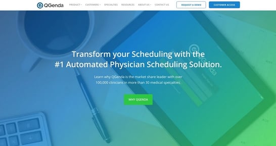
An example of a gradient effect. Client: QGenda
6. Cartoon Illustrations
Who doesn’t love cartoons? While good still-life pictures are pleasant, cartoons can add a bit of whimsy, humanize your brand, and infuse it with personality. Often, and especially when it comes to web design, illustrations can go hand in hand with animation and give people a reason to spend just a few more minutes on your website.
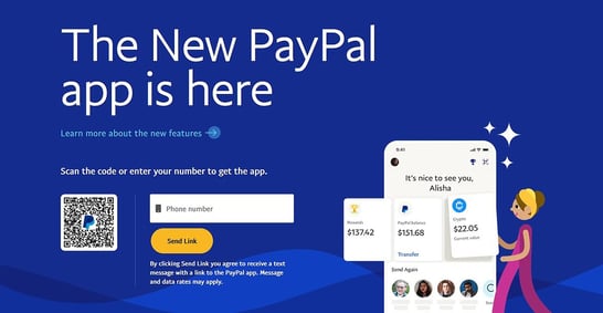
Credit: PayPal.com
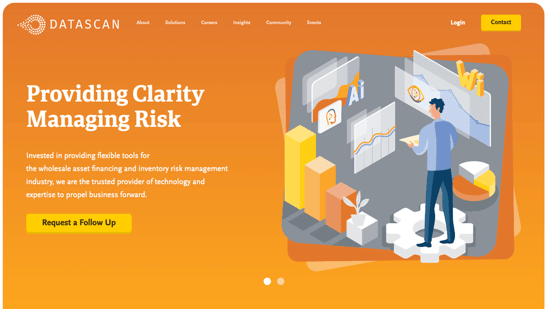 An example of cartoon illustration in web design. Client: DataScan
Check out how PayPal utilizes cartoon imagery on its homepage. At the time of this article, PayPal uses a simple cartoon illustration alongside its hero text and form fields. It's not over-the-top -- it's simply an eye-catching and visually distinct element that adds a bit of fun to an otherwise dry eCommerce service.
And there's another benefit here. If you leverage cartoon illustrations, you don’t have to rely on design-heavy elements to make your website impressive. Whether you choose static or dynamic interactions, both can create a positive response from visitors.
7. Geometric Design
It’s no secret that humans crave symmetry and order in design. Even though most websites aren’t completely symmetrical, an orderly layout is superior to something disjointed and chaotic.
In 2021, we saw more websites lean into geometric grids. Even if it’s not perfectly symmetrical, it creates structure—which people also crave. The goal is to create a design that’s orderly and helps guide visitors through a desired course of action or to make it easier to access information. Check out the web design we did for ContinuousHealth:
The ContinuousHealth website employs grid-like design on its website.
It's not a literal grid -- but information is organized in a grid-like fashion with clear tabs and organizational hierarchy. This client's UX had a clear order of operations, and we built their site to reflect that. Each step is laid out clearly with one item following the next, guiding viewers down the path and leaving no room for confusion.
8. Retro Fonts
Fonts can also create visual interest and help guide visitors where you want them to go. While you shouldn’t use highly stylized fonts for large blocks of content because they’re harder to read (and therefore, less accessible), they’re perfect for headers and areas where you want to denote new sections.
A popular theme we’ve seen this year is the resurgence of retro fonts. In particular, mid-century fonts are having a heyday as they do have a timeless quality to them. We like the website of wine purveyor Cirq, here:
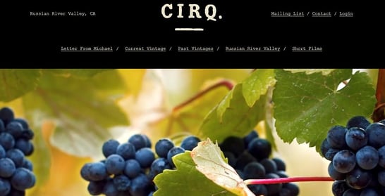
Cirq demonstrates the use of retro fonts. Credit: Cirq
Combining a minimalist web design with retro fonts, Cirq plays into the "vintage" nature of its brand and presents a clean, high-end design without excessive clutter. It's not ideal for every brand, but for certain industries -- such as wine -- it's a fantastic approach.
9. Parallax Scroll Animations
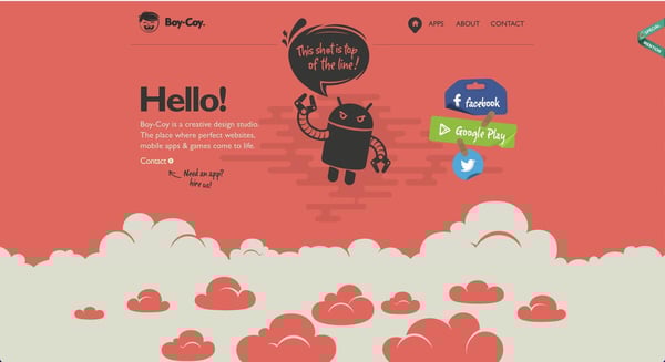 Boy Coy's website uses parallax scroll animation. Credit: Boy Coy
This is a trend that also isn’t new, but is a great way to create visual interest. Parallax scrolling makes background content on a website move at a slower speed than the foreground content. When done properly, it can be an interesting web design element that makes a website more engaging.
10. 3D Visuals That Create Interest
Thanks to incredible innovations in web design, you aren’t limited to flat 2D style images. 3D design can bring your website to life.
We’re highlighting an updated 3D format that integrates into your website without being obtrusive. In many cases, they play well with minimalist designs and add a critical pop of interest that’s aesthetically pleasing and doesn’t interrupt user flow. 3D designs can also play with color to help build out branding strategies.
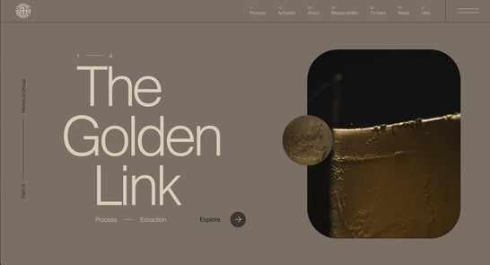 Credit: Argor Heraeus
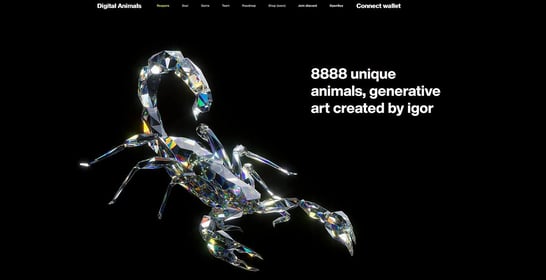
Credit: Digital Animals
Check out how Digital Animals utilizes this idea on their homepage. With a brutally-minimalist color scheme of black and white, and nearly no other on-site elements to distract, the creators use a rich 3D visualization to create a high-impact image that absolutely jumps off the page. This is a great approach for the art-centric nature of the brand, though companies of all kinds can leverage the same idea to create visual appeal.
11. Web Accessibility
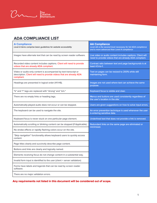
This one is not a "trend," but we can’t stress enough that accessibility matters and having an accessible website is more or less considered a mandate for many businesses and organizations. Aside from the fact that business owners have a responsibility to create accessible websites per the Americans with Disabilities Act, public pressure for accessibility continues to grow.
According to the CDC, a quarter of all American adults have some form of disability. That can be anything from a physical disability that makes using a computer difficult to color blindness.
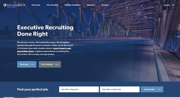 Lucas Group's website is ADA compliant. Client: Lucas Group
Ignoring this important demographic can leave businesses open to legal liability. As 2022 forces society to grapple with inequality and ensure equitable access for all, keep in mind that this conversation isn’t limited to physical, racial or gender disparities in physical spaces. It also includes confronting digital ableism. If a website refresh or new web design is part of your 2022 marketing plans, make sure you reference the Web Content Accessibility Guidelines (WCAG) to make sure your website is compliant. To make things a bit easier, here's a checklist for you:
Build a Website for the Future
Some web design trends come and go, but many of the popular options fueling conversations in 2022 incorporate a focus on efficiency and functionality. Whether this is the year that you make ADA compliance a priority or decide to declutter your overall layout, there are countless ways to give your website a modern approach, one that’s still functional and supports your business’s overarching goals.
No matter what your goals, The Creative Momentum knows how to help implement them into a cohesive website that’s effective and engages your target audience.