
For almost 15 years, the F pattern has dictated the world of digital marketing and web design. Designers and content creators have worked tirelessly to make their web pages conform to their visitors’ gaze. Now, in 2020, it’s time to rethink the F pattern. Is it still effective? Or have website visitors’ viewing habits changed over the years?
What Is the F Pattern?
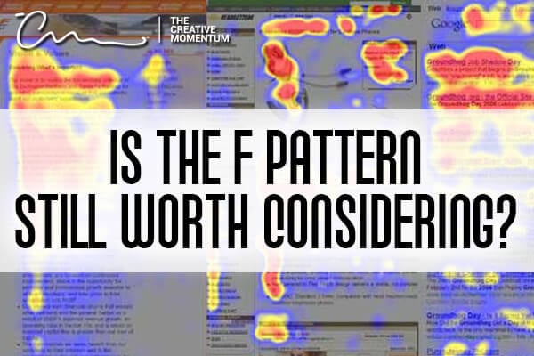
The F pattern was a discovery released in a 2006 study from NNGroup. Researchers used eye-tracking software to see where people focused their gaze when they looked at various websites.
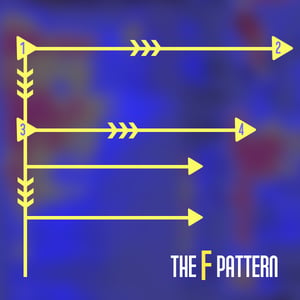
What they found was that people typically scan websites in an “F” shape. They start at the top and read horizontally. This forms the top line of the “F.” Then, they’d skip down a few lines and read another, shorter horizontal section. This is the second line in the “F.” After scanning the top two sections, readers tended to scan in a vertical line moving down the page, which finishes off the stem.
While the “F” wasn’t always clear cut, study participants followed a similar eye tracking pattern. They’d scan the top section left to right and then make their way down the page. Sometimes the heatmap would come out looking more like an “E” or an inverted “L,” but generally, this was the pattern seen by most participants.
Implications of the F Pattern in Web Design
The main takeaway from the F pattern study is that people don’t read all the content on a page. They don’t even read half! The average website visitor will read only about 28% of the words on your page—and even that’s generous.
Instead of exhaustive reading, website visitors scan for the most important information. After all, the internet is all about fast results; nobody has time to read every word on a web page.
Here are some of the lessons learned from the F pattern in Web Design:
- Put the most important content at the top. Most people scan the first two paragraphs, then skim through the rest of the content. Web designers should put the most important information at the top of the page. It’s the only place that has even a shot at a full read.
- Use subheadings and bulleted lists. The rest of the page should be filled with subheadings and bullet points: anything that can help the reader scan for important information. The easier it is to find info, the more likely someone will take the time to read it.
- Place important content on the left side. If you look at the shape of an “F,” nothing happens on the right. Even your subheading titles should be left-focused.
- Focus on the first two words of your subhead. People tend to read the first two words in a subheading much more often than the third, fourth, or fifth words, so make the first two words as pertinent as possible.
The F Pattern in 2020
A lot has changed since 2006. Websites are more intuitive and immersive, and the rise of mobile devices has changed almost everything about web design. Is the F pattern still relevant in today’s world?
NNGroup had the same question, so in 2017, they conducted another study.
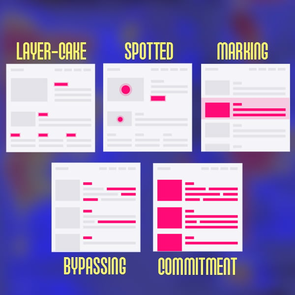
Without headings, pictures, or user interest, the F pattern still reigns supreme as the default scanning pattern. But this study also identified some other scanning patterns:
- Layer-cake pattern: when users scan subheadings and skip normal text. The eye tracking pattern looks like horizontal lines running down the page, like the layers of a cake.
- Spotted pattern: created when users try to pick out specific information from a page, typically a statistic, link, digit, or set of words with a specific format like an address. The pattern map looks like random dots scattered around the page.
- Marking pattern: the eye stays focused on one part of the screen while the page scrolls underneath. This pattern happens more frequently on mobile devices.
- Bypassing pattern: users skip the first few words of a line when several lines begin with the same word or phrase.
- Commitment pattern: when users read most of the words on a page. This usually happens only when people are highly interested in the content. While this is the best scanning pattern, it’s also the rarest. Don’t count on it.
 They also found that the choice of scanning pattern depends on four things:
- Their task
- Their previous assumptions about the brand, internet, or website
- The layout of the page
- The type of content on the page
As it turns out, the F pattern — although still alive and well in 2020 — is used only when website visitors don’t care about the content or if your webpage has a terrible, boring, unfriendly layout.
Consider the F Pattern in a Different Way
The F pattern is the worst eye-tracking pattern for both users and businesses. Users don’t get the information they need, and businesses can’t convey their message to the audience. It’s a lose-lose situation.
People use the F pattern for three reasons:
- The webpage has little to no formatting.
- The visitor wants to be efficient.
- The visitor isn’t really interested in the content.
When all these elements come together, website visitors go to their default scanning pattern — the good ol’ F pattern — and skip over all your lovely content.
The problem comes down to a fundamental disconnect in what the F pattern study actually meant. When the F pattern study was released in 2006, web designers incorrectly believed that if they organized their information in an “F” shape, they could give users the most important information on the page. Instead, they should have taken the F pattern as a precaution.
The major mistake was that web designers thought they should cater to the user when, really, it’s their job to guide the user to the most important information. Organize your webpages to draw users away from the F pattern and attract them to the information you want them to see.
With that in mind, is the F pattern still worth considering?
Absolutely -- but make sure you consider it with the above context in mind. If you know that this is a visitor’s default scanning pattern, use it to guide their eyes to more important information. Once you get them away from the F pattern, they might like what they see.
Website Design Takeaways from F Pattern and Eye Tracking Patterns
In the end, it’s up to you as a web designer and content creator to organize your information, format the webpages in an engaging manner, and create content your visitors actually want. Get them out of their bad F pattern habits and guide them to your content.
- Put important points in the first two paragraphs to get their attention.
- Use plenty of headings and subheadings.
- Make important content stand out with borders or alternate formatting.
- Bold the most important words and phrases.
- Use plenty of bulleted and numbered lists.
- Remove unnecessary content.
- Include other forms of content like pictures and videos.
