
 Your website’s primary goals are to provide information, interact with visitors, and, eventually, set them on the road to conversion. Of course, “conversion” can mean many different things: Providing an email address, downloading content, receiving a quote, or even purchasing a product outright.
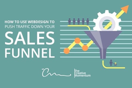
In the typical sales funnel, this process follows several steps:
- Strangers find your website via SEO, marketing, or personal recommendation.
- Upon arrival, they become prospects — visitors who are just browsing their options.
- When prospects take action on your website (conversion), they become leads.
- Leads are primed via email campaigns, content strategies, and so on until they’re ready to become full-fledged customers.
The third step is what we’re focusing on today. Let’s assume you’ve already built a healthy acquisition funnel for new prospects and have plenty of traffic to your website. How can you maximize the number of prospects who convert and decrease the length of your sales cycle?
Start With Page Efficiency
Let’s start with a quick word on the backend. Your website design isn’t just what visitors see — it’s what visitors experience. Sluggish websites, pages with broken elements, and busted 301/302 redirects are poison to the UX. Make page efficiency your first stop, because any further optimizations will fall flat without it.
Promote Your Value Propositions
We’ve discussed the visual hierarchy at length in previous posts and for good reason: it’s the best way to help visitors gain an intuitive understanding of what your page is about. And when you’re pushing visitors through a sales funnel, this understanding is crucial to conversion.
Look at Dropbox for a clear example of a well-structured visual hierarchy that serves purposefully. Most site visitors come to sign in, so that’s front and center. Those who are interested in learning more about the company are led through a clear value proposition in the hero image, followed by key features and benefits relevant to the target market, and finally more details on individual elements. It feels like it has a beginning, middle and CTA, and that’s crucial to leading a prospect on the intended path.
This advice sounds obvious until you see a website that gets it wrong. Make your value proposition clear if you want visitors to take action.
Leverage Micro-Conversions
Viewers will be put off if you slap them with a big sales pitch without priming them first. (Incidentally, this single lesson is why inbound marketing strategies are fast outpacing outbound tactics in overall ROI.) Rather than asking them to fill out their email addresses or personal details immediately, include a series of “micro-conversion” tools on your website:
- Pop-up windows that ask users to answer a few questions about their browsing experience
- Buttons or windows that encourage visitors to follow on social media
- Requesting that they enable “push notifications”—a small concession that can create plenty of new touchpoints
These tools hark back to the old “yes ladder” in traditional marketing psychology. If you can get your foot in the door with smaller concessions, they’ll be more responsive to your bigger requests.
Minimize Distractions
Distracting web design can plague any page on your website, but there’s nothing more frustrating than when these distractions influence users who have reached your landing page. As such, many businesses are removing links and navigation bars from their landing pages altogether to prevent the herd from straying.
HubSpot conducted extensive research on this topic and found that removing links substantially increased conversion rates across all stages of the marketing funnel.
Bringing It All Together
When all the wheels are turning, you end up with a marketing tool that helps, rather than impedes, the process:
- An unquestionably clear value proposition
- Request for website push notifications
- Pop-up window with a gentle CTA that doesn't request information, yet asks the user to participate
- Overall website layout free of clutter and distractions that draw users away from the primary goal
Remember, your website exists to engage visitors and encourage participation with your brand. Each of these strategies encourages this engagement and promotes a sales funnel with high potential for conversion.
