
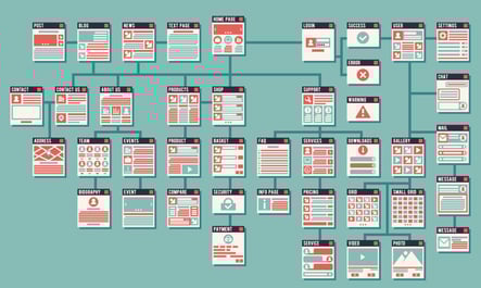
Designing the perfect website requires just as much science as artistic sense. Your website is one of the first steps you take in communicating with your customers. It tells about your company, about yourself, and your services.
If you are not getting the conversion rates that you want for your website, then ask yourself, ”Do I need to make changes to my site?” You can optimize your webpage’s layout by following a basic principle of web design known as visual hierarchy.
Add Visual Hierarchy Principles to Your Toolbox
We’ve previously mentioned the importance of a well-designed website and how a poor layout can be detrimental to your company’s business. Applying design concepts that are related to visual hierarchy is a great way to design a successful site that can attract customers. Here are some elements that can greatly improve your site:
1. Size
You want your most important objects to be big so that they grab the customer’s attention. This can be your logo, an image of the product itself, or anything that is essential to your brand image.
The point to remember with size is that importance should correlate with it. The more essential an element on your site is, the bigger it should be. Conversely, content with little importance should be significantly smaller.
2. Reading patterns
Forcing your readers to decipher a wall of text can overwhelm them and cause them to lose interest. Studies show that readers prefer text to be presented in F-shaped reading patterns, where it is broken up every two to three lines. Additionally, research has also shown that readers are more attentive to content on the left side of the screen.
3. Color choices
Even your color scheme can have an effect on capturing customers’ attention. Bright colors, black, and blue are all attention-grabbing. You want to use these types of colors in a place where you want customers to focus their attention, while using softer and more neutral tones in the background—or not at all.
4. Spacing and proximity
Another important element that is related to the website's layout is spacing. How close two or more objects are together influences the customer. Putting similar content close together is an excellent way to help your customers mentally draw an association between content.
Also, consider how much space on your web page you want to fill. Going the minimalist route could force you to leave out important content, while filling up all of the empty space will make your website look cluttered and overwhelm your customers. Keep in mind, a study has found that having empty space between paragraphs significantly increases your customer’s reading comprehension.
Creating Your Ideal Site
By implementing some of the principles of visual hierarchy into your web design, you can attract more customers and increase interest in your product. Experimenting with concepts like layout and color schemes not only showcase your creativity but can make your website more appealing to a wider audience.
Feel free to share in the comments section below what is working for you.
