
Just like speaking isn’t the only way to communicate with someone face-to-face, text isn’t the only way to communicate on your website. In real life, you can get communication cues through facial expressions and body language. On your website, users might not be able to read your body language, but they can certainly receive information from the visuals on your site.
Visual communication is an important part of website design. It can show changes in processes, emphasize the most important information, and draw users’ attention. Here’s how to harness visual web design to strengthen your website communication.
What Is Visual Communication?
Much like someone using hand gestures for emphasis while talking, visual web design will work with your website copy to give users important information.
Visual communication is when you relay information graphically, using elements like images, fonts, sizes, and patterns instead of words.
What does visual communication look like in action? For example, you probably read our definition above before reading the first paragraph. It's set apart from the surrounding text, italicized and your eyes were drawn to it. I communicated to you the importance of that sentence without typing out, “Hey, this sentence is really important, so pay attention!”
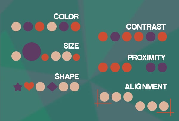
Visual communication comes in many shapes and sizes (quite literally!) Any way to draw a user's eye counts as visual web design:
- Position
- Color
- Size
- Shape
- Orientation
- Contrast
- Pattern
- Proximity
- Alignment
- And more
The list goes on and on. There are countless ways you can use visuals to portray information in your website design.
Why Should I Care about Using Visual Communication in Web Design?
It’s so easy to communicate through text, so why would you bother to work on visual communication? Because visual communication is more impactful.
- People remember 10% of what they read and 80% of what they see
- Humans process images 60,000 times faster than text
- Most people read about 25% of the words on a page, but 80% will watch a video
As it turns out, humans are just hardwired for visual communication. So incorporating visual communication in your website design is a great strategy for more effectively reaching your audience and optimizing your site. You can show them where to find the most important information, drive them to the next stage of the buyer’s journey, or help them understand your site’s content.
Visual communication also helps hold users’ attention. Giant walls of never-ending text are a quick way to drive users away. Visuals break up the text and give website users something different to look at.

Create a Visual Hierarchy
The most important part of visual communication is to create a visual hierarchy.
A visual hierarchy is the process of organizing the content on a page in order of importance and so users’ attention is drawn in a certain order.
A hierarchy communicates the most important parts of the page. So how do you create a visual hierarchy? Ask yourself three questions:
- What is the most important element on the page?
- What path do you want the users’ eye to travel?
- Where do you want users to end up?
Let’s consider the visual hierarchy of a landing page. The most important element on your landing page is the title. It tells users exactly what to expect on the page. From there, you probably want them to check out an infographic to get a bit more detail about your offerings. Finally, you want them to land and click on your call to action (CTA).
In this hierarchy, you’d make your title big and bold so users can’t possibly miss it. It’ll be the first thing they see when they click your site. The infographic should be smaller than the title but larger than the rest of the copy on the page. You can also use color to help it stand out. That way, they’ll see it second, before reading the rest of the content. Your CTA is the last thing you want users to read, so you put that toward the bottom of the page.
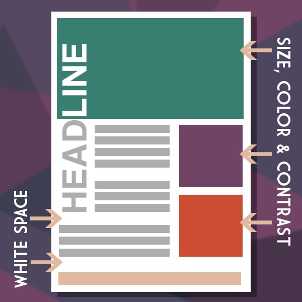
Three Different Ways to Create Visual Hierarchy
1. Size
The bigger something is, the faster it’ll grab someone’s attention. Make the most important information on your page larger than everything else, and it’ll be the first thing visitors see.
Size should correlate with importance. If something is super important, make it huge. If something really isn’t that important, make it much smaller than the rest of the content.
2. Color and Contrast
Color is another way to make website elements stand out. If most of your content is black and white, a red and yellow infographic will really shine. Use bright, bold colors to make elements stand out from the rest of the content.
If you really want to wow visitors with color, use contrast. A red visual on an orange background won’t stand out too much. But if you put that red visual on a white background, you’re definitely going to see it.
Use color sparingly. If you make your entire webpage too colorful, you lose the emphasis. Only use color on key elements that you want to emphasize.
3. Whitespace
Whitespace is just blank parts of your webpage. It’s used to separate elements and make them seem more important. For example:
This sentence seems really important because it’s surrounded by lots of space.
Separate elements with plenty of whitespace to make them stand out and show that they’re different from the rest of the content on the page. Here are a few examples of websites that effectively use whitespace to showcase important information.
Communicate with Website Visitors Using Visuals
There are many different types of visuals you can use to communicate with your website visitors. From bolding and italicizing fonts to creating bright images and buttons, use visual website design to command your visitors’ attention and tell them where to look next.
If you need help optimizing your website’s visual communications, contact the experts at The Creative Momentum to schedule a free consultation. Tell us about your project, and we’ll help you build a winning strategy to make the most of your online presence.