
“Hello darkness, my old friend
I’ve come to talk with you again…”
Thus spoke Paul Simon in the 1964 album “The Sound of Silence.” The haunting melody is one of angst; it’s an elegy of emptiness that paints a picture of a world where we can’t communicate with one another for our voices being drowned out by an immutable and pervasive silence.
That’s a little heavy. So let’s try to put it in web design terms.
In this case, the themes of silence Simon refers to must assuredly be your website’s whitespace: The negative zones of your page. These elements draw contrast between your on-site elements, and much like the heavy silences that can fall during conversations, they have a communication style all their own.
Let’s review a few examples of websites that got this concept right.
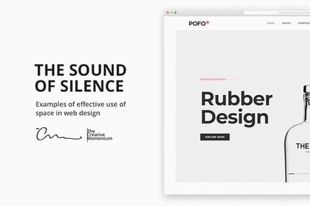
1. Apple
For our first example, who better to turn to than Apple? The computing company overcame contenders like Microsoft and HP in the personal computing market for one reason: Steve Jobs had an uncommon mastery of the power of design—and of white space.
Apple’s website is the perfect example of white space in action. The design is clean. It’s simple. It entices readers rather than assaulting them. Apple was successful because of its commitment to how the design of an object influenced the user experience—and its website design is no exception.
2. Dropbox
As of last year, Dropbox has updated its innocent, everyman brand image into something more corporate-cool. The company’s web layout is a great example. Look at the way they keep text minimal while utilizing stark blocks of color to create visual contrast.
Like Apple, there’s almost more negative space than actual content on the page. This projects a great level of efficiency and elegance, perfect for Dropbox’s newly honed brand image. Consider this a perfect example of how color and space act as tangible on-set elements.
3. Simpla
True to its name, the website for architecture consultants Simpla is about as simple as it gets.
The great thing about this site is that it practices what it preaches—simplicity in form and style. The company promises to help clients optimize and freshen up their interior design, and based on how their website is structured, they’re probably pretty good.
They use whitespace like pros, carefully nestling their web copy in simple text blocks while letting their high-impact imagery do most of the talking. It works, and we dig it.
4. Volta
Let’s get one thing straight—we’re not a fan of the messy parallax scrolling featured on the Volta Footwear website. But if you can look past that, it provides a good example of how white space can support image-heavy pages. As you scroll down, users are treated to a selection of products that appear across various points in the page’s whitespace.
There’s not much else to it, because there doesn’t need to be. The high-quality imagery is placed front and center, with ancillary site elements taking a back seat.
5. Simon.Works
The website of Simon Ammann is certainly worth a mention. The site is the ultimate in minimalism; for designers, by designers. With only a few key black lines of text to draw the eye, Mr. Ammann has taken design simplicity to a new level. While not every brand can get away with such a bare-bones approach, Simon Ammann makes the understated style work to his advantage by making users curious to click around and learn more.
Unlock the Sound (Design) of Silence
The communication themes present in Simon’s lyrics illustrate an idea that holds true over 50 years later: Silence itself is a type of communication. There’s never nothing going on; even in moments of quiet, our minds are always running, processing, taking in information. Such as it is in web design.
Your website’s whitespace gives your viewers just as much information as your web copy, images, and CTAs.
Learn how to use it, and use it well.
