A key component of successful inbound marketing campaigns is a rock-solid landing page, designed to convert the anonymous onlooker into a qualified sales prospect. How well you design and incorporate landing pages into your campaigns plays a large impact on your campaign success.
The purpose of a landing page is to capture qualified leads that you want to sell to in the future. When you receive a lead’s email address in exchange for a piece of content, they’re giving you their permission to be marketed to again in the future. Once you have their email address, you can enroll the lead into an email nurturing campaign to be ‘warmed’ until they’re ready to purchase.
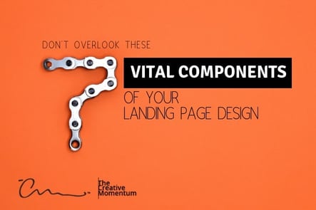
Landing pages are different to regular web pages in a few unique ways. While a standard web page contains a ton information and links for potential customers, a landing page has a highly-targeted message and a single call-to-action. Its purpose is to convert visitors into leads. Here are 7 of the defining characteristics of a well-designed landing page
Attention-Grabbing Headline
To borrow a quote from the Father of Advertising, David Ogilvy, “On the average, five times as many people read the headline as read the body copy.” Ogilvy, knew that headlines were the most important element of his advertising copy, and the same copywriting principles still apply to digital ads and landing pages today. If you have an unengaging headline, people won't read on.
You have only a fraction of a second to convey what your offer entails and why the user will benefit. Forget about getting them to fill out the form, if you want the user to stay around long enough to read your body copy, you need to use simple, engaging language in the headline to hook their attention.
And make sure your headline matches the messaging presented on the ad that was clicked to reach the page. People hate “clickbait” and if they reach your landing page only to find that your offer isn’t what they intended, they’ll exit immediately -- wasting valuable ad spend. All it leaves you with is a high bounce rate and low conversions.
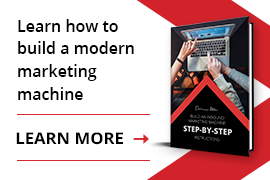
Visually Engaging Image or Video
Humans are visual creatures. We respond to and process visual data better than any other type of data. The old adage “a picture is worth a 1000 words” is especially sage advice when it comes to landing page design. Images can be used to set the tone for your brand and convey much more to the viewer than the headline and copy alone.
And video outperforms images. In fact, the average user’s visit to a text and image-based page lasts only 43 seconds; for a website with video, the average visit lasts 5 minutes and 50 seconds (that’s 88% more engagement).
Just remember, as with your messaging, if the ad used to attract the user incorporated graphics or multimedia, be sure to match that on your landing page as well.
Subheading
Sometimes, the headline alone can’t get across the value of your offer. And that’s ok - it’s supposed to be concise afterall. Subheads can be used to provide additional information or highlight supporting statements you want the user to consider. Think of it as your second chance to persuade the user to convert.
List of Customer Benefits
Don’t talk about product features in your landing page copy - - that puts too much focus on you! Use the copy instead to build the reader’s interest by telling them how they’ll benefit from your product or service.
If they reached your landing page you know they’re already interested in your product or service, so now’s the time to wow them with an offer they can’t refuse. Speak to their pain points, using language they would use. Knowing your buyer persona is key here.
Use formatting like bolding, italics, and bullet points to break up heavy blocks of text and draw the user’s attention to the most pertinent information. Also, consider using trust-building elements like customer quotes, video testimonials, or other forms of “social proof” to help encourage conversions.
Compelling Call-to-Action
While CTA copy and design are worthy of their own blog posts, here are some of the most widely agreed truths when it comes to landing page CTAs:
-
Your landing page should contain a single call to action. The last thing you want is to confuse the visitor with competing actions, so keep it simple and give them one option.
- Remove traditional website navigation so you limit distractions and opportunities to click on anything other than your CTA.
- Know where your visitor fits into the buyer’s journey and align the CTA to their buying stage. A complete stranger is unlikely to “Buy Today”, but they make feel perfectly comfortable with a “Free Trial” or “Schedule My Demo” option.
- While contrasting colors will make your CTA button pop off the page, you need to consider the impact certain colors will have on conversions.
- Your CTA button should contain action-oriented copy and create a sense of urgency (for example, “Download Now” or “Start Today”.) Also, consider how much more personal it feels adding pronouns like “My” or “Your” to the CTA copy (for example, “Claim Your Spot” or “Schedule My Demo”).
- Size matters! Make sure that your CTA can easily be clicked on a mobile device and ensure you’ve got enough white space around it so it doesn’t get lost on the page.
- Location, location, location. People won’t convert if they can’t find your CTA. Put it above the fold, but keep in mind that you have to pack a lot of information in that same space so be careful not to overwhelm your visitor. The one exception to the ‘above the fold rule’ is in highly complex products or markets where the prospect has a lot of information to digest. In those situations, it can make sense to put the CTA lower down the page.
- Use visual cues to draw the reader’s eye where you want it to go. Graphics like arrows, hands or fingers pointing, and animation are all great ways to do this. You can also use a more subtle approach by the incorporating the line of sight of people featured in your images.
Optimized Layout
Users don’t read web pages, they scan. Most western readers will scan your page the same way that they would read a book — top to bottom, left to right.
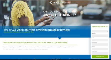
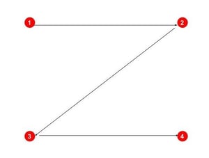 Building landing pages in a Z-layout helps to create a visual hierarchy that users are more likely to follow. This leads to more conversions because you’re in control of where the user’s eyes go. Using the Z-layout, the top horizontal line should include the first thing you want viewers to focus on - your headline and subhead. The diagonal line should lead them through the list of customer benefits; building up to the grand finale - the call-to-action at the end of the bottom horizontal line.
The Perfect Lead Capture Form
Your form should be equal in length to the perceived value of the content you’re offering. If you’re offering a checklist or cheat sheet, you can’t go asking 20 questions. The length of your form should also take into consideration the buying stage. For top of the funnel leads, ask for the bare minimum information that you need to start a relationship with a prospect. As a general rule of thumb, the closer you are to the bottom of the funnel, the more questions you’re allowed to ask.
Just as with your landing page copy, use white space to make the form easier to read and mobile friendly. Provide the user options like radio buttons or drop-downs to cut down on typing.
If you have the capability, make your forms smart -- there’s nothing more annoying that providing a company that you deal with regularly the same information over and over. If you already have their name and email address, use your form to capture more qualifying questions instead. For example, you could ask, “What’s the size of your business?” “What’s your job role?” or “How close are you to purchase?”.
Never Stop Testing
To end with another gem from Ogilvy, “Never stop testing, and your [landing pages] will never stop improving.” Even using the elements common to the most well-designed landing pages, there’s always room for improvement. Take one component at a time and A/B test to see which performs or converts the best. And if you’re using the landing page as part of a long-running campaign make sure to test it on a regular basis.