
The words “contentious” or “controversial” used in the same breath with “web design trends” might seem a little weird—unless you’re heavily entrenched in the world of graphic and web design. But just like any other industry, web design isn’t immune to trends. Some trends are so enduring that they become timeless principles, like using legible fonts or ensuring that your color palette isn’t too intense for viewers’ eyes.
Keep reading to learn about six controversial web design trends and why they continue to stir debate.
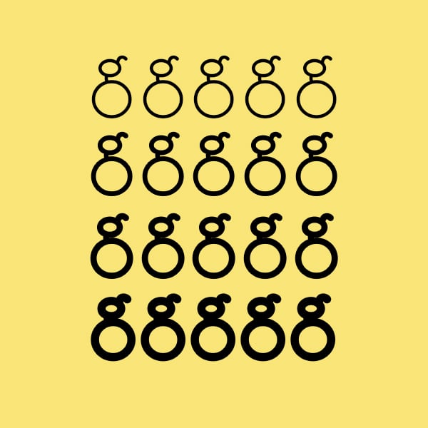
1. Variable Fonts to Create Visual Interest
A basic tenet of web design is to create a website with content that’s legible, easy to read, and doesn’t distract from your message. A standard belief is that while headers, titles, or even navigation menus might rely on a different typeface to signify a different section, your body text should be consistent and in a font that translates across browsers.
But in some cases, variable fonts toss that key principle out the window and throw multiple font styles together in one block. In some extreme cases, the font in one block can not only vary in style but size and color.
This can be good because it creates visual interest as the breakout font draws the eyes in. Humans prefer symmetry and order. So, anything that disturbs that natural inclination causes us to take notice.
An occasional bold or color-change design element is a great way to make key passages or words stand out, but excessive use of this design element is distracting. Remember, people like symmetry and order. So, employing too many fonts in a paragraph is about as enjoyable as reading an article written in all capital letters.
How to make variable fonts work in web design:
- Headers and titles are great places to create differentiation with font styles
- Occasional words in bold or a different color help create emphasis
- Avoid getting carried away with multiple fonts and style changes in one content block.
2. Using Videos and Auto-Play within your Website.
This is a contentious one, and we understand both sides of this debate. Video content on websites has been around for more than a decade. But there’s an argument regarding whether content should auto-play or should be activated by the users. If you do opt for auto-play video content, is there a time limit, or can you force users to watch longer videos that are more than a few seconds?
Video has the benefit of being more interactive, it encourages people to stick around on your site, and it can highlight key selling points or calls to action (CTA) faster than written content can.
On the flip side, long videos can ruin site performance if they don’t load quickly. In some cases, the video files are so large that they render other actionable spaces on the page unusable. Not to mention, videos that are coded to automatically play with audio can be incredibly annoying if your visitor is already playing music or other audio in the background.
How to make videos work in web design:
- Keep video lengths to a maximum of 10 seconds
- Ensure that file sizes are small so you won’t sacrifice page load speed
- Code videos to play with sound muted if you insist on auto-playing them once a page loads
- Don’t forget that it needs to be adaptive to all screen sizes.
- Follow these best practices for adding video to your website.

3. Mobile Animation
Anything that gives your website a fresh design can be a great option. Mobile animation is specific to users on mobile devices and helps to make a site look interactive and fresh. And when implemented well, it can make users stay on your site longer.
However, animation can add to load speeds and in some cases cause other clickable elements to freeze. At the end of the day, a site that fails to load or has clickable elements that don’t work ceases to be useful.
How to make mobile animation work in web design:
- Remember not to sacrifice load speed for a slick animation.
4. Vibrant Colors
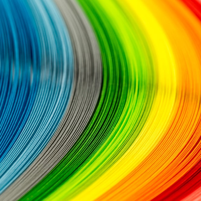
This is another contentious topic depending on how this design trend is implemented. Vibrant colors are bold and serve as the backdrop for accent colors. Depending on the design layout, vibrant colors can either create a sense of calm and keep users on a site, or they can hurt their eyes and send them searching for the close button.
When done properly with strategic placement, a bold color can make key content pop against the overall design. The content is still legible, and you’re not hurting users’ eyes. But when you go overboard and pull every color from the Pantone book for your website, it’s chaotic to view, is disorienting for the eyes, and is uncomfortable to read.
How to make vibrant colors work in web design
- Less is more — pick one or two bold hues and contrast them with subtle shades to give eyes a break
- Keep content legible by picking neutral backdrop shades that are less intense
5. Overdesign
Web designers love to showcase their creative abilities. For art-driven sites, this can work to your benefit. The user who visits a website known for design expects to encounter the unexpected, but the same expectation doesn't apply for an online newspaper, and would be overwhelming.
When design teams get carried away, it can backfire and create a complicated website with competing elements. In some cases, this may cause your site to load slowly because the content is too heavy. But most often, it creates a disjointed, chaotic viewing experience.
How to create the right design for your website:
- Less is more. It’s not necessary to employ every website element you’ve ever admired. Pare down to one or two elements and let your content speak for you.
- Design with your end-user in mind — not your designer.
6. Artificial Intelligence

For better or worse, artificial intelligence (AI) is here to stay. And as more websites opt to integrate responsive chat options, there’s no avoiding it. A common concern is that AI never chats the same way humans do, but that’s not the only issue. Your ability to hand off an AI chat to a real person is going to matter. For simple needs like requesting tracking information for an order or submitting a basic return request, most AI chats are quite capable. But if you try to pass off your AI chat as a real person, and your users realize they’re talking with a bot, you can lose credibility.
How to make AI work in web design:
- Make it clear that the initial chat experience is an AI assistant
- Aim for conversational dialogue
- Include options to send an email to a live agent or clarify that after answering a few questions, the bot will route users to a live agent.
Things to Remember
Even though we’ve listed some design trends that have sparked debate, we’re not insisting that they can’t be incorporated into your website design. Instead, we recommend that if one of these elements sparks your interest, use it sparingly. All of the trends we discussed can build visual interest, draw users in, and create a memorable browsing experience that sets your brand apart from the competition.
But if you’re in doubt about how to implement these elements, let the team at The Creative Momentum incorporate a balanced approach to create a design that you’ll love.