
If you’re thinking about building or updating an existing website, hopefully someone has reminded you of the importance of having a mobile-friendly site. Maybe you've heard the terms "mobile design" and "responsive design" and want to know the difference between the two.
Well, unless you're a web developer, you probably don't know. Mobile design and responsive design tackle somewhat similar concerns, but aren't interchangeable. So, we're addressing these questions in this article to help you determine what's right for you and your website:
-
What are the differences between mobile design and responsive design?
-
Is one better than the other?
Keep reading to find these answers and more.
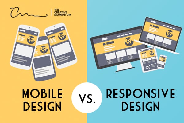
What Is Mobile Design?
Considering that more people are accessing the internet through mobile devices, the question is not, “Does my website need a mobile-friendly version?” but, rather, “Which mobile-friendly design is best for my site?”
Mobile design simply means that you’ve created a version of your website specifically for mobile devices.
Your users will have a different experience on their desktop computer than they do on their smartphone or tablet. Mobile design is typically created first for the desktop, then adjusted with an alternate version that’s compatible with smart devices.
What Is Responsive Design?
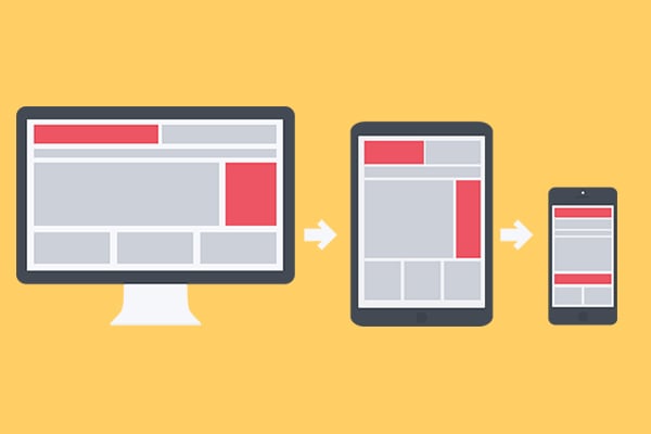
Here’s where the core difference lies between responsive and mobile designs: Responsive design means that your website’s backend is automatically configured to check for device specifications in advance, and then it adjusts the website for optimal results.
Responsive design relies on cascading style sheets (CSS) to determine the proper layout to serve a visitor. Your backend automatically scales your design so that the pages adjust for a desktop screen or a smartphone screen.
With this definition, we’re not talking about a website that’s designed to be a mirror of the desktop version. Depending on the device used to access a website, the appearance may be altered to accommodate the screen size and available functionality, such as thumb-typing/browsing, as opposed to traditional desktop keyboard input methods.
How Are Mobile Design and Responsive Design Different?
The technical definitions above can still feel murky if you’re not immersed in web design. The general idea is that mobile design doesn’t change based on the device being used. In contrast, responsive design will alter itself for an adaptive experience.
Limitations of Mobile Design
Visitors to mobile design websites will notice that the page will look optimized for mobile devices — even if you visit from a desktop. This is because the URL is specifically pointing to a mobile version of each page. You’ll also find that a mobile design website is often stripped down in terms of functionality. Navigation may be limited, and additional elements may be removed to streamline the site.
This can translate to an inferior experience for your end-users. Anyone who’s ever visited a "mobile version" of a website after having viewed the full desktop version knows that sometimes “mobile-friendly” isn’t very friendly at all.
More site owners understand the benefits of responsive design and have implemented it. If your website doesn’t have it, yours will stand out as clunky and limited. If your visitors have a negative experience on your mobile site, they will likely bounce and either vow to return to the desktop site later or more likely, never return.
Limitations of Responsive Design
Although there’s a lot to love about responsive design, it’s not a cure-all for your digital strategies. Likewise, implementing this web development strategy won’t automatically result in better conversions, more traffic, and other end-goals.
As a business owner, your priority should be to meet the needs of your target audience. If you’re building a responsive website because you know that the majority of your traffic arrives through mobile devices, then you must understand where they spend the most time, how they navigate through your website, and what motivates them to visit specific pages.
If you don’t master “user intent,” it doesn’t matter how slick, adaptive, or functional your website is — you won’t get the results you want. And the same warning can be made for mobile design and any other web development strategy.
Is One Better Than the Other?
While there’s an argument to be made for a classic mobile design website, the reality is that responsive design is becoming the standard. Keep in mind that regardless of which option you select, Google ranks mobile sites higher than desktop versions in their SEO rankings. To support your decision, you should consider the following questions:
- What is my website’s purpose?
- What action or behavior do I want users to take on my website?
- How are customers reaching my website?
Why Responsive Design Is Preferable to Mobile Design

One of the biggest drawbacks of mobile design is that no matter how a visitor reaches your site, the page remains the same. So, while the streamlined layout might make more sense on a mobile device, if a desktop user stumbles on that same URL, the functionality and appearance won’t be compatible with a desktop experience. Here are three reasons responsive design wins out over mobile design:
- Responsive design user experience tends to be better. A coherent experience across devices is the best way to foster trust and a sense of reliability.
- Responsive design ensures that you don’t need to strip your desktop website down to a skeletal version just to be compatible with mobile devices. CSS allows your site to natively adjust to fit varying screens and interactivity limitations. As far as the user is concerned, the experience is the same across all devices.
- Perhaps most importantly, using responsive design means you don’t need to create multiple versions of your website. Instead, one flexible template intuitively manages display schematics and streamlines user experiences.
Agile Web Design for a Mobile World

Mobile traffic has outpaced desktop traffic for years now, and that trend shows no sign of changing.
This means consumers rely on mobile devices to manage everything: booking appointments, shopping, and casual browsing. Business owners looking to create a website optimized for mobile should opt for responsive web design because it creates a seamless user experience while streamlining your backend and SEO.
Need help? Our award-winning web design team is well-versed in adaptive and responsive web design and ready to bring your visual concepts to life.
