
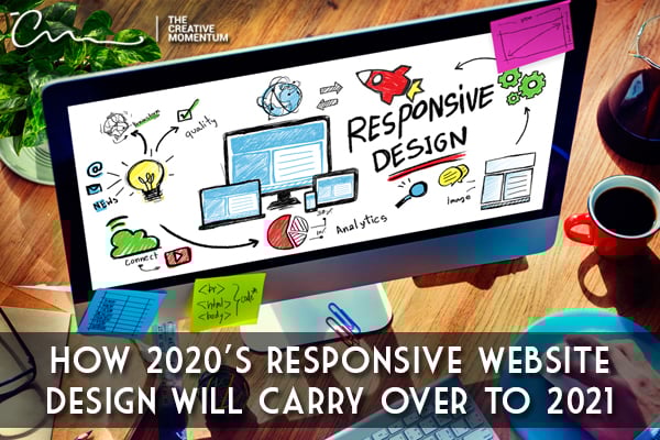
Website design has come a long way since the early days of the internet. Simply having a website was a feat once upon a time, but these days, responsive website design is required to compete in the digital space.
A responsive website is essential because the majority of users access websites using mobile devices like smartphones and tablets. We're answering the question, "what does responsive design mean," and providing important responsive website design elements from 2020 to continue to follow in 2021.
Responsive Website Design Explained
Responsive website design means that the user experience is seamless between mobile and desktop versions of a website.
In short, “responsive website design” means that your website looks consistent on a variety of screen sizes whether it’s a desktop, laptop, tablet, or smartphone screen.
While the overall layout might adjust slightly so that content is formatted in an organized manner, your mobile website shouldn’t look much different than the original desktop version.
Responsive Website Design Is Not Adaptive Design
It might sound like semantics, but responsive website design isn’t the same as adaptive design. While responsive design adjusts a single page to fit various screen sizes, adaptive design creates multiple templates to accommodate for every potential device screen size.
The main difference is the method used to display content. While responsive design relies on CSS code, adaptive design launches a script that automatically checks for screen size before accessing the appropriate template for a device.
Why Responsive Website Design is Important
Mobile search and browsing continues to outpace desktop access worldwide, so having a site that can accommodate various devices and their screen sizes is necessary to ensure users can access your site's content. Forcing mobile users to navigate a multi-column website designed for the desktop is a recipe for disaster that leads to poor user experience, quick abandonment and a high bounce-rate.
In addition, with Google giving weighted priority to mobile-friendly sites over desktop versions, refusing to embrace a responsive website design plan can backfire, reduce your rank in search results, and lead to lower visibility.
7 Responsive Website Design Trends to Follow in 2021
A responsive site is critical, and a website that successfully converts is also critical. Your goal is to create a website that’s presentable, easy to navigate, and user-friendly. With that in mind, these trends were strong in 2020 and are on track to remain important in 2021.
1. Pare Down the Website Content
If you’ve ever visited your favorite news website both on a desktop and a browser, you’re most likely aware that the experience is different. While the desktop version might feature multiple columns and stacked headers, the mobile version tends to be cleaner. And there’s a reason for this: You have less screen real estate on mobile devices, so the most essential content needs to be at the top of the screen.
Remember, mobile users don’t want to scroll horizontally, so you need to streamline the most important aspects of your site for a single-column experience.
2. Prioritize the Call-to-Action (CTA)
Whether on a desktop or a mobile device, your CTA should be highly visible and easy to find. On desktops, you can place CTA buttons in various locations, like directly on a page or the navigation bar. When possible, try to keep those CTA buttons above the fold, even on mobile displays. But navigation menus are often shortened on mobile devices, meaning that a CTA button could be on the chopping block.
Work around this issue by placing CTA buttons in multiple places when thinking about mobile renditions of your site.
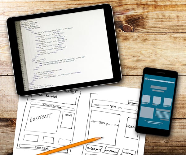
3. Use Scalable Vector Graphics and Optimized Images
Responsive design schemes call for agile graphics. Scalable Vector Graphics (SVG) are essential because they can automatically adjust to screen size constraints without the risk of pixelation.
In contrast, more traditional image files like JPG and PNG aren’t scalable without sacrificing quality. Another bonus with SVGs is that they’re smaller files that load quicker. Along those same lines, make sure to include web-res versions of images to ensures that your mobile pages aren't bogged down when they try to load files.
4. Make Links Finger-Friendly
Keep in mind that most people use tablets and smartphones with their fingers, not a mouse. So buttons and other interactive areas on a page, like text links or clickable areas, need to be large enough that a person can tap them with accuracy.
Most developers recommend keeping clickable elements to a minimum of at least 48 pixels in height. But this can be difficult for in-line links such as in articles or blog posts.
5. Font Matters

A site that’s hard to read is a recipe for page abandonment. While some typefaces might look great on desktops, they don’t always translate well to mobile devices.
Along with actual font faces, you want to think about the sizes of headings versus body sizes. You want the content to be legible but not so large that it feels exaggerated. Keep in mind that picking a font that’s too big can lead to excessive scrolling whereas a font that’s too small is hard on the eyes.
6. Leverage Mobile Functionality
Most modern smartphones and tablets automatically dial linked telephone numbers or open an email compose screen with the “to” recipient auto-filled when an email address is tapped. Likewise, social buttons can be coded to open in the app if they’re installed on a device.
Take advantage of these opportunities to provide a seamless, intuitive experience that’s user friendly. Doing so keeps mobile users in a comfortable digital environment that doesn’t require extra effort on their part to interact with your website.
7. Don’t Forget to Be User Friendly
While you’re creating a streamlined mobile browsing experience, don’t forget about the backend and structural concerns. Sites that load slowly and clickable elements that freeze or randomly shift after the page loads are problematic.
Not only will Google’s upcoming Page Experience algorithm punish you for these errors, but you’ll lose trust with potential customers. No one wants to click on an ad because the page shifted or buy a product because the submit button moved.
Mobile-First Design for 2021
Your website needs to meet your audience where they are, regardless of device.
Our final tip: if you take a mobile-first approach to web design, you can solve many of the headaches that desktop websites present in mobile environments.
The Creative Momentum is well versed in creating responsive website designs for a seamless experience, so if you need some help, please use the button below to get in touch.
