
Conversions are crucial key performance indicators (KPIs) for marketing and web design departments. The more conversions you have, the more you can assume that your design tactics are effective.
Some ideas, while well-intentioned, may not be data-driven or actionable. This, in turn, forces web designers and developers to implement website elements that may be doing more harm than good. Sometimes jumping on a design trend bandwagon isn't the best idea.
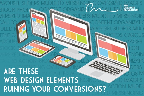
It’s important to understand how different web design elements impact the conversion funnel for your website. Keep reading to find out if these web design elements are hurting your conversions.
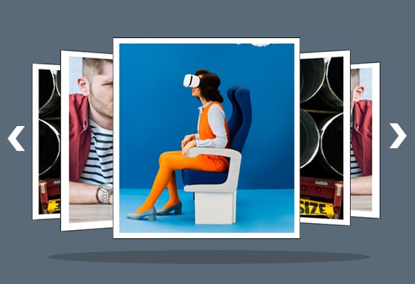
Carousel Sliders
Carousel sliders became so popular over the last decade that almost every B2B or B2C website featured one. They look nice and give designers more real estate to work with.
Unfortunately, carousel sliders rarely convert.
A study conducted by Harrison Jones and Search Engine Land showed that carousel sliders had less than a 1% click-through rate.
The consensus is that carousel sliders offer too much too quickly, and there’s no central focus above the fold.
Conversion solution: Use static design and narrow your focus to one or two elements. You'll get higher conversion rates using static pages and focused marketing messages than you ever will with carousels.
Stock Photos
Stock photos are a great way to help populate website content areas. In fact, content with relevant images is 94% more likely to be viewed than content without, but customers are quick to notice those that don’t fit.
Stock photos are hit or miss as far as conversions go. What you need to watch out for is disingenuous stock photography that alienates your customers and hurts your credibility. Stock photos come in all shapes, so be sure to choose photos that align with your brand message and aesthetic.
Conversion solution: Either spend more time choosing appropriate stock photos or hire a professional photographer to take content-specific photos for you.
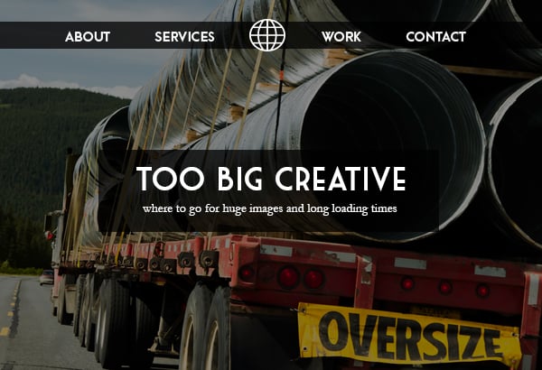
Oversized Images
Full-page and oversized images, much like corporate stock photos and carousel sliders, are a popular homepage design trend.
Pixel-perfect, large format images look great and sell your branding in a way that smaller, less-impactful images cannot. Full-sized, high-resolution images can drastically impact your conversion rates.
The danger in using oversized images lies within their load times. Big images take longer to load, plain and simple. The longer it takes for your images to load, the quicker visitors will abandon your site.
In fact, a mobile page speed benchmark report from Google shows that as load speeds increase from 1 second to 10 seconds, bounce rates also increase—by 123%.
Conversion solution: Even a simple image compression pass through your website content works wonders for page load speeds. Compress your images and replace extra large images with smaller, leaner ones.
Equally Weighted CTAs
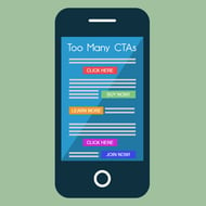
It’s tempting to sprinkle calls to action throughout your website content. The thinking is that the more CTAs you have, the more chances your visitors will have to convert.
The truth is that more CTAs means more clutter, and this leads to confusion.
The more choices users have, the less likely they are to actually make one. Psychologist Barry Schwartz calls this The Paradox of Choice. With too many choices, a person might not make one at all. It sounds counterintuitive, but it’s true.
No CTA stands out on the page if you have multiple CTAs that are equally weighted.
Conversion solution: Either focus your design efforts into one attractive, intuitive call to action or (if you absolutely have to have multiple CTAs) be sure to place more emphasis on some CTAs over others.
Muddled Messaging and Content Organization
It’s Marketing 101, but consistent messaging and company branding can make or break your website conversions. You lose potential customers the more muddled your messaging is, so it’s important to be as consistent with your brand messaging as possible.
The same is true for your content organization. We’ve all seen websites that have no clear aesthetic direction or organizational hierarchy. They’re a mess, and it’s nearly impossible to find what you’re looking for.
Conversion solution: Take the time, before launching your website, to formulate a solid messaging strategy. What goes where and why? The more thought you put into the process, the easier it will be to funnel visitors through to conversion.
Convert with Your Web Design
These few low-conversion culprits only scratch the surface of the “what and why” behind your web design. If you're using them, don't worry! Try using the conversion solutions provided above or ask yourself if your design might benefit from more effective tactics.
Sometimes, a professional web design company is just what you need to get back on track.
There is no one-size-fits-all web design solution to guarantee conversions, but use our guidance here to hedge your bets. And if you'd like to some help, get in touch with us by using the button below.