
No one builds a website so that it can metaphorically collect dust on the internet. Especially for businesses, a website is more important than a business card. As we've said before before, business websites may be the most important marketing asset they possess, and may also be the first point of contact a consumer has with your brand.
How your website functions, or how easily it can be navigated impacts how likely your digital visitors engage with you — whether its an inquiry, making a purchase, or booking a service. Learning to incorporate web design tactics that are proven to drive user engagement is the best way to ensure you’re creating a website that’s supporting your overall business goals.
1. Optimize Your Site for Google’s Page User Experience Update
“Functionality” can mean a lot of things, but when used to explain Google’s most recent algorithm, Page Experience, it means that your website (including visual elements) loads quickly, doesn’t contain miscellaneous elements that mysteriously refresh your page (annoying visitors along the way), and is mobile-friendly which improves the user experience.
Beyond the fear of being punished in Google’s search rankings, research has proven that no one wants to visit a slow-loading website. In other words, if you’re experiencing high bounce rates, review your load speeds. If it's slow, consider removing unused code from the page, pairing back on design elements or incorporating web development tricks like lazy loading which allows images to only partially load until they become visible on the screen.
The good news? Google's Page Experience tab in Google Search Console will provide you with reasons why certain pages don't have a good page user experience, similar pages with the same issue, and potential ways to fix them.
2. Make “Above the Fold” Content Count
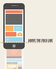
“Above the fold” is one of those phrases that’s a carry-over from the print world. It essentially refers to the part of a newspaper that you can see when it’s folded and facing up — and usually references the front page. In the digital world, above the fold refers to the visible portion of your page (usually the landing or home page) that loads when a user first comes to your website.
There’s some contention over whether the phrase is still relevant considering that varying device screen sizes can alter what’s visible before a person begins scrolling. But, what’s not up for debate is the research that shows a higher drop-off rate as soon as people begin to scroll. According to Nielsen Norman Group, their 2018 study respondents reported that they spent 57% of their time on a page viewing content that was above the fold with a sharp drop off below the fold, indicating a decrease in user experience.
This means that when people land on your website, whatever is visible within the initial field of view needs to be compelling, and straight to the point. This doesn’t mean that you should crowd every bit of screen pixels with text or flashy animations.
3. Less Is More
Have you ever had to make a decision, but were forced to choose between a massive selection of options? Did it feel like a no-brainer or were you so stumped that you didn’t even want to make a choice? If you experienced the latter rather than the former, congratulations because you just experienced the phenomenon known as Hick’s Law.
Hick’s Law is a psychology principle that carries over into marketing and sales. It simply notes that when you provide too many options to an individual, they’ll either take longer to make a decision or concede no choice instead - a big factor when it comes to user experience !
This doesn’t mean that if you’re a consumer goods brand that offers a wide range of products, you should run out and slash your catalog down to a handful of options (ahem...Amazon?) But this does mean that when presenting your content to consumers, don’t throw everything at them right away. Strategize your navigation menu or user flow in a way that feels natural and makes sense.
Maybe instead of showcasing all 30 t-shirts and 50 pants on your landing page, you show one picture of a shirt labeled “shirts” and one pair of pants also labeled “pants” — with both options navigating to their corresponding category pages.
A simple choice allows for faster action by your web visitors. And once they get to the general category pages, offer filters to help them browse by color, fit, price, or even size.
4. Function Over Form
It’s easy to fall down the web design rabbit hole and start tossing cool elements onto your website because you saw them elsewhere and want to see how it looks. But if it’s not supporting the user flow, it might be a good idea to stick with the basics (this is an essential part of building the user experience aka UX).
Unless your brand is known for funky design or out-of-the-box thinking, you can encourage page abandonment or waste resources by incorporating features that — while cool — don’t support your core goals or make navigating your website more difficult (see Google Page Experience above).
For example, a study from Notre Dame University showed that while media carousels are a cool feature that people enjoy, they didn’t necessarily improve conversions. Specifically, the drop-off rate was dramatic after the first slide in a carousel. While the first slide received roughly 90% of the clicks, the following slides were virtually ignored.
5. Incorporate Social Currency
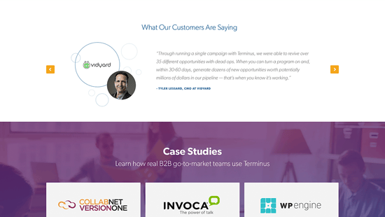
Like it or not, social media and online reviews aren’t going anywhere for the foreseeable future. Especially if you’re just starting out with a website or building a social following, you need to prove to your target audience that other consumers like them think that your business is reputable.
Formally known as conformity bias but casually referred to as social proof, the concept refers to a willingness to try something new when others have already approved of it. In the modern era, this goes beyond a friend or relative endorsing a product and points to how popular your brand is in the digital world.
Take advantage of this known phenomenon by collecting and incorporating testimonials, reviews, or creating a strong, accessible social media following to signal to potential shoppers that your business is active and trustworthy.
6. Use Asymmetry to Your Advantage
A common tenet of web design is that symmetry = good. It creates order, balance, and structure on the page. While this is true, you can spin the idea to your benefit with strategic use of asymmetrical site elements.
As a psychological principle, viewers crave structure in the sites they view. We expect to see conventional site elements organized in a certain fashion. So, when a certain element -- such as a CTA or lead magnet offer -- disrupts this flow, it naturally catches our attention. Use this to your advantage when placing offers across your pages. Symmetrical design is good practice, but breaking the rule as a deliberate design tactic can also yield results and impact user engagement and user experience .
Leveraging Science to Build Your Brand
Use these core behavioral principles to your advantage. Remember that ensuring that your website meets basic functionality goals is the bare minimum; you need to create a discoverable website with pleasing aesthetics that doesn’t send people running the other way as well. The goal is to maximize not only user engagement , but also the user experience.
Regardless of your overall business goals, The Creative Momentum can work with you to create a smart web design strategy that leverages science to create a website that’s engaging and converts.