The purpose of a business website is to attract potential customers, regardless of whether they’re B2B or B2C. The end goal is to get them to take action—either by purchasing a product, requesting more information, or retaining your services.
A good website nudges customers in the right direction. Take advantage of the following core psychological concepts to help encourage the right actions when consumers visit your website.
1. Know Your Target Audience
Web design projects go awry when designers don’t create with their audience in mind and instead design for themselves. Before drafting plans, remember that your customer comes first. Anything you create should make their lives easier when they visit your website.
Make sure that navigation and web flows are easy and make sense. If you notice that certain pages or content are your highest performers, then pay special attention to and take time with their design. If you already have high converting pages, it's best to make small changes and adjustments rather than performing an overhaul. Aiming for absolute perfection can backfire.
One of the best ways to make sure your audience is a priority is to take time to create “personas.” Once you know how users interact with your website, you can pinpoint areas to improve, enhance, and remove if necessary.
 2. Choose Colors Wisely
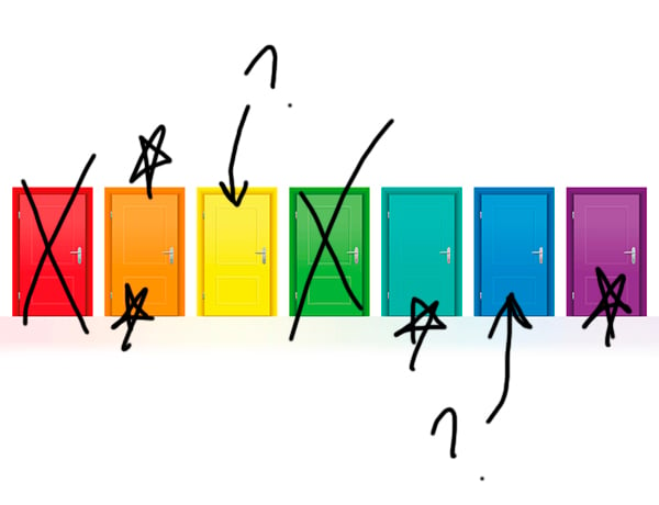
There’s a reason so many brands gravitate toward specific colors as part of their website and branding goals. That’s because colors elicit a subconscious emotional response, and people rarely think about how a color makes them feel.
For example, blue and orange are popular colors across saturation levels in web design and branding because they evoke positive responses from viewers. In particular, blue tends to be associated with trust, so it’s a great choice for financial institutions. Meanwhile, orange has positive and energetic connotations and makes it a great accent for blue since it’s the complementary color to that shade.
Does this mean that you need to go out and scrap your brand logo if it’s not blue or orange? No, of course not. But there are some basic user interface (UI) tenets of design that you should keep in mind as you build out your website.
- Avoid bold shades for larger areas such as where a user must read text. It can be hard on the eyes. Negative space (white background) is, and always will be, your best friend.
- Create a cohesive color palette with just a few shades and use it throughout the website.
3. Less is More
When you fall down the web design rabbit hole, you might assume that you need a website that has bells, whistles, and everything in between. To be sure, that can be impressive. But more often than not, your audience doesn’t want or need those design elements.
If you consider some of the most successful websites that receive large volumes of traffic, they have one thing in common: simplicity. No one feels overwhelmed browsing Facebook, Craigslist, or Google. Why? Because these sites keep it simple.
While all of the sites we mentioned are highly interactive with complex backend systems, what’s presented to the end-user is a simple website with a straightforward web flow that even a first-time visitor can follow.
Even if you don’t aim to be the next Facebook, you can learn a lot from their design strategy:
- A simple color palette that relies mostly on negative space offers a cleaner look.
- Fonts are easy to read and consistent across browsers. This includes picking an appropriate size that’s not too small for the eyes.
-
Design elements are kept to a minimum. While there are plenty of interactive elements, you won’t see intrusive popups or heavy images that take forever to load.
4. People Prefer Symmetry or Approximate Symmetry
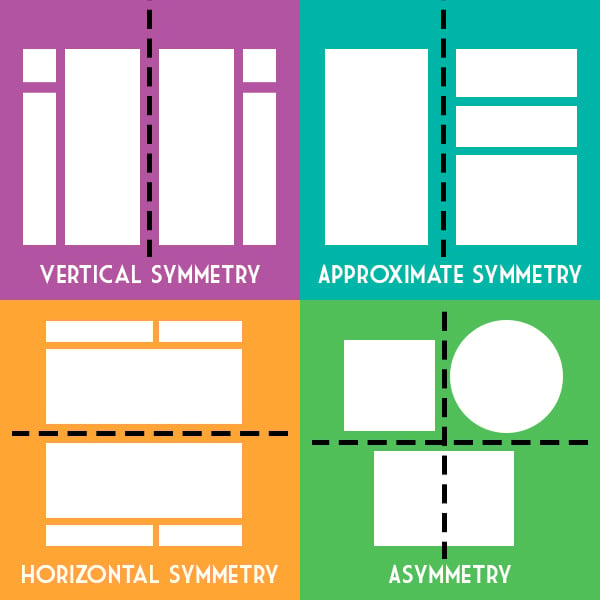
Another secret of effective web design is preference for symmetry, or close to it. Often used when discussing branding, Gestalt’s Law of Principles is equally important when designing a website. In particular, you should pay attention to the Law of Symmetry because humans tend to prefer symmetrical designs over asymmetrical ones.
However, keep in mind that “perfect symmetry” can be a tall order considering that one of the most popular layouts in web design features one large column with a sidebar. This is known as approximate symmetry. While it’s not perfectly even, it creates a flow that’s easy for the eyes to follow.
5. Establish Your Authority
Encouraging customers to purchase from an unknown brand is challenging, even more so with today's increasingly conscientious consumers. The hesitation is understandable—who wants to buy a product or secure a service from a virtual stranger?
But there are design elements you can incorporate into your website that help to build trust. Along with crafting copy that’s compelling, relevant, and proves that you have experience in the industry, you can also use a few design tricks to convey the same thing.
A common tactic is to highlight major clients or customers such as when a software company displays the logos of all the highly-respected, well-known firms that use their product. Brands that sell a physical product could outline where their products are sold, or if they’ve secured press in notable outlets, include an “As Seen In” feature listing the reputable publications.
In place of knowing anyone who has used your services or product, these tactics help establish trust and authority that in turn helps prospects feel confident and take action.
6. Demonstrate Your Credibility
Along the same lines, customers are more likely to book a service or buy a product when they see feedback from other real customers. This is where reviews or customer testimonials come in handy. They provide peace of mind for prospects looking to take the next step.
While this tactic might not work for every business model, it's nearly essential for service providers and brands that sell products. Displaying reviews from aggregate websites such as Yelp or Google is an easy way to include customer feedback (and reap SEO rewards in the process!)
The companies that do this best have responsive customer support that is capable of addressing positive and negative reviews alike.
7. Changes Should Be Made Gradually
Great branding entrenches itself in your customers' minds. Nobody needs to be told that Coca-Cola's primary brand colors are red and white, for example. These branding elements are solidified in our minds through years of exposure.
But what happens to this brand equity when these elements get changed? If Coke were to swap its color scheme to, say, green and white, it'd take consumers a long time to adjust. The same applies to any branding, even if it's not on the global level.
The Pareto Principle (or the 80/20 rule) states that 80 percent of outcomes are generated by only 20 percent of inputs. This is a psychological principal with big implications for your website design.
You'll likely find that there are certain on-site elements -- possibly logos, color schemes, or imagery -- that create significant branding value for your company. If you get too crazy with website updates and end up changing too many of these heavy-hitting elements, you may be doing more harm than good.
We recommend performing thorough research on your branding by way of feedback and focus groups and getting familiar with what's working. Applying changes gradually ensures two things: customers won't get confused by big branding shifts, and you'll avoid making drastic changes that decrease the consumer mind share you've worked hard to build.
Leverage the Power of Human Nature to Elevate Your Web Design
Human nature is powerful and instinctive, and can have a significant positive impact on web design when used properly. Take advantage of these secrets of effective web design while remaining true to your brand ethos and goals. The Creative Momentum can assist with creating customer personas and crafting a web design strategy that caters to their unique needs and your overall business goals.


