
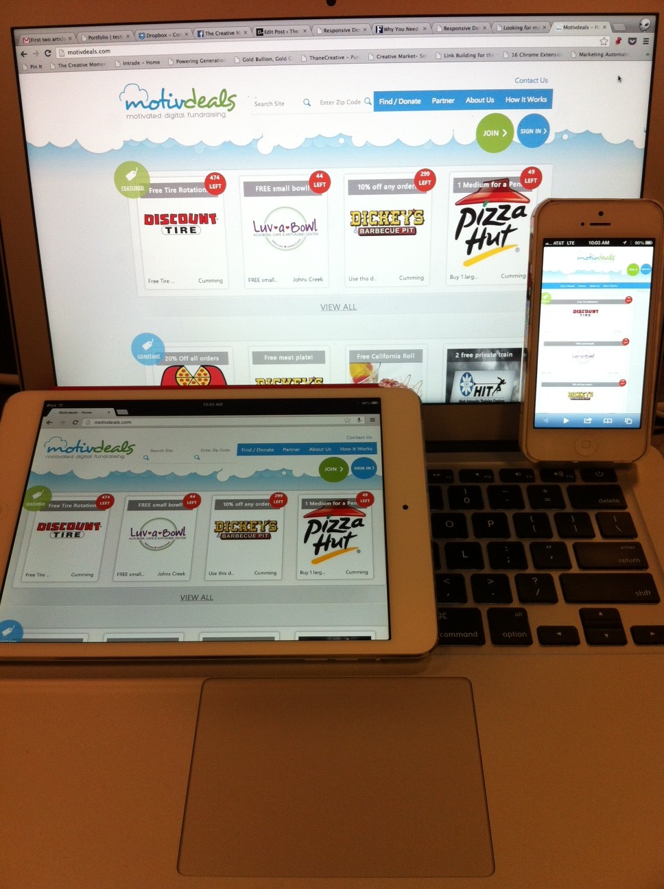
You’re a man (or a woman) on the go, connected at the fingertips to more computing power than the entire Apollo spacecraft. You check your email by tablet, poolside while sipping a really big coffee, read the news on your smartphone while waiting for the subway, and plug into the world when you sit down at your trusty (but really large and flat screened) desktop at work.
In other words, two hours into your day, you’ve accessed the web on three different devices and, likely, you had a different experience on each. And we haven’t even begun to consider the enormously wide range of smartphones and tablets. If you are having a hard time adjusting to all the different views, why wouldn’t potential viewers (and let’s just be honest here, potential clients) be having the same problem?
Enter responsive design.
Why does this even matter?
Adaptive website design is a relatively new concept growing in popularity over the past two years, and predicated on the belief that single website design should work for all viewers, regardless of how they are seeing your site. Not convinced you need responsive design on your site? Consider the following:
- 61% of all people using mobile phones use smart phones
- Mashable.com recently reported that their site is viewed by over 2,500 different types of devices
It is safe to assume that your site isn’t always viewed from the comfortable confines on a 15.6 inch laptop screen. If you want your message to be clear, adaptive website design is the way to go.
What it Means
When you stop and really think about it, responsive design allows you to stay front and center with your clients no matter where they are. It represents your company and brand the way you envisioned it, whether the customer is looking at a 4-inch smart phone screen or a 32-inch flat screen. The concept has been touted as the single greatest e-commerce marketing move for 2013. In others words, if you are only going to do one thing, it should be adaptive design for your website.
If you still aren’t convinced that you need to make the switch, borrow a few devices from friends, boot up your own website and check out just how different the experience really is. You will likely be converted to the responsive design bandwagon, and hey, at least you can finally ditch your old mirror site!