
By now, most of us are familiar with minimalism in web design. It’s the idea that you can say more with less and create a visual style through strategic use of simple elements:
- Hidden navigation/menus
- Simple, clean layouts
- Understated color palettes
- Preference for visuals over text
- Generous white space and room to breathe
But let’s be honest. It’s easy to get swayed by the benefits of a simple style and lose sight of your brand’s originality. Minimalism is great, for specific brands whose messaging aligns with this need for simplicity and clarity.
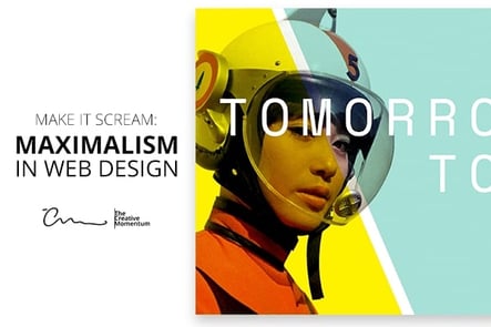
But for those who want something a little more, a new trend has emerged in response to the push for less: Maximalism!
Go Big or Go Home
Maximalism is a no-holds-barred approach to design that involves embracing excess, getting loud, and adding distinctive visual flair to your site.
While it runs counterintuitive to the minimalist dogma pushed over the past decade, maximalism in your web design does come with certain advantages.
- While minimalist design can be useful, not every style is right for every website;
- Maximalist design can convey specific ideas that less aggressive aesthetics can’t.
After all, the point of your web design is to showcase your brand’s identity, and just because “lean and mean” is hot right now doesn’t prove all other styles invalid. Indeed, as we’ll discuss in a moment, some websites have used maximalism concepts to create unique brand identities that definitely stand out from the crowd.
Make your design serve a purpose.
Of course, maximalism doesn’t mean throwing anything you want at the page and calling it art. Like other visual styles, maximalism in its best form is governed by specific design principles that website owners will need to keep in mind:
- A structured visual hierarchy that presents the most important information first;
- Specific use of colors that support one another and create a deliberate style;
- Effective navigation (hidden or not) that users can access;
- Contrasting site elements that help users understand what they’re looking at, regardless of what else is on the page.
Maximalism In Action
For a good example of a maximalist website that got it right, check out One & All, a one-day creative festival for artists and designers.
Maximalist is an understatement. The design is bold, brash, and in your face. Don’t like bright colors? Too bad. The layout is a vivid neon green splashed against contrasting black and white elements, complete with a background that can only be described as a swirling nebula of dynamic stripes that doesn’t really seem to serve much purpose.
But in fact, it does. The idea behind this site is to let creative professionals know what the event is all about—and it certainly accomplishes this.
There’s no fear. No playing it safe. No minimalism. Heck, there’s not even any white space. While this type of site would be inappropriate for a professional e-commerce site, it works perfectly for showing off the event’s in-your-face push for creative expression.
And as noted above, it checks all the boxes for good web design. Its style is deliberate. The most important elements are featured front and center. Navigation is clear amidst the noise. The site creates a distinct, uncompromising flavor without alienating its readers with a poor UX.
Be Deliberate and Get It Right
All in all, don’t be afraid to embrace more aggressive styles if you think it’ll help your brand. Maximalist designs are certainly possible to get wrong if thrown together haphazardly, but when done with care, they’re a great way to make an impact with your audience.
Be sure and check out: The Sound of Silence: 5 Examples of Effective Use of Space in Web Design