
The purpose of B2C websites is straightforward: attract users, keep them on your page(s), and lead them down the sales funnel. In the end, you’re looking for conversions—whether that’s a sale, lead capture, or just website visits.
Of course, this is much easier said than done. How do you get visitors to stay on your website and follow the path to conversion? Start with outstanding B2C web design.
According to research, 94% of first impressions are design-related. This means even if you put in the work to boost your search engine optimization and actually attract visitors, it’s all for naught if you don’t have great design.
Luckily, we’re here to help. Here are a few tips to improve your B2C web design.
 Keep Web Design Simple
Have you ever heard the old KISS principle: “Keep it simple, stupid”? Not only does it apply to naval systems (which is where it comes from), it also applies to your B2C web design.
You want people to understand your website content, so make it easy for them to digest it. Keep your design simple without clutter or distractions. This simplicity will ease users down the buyer’s journey and help them reach your end goal of conversion.
Avoid any unnecessary design features. If it doesn’t serve a specific purpose, don’t use it. Here are a few ways to simplify your B2C web design:
- Color – Stick to around five different colors (or fewer). Too many colors can overwhelm visitors and turn your website into an eyesore.
- Typefaces – When choosing fonts, focus on readability and readability alone. You may think Jokerman is a great font, but it's difficult to read. Stick with simple fonts and colors that contrast with the background.
- Graphics – Add graphics only if they serve a purpose, perform a specific function, or help a visitor complete a task. Using unnecessary graphics adds clutter to your site and slows down page load times (which we’ll get to later).
💡Generally, stick to no more than three different fonts and three different font sizes throughout your site.
Apple’s website is a great example of simple design. It employs a minimal color palette, readable typefaces, and no unnecessary graphics. If there was one tip from this list that could improve your B2C web design the most, it’s this one. Remember, KISS.
Simplify Navigation
Speaking of simple, this practice should extend to your navigation.
Visitors don’t want to spend much effort finding the information they need. In fact, they don’t want to spend any effort! According to research, 61.5% of people will leave a website if it has lousy or difficult navigation. Internet users want the information they’re looking for with speed and ease. If they can’t do that on your site, they’ll find another.
Help visitors find information by making navigation easy:
- Use a simple, consistent navigation bar at the top of every page that provides clear destination points.
- Include navigation links in the footer of your website.
- Keep options to a minimum. Too many navigation buttons can confuse visitors.
- Provide links and make it obvious where the links go.
Not to brag, but if you want an example of simple navigation design, check out our homepage at The Creative Momentum. While we offer dozens of services, there are only four tabs to choose from, they’re prominent at the top of every page, and it’s easy to tell where they lead. There’s no guesswork when it comes to navigation.
Make Pages Scannable
No matter how good your website copy is, nobody is going to read every word. In fact, studies have shown that 79% of users always scan a new website page, and only 16% read pages word-for-word.
Knowing this, help visitors by making your website scannable. The faster they can find information, the more likely they are to make their way through the buyer’s journey.
Here are a few tips for how to increase webpage scannability:
- Add plenty of meaningful subheadings. A visitor should understand the point of your webpage without reading a single line of body text.
- Keep body sections to one idea per paragraph and keep paragraphs short. If users scan the first sentence and decide they don’t need that information, they’ll miss the other ideas in the paragraph.
- Use bullets and numbered lists.
- Use bold, italics, and underlines to emphasize important keywords and ideas. Hyperlinks also serve as a way to highlight important information.
Check out the PayPal homepage for a good example of scannable content. You can scroll down the page and find the exact information that interests you without reading one word of body text.
Reduce Page Load Times
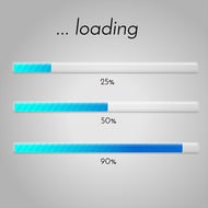
You know that internet users are impatient, but how impatient are they? According to studies, 47% of consumers expect a website to load in two seconds or less, and 40% will leave if it takes more than three seconds. That’s not much time.
As you work on your B2C web design, keep page load speed in mind:
- Enable file compression
- Reduce redirects
- Use browser caching
- Utilize a content distribution network (CDN)
- Optimize images (and avoid high-resolution images and videos)
Once you make these changes, test your load speed with a tool like Pingdom. Aim for a load time between zero and four seconds. Ideally, stick within the two-second range for maximum conversions.
Remember to Include Calls to Action
Website visitors aren’t going to follow the sales funnel themselves, so it’s up to you to tell them where to go next with a powerful call to action (CTA).
A call to action is like a road sign that tells users the next step of the process. For example, if you have a high-level blog post about how to solve a specific problem, the CTA at the end should lead readers to information about your specific products or services that solve the problem you just discussed. It leads them from the Awareness Stage into the Consideration Stage.
There should be a call to action on almost every page. Without clear directions, visitors might get lost and go somewhere else. Show them the way.
Need More Help? Hire B2C Web Design Experts
Your website may be the most important component of your B2C business. It's where your prospects and customers go to learn about your brand and many times, shop for products.
Therefore, optimizing your B2C website is essential. If you need more help than the tips provided above, reach out to our experts at The Creative Momentum. We've helped many B2C companies turn their websites into a lead and sales-generating machine, and would love to do the same for you. Contact us and tell us about your project!