
![Designing navigation bars is an important part of website design. [Background] a content management system interface.](https://www.thecreativemomentum.com/hs-fs/hubfs/blog-files/2007%20batch/2007-24-Navigation%20Bar-image-h-3.jpg?width=600&name=2007-24-Navigation%20Bar-image-h-3.jpg) When users visit a website, they expect to find the content they need with ease. The navigation bar is the simple design element that facilitates this. However, don’t let the simplicity of its concept allow your designers to neglect it, as it is one of the most important aspects of your overall design.
When users visit a website, they expect to find the content they need with ease. The navigation bar is the simple design element that facilitates this. However, don’t let the simplicity of its concept allow your designers to neglect it, as it is one of the most important aspects of your overall design.
The navigation bar is an anchor point for the entire website and will be visible from almost any page a user reaches. As such, it not only facilitates good navigation but is a crucial element to maintaining positive numbers for time spent on the site, bounce rates, and conversions. Set your webpage up for success by building an ideal navigation bar.
Why is a Good Navigation Bar Important?
Without a good navigation bar, users won’t be able to find the elements they need. Basic components such as blogs, product listings and contact information are not useful if users can’t locate them.
No matter how intuitive you believe your overall design is, navigation is always in the hands of the site’s visitors. Users will not all take the same path and will end up leaving if they can’t navigate the site in their preferred manner.
A good rule of thumb is that any user should be able to get where he or she wants in no more than three clicks. If this isn’t possible, there may be a fundamental problem with your overall design, not just the navigation menu.
What are the Components of an Ideal Navigation Bar?
A good navigation bar should complement your webpage design while giving users all the information they need.
Here are some of the crucial design components to consider when building a strong navigation bar:
- Simple – The navigation bar should clearly communicate its destination points and navigation routes.
- Brief – You don’t have a lot of space in most navigation bars. Keep text short and neat.
- Consistent – The navigation bar will serve as the anchor point for the site design and navigation destinations. Don’t change how it looks on different sections of the site.
- Prominent – Keeping things simple doesn’t mean they should blend into the background. Make the navigation bar stand out so that the user knows where to go.
- Accurate – The navigation bar should provide easy answers to users’ questions. Make sure that it doesn’t hinder them.
With these principles in mind, let's look at the different types of navigation bars.
Types of Navigation Menus
Typical navigation menus come in several varieties. While some of these choices are more common than others, they all have their own specialized purpose, and what may seem unworkable for one site might be the perfect choice for another.
![The most common menus in website design are horizontal navigation bars. [graphic] A website's horizontal navigation menu.](https://www.thecreativemomentum.com/hs-fs/hubfs/2007-24-Navigation%20Bars-image-2-Horizontal-jpg-2.jpeg?width=600&name=2007-24-Navigation%20Bars-image-2-Horizontal-jpg-2.jpeg)
Horizontal Navigation Bar
The most common type of menu bar is the horizontal navigation. Users rely on this conventional menu to navigate their way around websites. While your more creative instincts might yearn for something unique, a standard top-oriented horizontal navigation bar is not just expected; the absence of one will normally frustrate your website visitors.
These types of navigation setups are useful in responsive designs meant to scale for mobile devices, which means that you can provide a uniform experience to users regardless of device. In addition, their familiar nature means that they work well with advanced designs such as drop down or mega menus.
![The footer navigation is a common feature of many website designs. [graphic] A generic website's footer navigation menu.](https://www.thecreativemomentum.com/hs-fs/hubfs/2007-24-Navigation%20Bars-image-3-Footer-jpg-2.jpeg?width=600&name=2007-24-Navigation%20Bars-image-3-Footer-jpg-2.jpeg)
Footer Navigation Bar
Another common menu-type is a bottom-oriented horizontal navigation menu. While this places navigation in a spot where users have to hunt for it, there are a couple cases in which a footer navigation bar is preferred.
A bottom-oriented navigation bar is frequently used on landing pages, as they provide navigational guidance without distracting readers from the page's primary value proposition. While some advocate for removing navigation from landing pages altogether for the sake of higher conversions, the practice is controversial from a UX standpoint. Typically, users don't enjoy losing navigation elements they expect to see. Footer navigation bars offer an effective middle ground that preserves landing page integrity without "trapping" readers on your site.
Another use case for footer navigation is through something called a fat footer. A fat footer is a link-heavy resource often found at the bottom of content-heavy pages. Here you'll find something resembling a full site map, particularly useful for sites that have dense navigation structures. This can be an easy way to share links that aren't as relevant to your site's primary elements, such as contact info, legal notes, compliance certifications, and so on.
You may also want to consider a responsive bottom navigation bar for your mobile device UI. This places your navigation options where users already have them on their phones and tablets. Just be sure that it doesn’t interfere with the standard navigation buttons that these devices use.
Vertical Navigation Bar
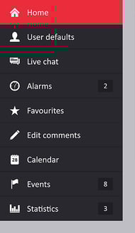 A vertical navigation menu is a modern option typically seen on mobile layouts. These are usually left-oriented but could be on either side of the screen to fit your website’s design.
One of the big advantages of a vertical navigation bar is that it is able to accommodate more links than a horizontal navigation bar. Since you can stack text instead of trying to cram it into a horizontal format, you will have more flexibility with the types of categories you include.
Keep in mind, however, that vertical navigation menus take up valuable real estate where content would otherwise be. Make sure that a vertical navigation bar fits the aesthetic of your webpage and adds value to the overall design.
Responsive Menu Bar
While all menu bar designs should accommodate for mobile devices, there are some options that are designed just for that purpose. One of the most common is a hamburger menu, named for its icon’s three horizontal lines that resemble a hamburger.
These navigation tools keep the menu hidden until the user hovers over it with the cursor or taps it on a mobile device. From there, the menu can expand and collapse to gives users full navigation options, while taking up a minimum of space. If most of your users are accessing your site from a mobile device, this is an excellent option.
Tips for Designing the Ideal Navigation Menu
With the above options in mind, let's review a couple quick tips to support your navigation menu development process.
Create a Sitemap
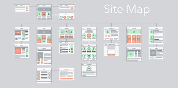
Before you build a navigation bar, you need to know what pages the navigation bar will lead to. Build a sitemap to gain a visual understanding of how many elements you’ll need. Aim for consistency and try to come up with navigation options that work well across each of your web pages.
Expand Menu Functionality
Think about what elements you want to include in your navigation menus.For example, larger sites normally have options that expand to provide more complex information and useful links.
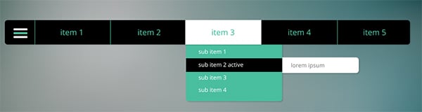
One common choice is a drop-down menu. These expand when hovered over and offer more specific choices. This is an unobtrusive way to provide visitors with more information without requiring them to load a new page.
Another, somewhat more extreme choice is a mega menu. This navigation method expands onto a significant portion of the screen and delivers a large number of navigation options. This is too intrusive for most sites but can be useful for content-rich environments such as an online magazine or an ecommerce site with many different departments.
Give Navigation Clues
One of the most important functions of the navigation bar is to make sure that site visitors are never lost. Designers can achieve this by always having the menu present and can be done passively with visual navigation cues and best practices.
Your logo should always redirect to the homepage. Use color gradients to indicate the section of the site the user is currently in and pages they have already visited. Breadcrumb navigation may seem old fashioned, but it remains an effective tool to orient users on websites that have deep navigation structures.
Remember: if users are confused, they will leave. And if they leave because a website has poor navigation or is hard to use, they won’t be coming back.
Build the Perfect Navigation Bar
Create a great experience with a well-planned, stylish and mindful navigation bar(s). Keep your target audience in mind and make sure that your navigation menu gets them where they want to be.