
If 2020 taught us anything, it’s that digital commerce is here to stay. More people stuck at home translated to higher demand for ecommerce solutions. From small garage-based retailers to massive global corporations like Amazon, there’s a lot of competition in the ecommerce world, and the more competition there is, the better your site needs to be.
For many businesses who built an ecommerce shop in 2020, the increased traffic brought their own set of challenges. So whether you’re one of those businesses or a seasoned ecommerce proprietor, we're maintaining this list of ecommerce web design best practices.
If you're interested in making waves and driving sales, read on.
1. Use a Clear, Simple Design
Back in the 1960s, the acronym KISS became widely popular (no, not the makeup-clad rock band - that was the 70s anyway). KISS stands for “keep it simple stupid.” In other words, strive for simplicity in everything - from design to systems.
A quick glance at the most of the popular ecommerce platforms’ built-in templates from Shopify, BigCartel, and BigCommerce and you'll notice a trend: the layouts use clean, minimal design.
Website visitors don’t want to work hard to buy a product. Use clear and simple web design with intuitive navigation to encourage online shoppers to stick around and return in the future. A bad experience on your website will lead to higher bounce rates and more sales for your competitors.
Here are a few things you can do on your website to simplify your design, and improve the user experience:
- Make your products or services the star of the show – Avoid distracting animations or competing web page elements to draw attention to your offerings.
- Obvious navigation – Use a clear navigation menu, search bar, and filters. If your site is hard to navigate, potential customers will give up and not buy your products.
- Avoid carousels and sliders – Especially avoid ones that automatically advance. You take away the ability for customers to compare products. Plus, they might forget what they saw if the slide advances too quickly.
- De-emphasize newsletters – They’re free and clutter up your site. Put them in a less prominent place and focus on items that make money.
- Easy-to-find cart – You want people to take the next step and purchase the products, so don’t hide the cart! If visitors can’t find it, they won’t check out.
- View all products at once – Make it easy for people to see everything you’re selling. If customers have to work to find certain products, you can bet those items will be your worst sellers.
- Add color responsibly (i.e. use plenty of white space) - Many popular websites rely on negative space and a bold color palette to tell a story that is vibrant. They skip the excessive design because those features can be distracting. More importantly, the more content and elements you add to a page, the more likely that your site will load slowly. If you force customers to fight with your website just to navigate and shop, most will abandon the page and shop elsewhere.
Tips for Ecommerce Homepage Design
Stick to the idea of minimalist design when creating your homepage as well. Too many pop-ups, clashing elements, and garish color palettes can be off-putting. For the majority of your site traffic, this is the introduction to your business.
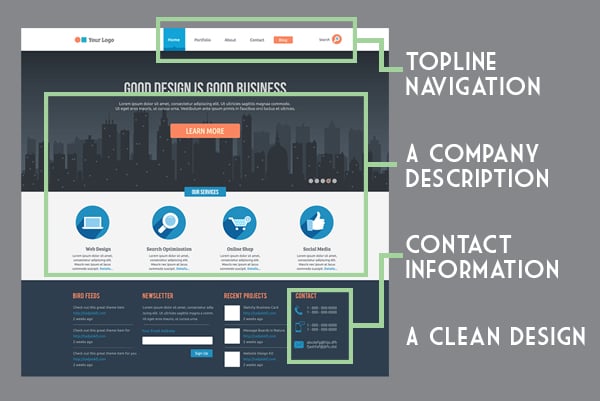
Use your homepage to make the case for what your business offers and why it might benefit your viewers. Key content includes:
- Topline navigation
- A company description
- Contact information
- A clean design
- Featured products and promotions (see #6)
2. Use Proper SEO Product Tags
Make sure your ecommerce pages follow SEO best practices. Ranking well on search engines is essential to attract new users to your website. Use proper tags on your ecommerce pages to boost your site’s rank.
For individual product pages:
- H1 is for the name of the product
- H2 is for subheadings in the product description
For product category pages:
- H1 is the category title
- H2 is for the names of the products
This will help search engines navigate your website, which will benefit your rankings.
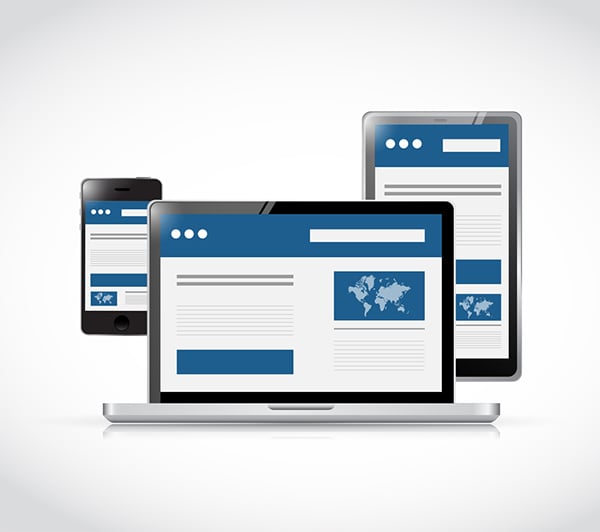
3. Make Your Site Mobile-Friendly
The goal of ecommerce web design is to make it easy for people to quickly find and buy your products online. At the end of 2019, 51.98% of all online global traffic was from a mobile device. Ergo, if you don’t optimize your ecommerce site for mobile, you’re excluding over half of your potential customers!
It's simple: by making your ecommerce site mobile-friendly, you make it more convenient for consumers to buy your stuff. For example, how many times have you bought something from Amazon from your phone just because they make it (almost painfully) easy? You too can capture the impulse-buy market!
More consumers are shopping directly from mobile-ready social media platforms like Instagram, so your store needs to be mobile-friendly to support that platform handoff. While there are bridge apps that allow you to create a mobile-friendly experience so that consumers don’t need to leave social media, it’s always best to create a mobile version of your eCommerce website.
If all this isn't enough to compel you yet, here's another reason: having a mobile-friendly site boosts your SEO.
Optimizing for Mobile on Ecommerce Sites
Is your site already mobile-friendly? Optimize it using the following mobile eCommerce UX best practices to take it to the next-level:
- Support of pinch-based image zooming
- Integration for GPS, cameras, and microphones
- Keeping search above the fold
- Voice/text support
- Forms that are mobile optimized
- Optimized checkout speeds
- Integration of faster payment methods such as Affirm, Afterpay, Paypal, and Google Pay
4. Include a Search Box
Include a search box to make it easy for visitors to navigate your website. If people know exactly what they’re looking for, they can go right to it without taking the time and effort to wade through every product and category page.
For extra user friendliness and potential upselling, include an autocomplete or a suggestion feature in your search box. This will help users find what they’re looking for faster—and easier—and even allow you to suggest items that might be similar to what they’re searching for.
5. Use Product Filters to Narrow Search Results
 Sometimes, your website visitors might know what they're looking for, but don't know what to call it. Offering product filters and categories lets them compare products on your site and/or filter out the ones they know they don’t want.
Offer filters based on things like:
- Product category
- Price range
- Brand
- Color/style
- Material
This list is by no means inclusive. Offer as many filters as you can think of for a specific product. If you’re having trouble thinking of filters to add, look at larger retailers that sell similar products for inspiration.
Also, be sure that shoppers can select multiple filters to narrow their searches down even farther. The faster and easier they can find the product they’re looking for, the more likely they are to make a purchase.
6. Add Featured Products to Your Homepage
How many times have you seen a promotional display for an item at the entrance to a store and thrown it in your cart? The same idea works for ecommerce website homepages.
Ecommerce homepages can pull double duty by functioning as a product page that allows consumers to shop directly from it. While this is a convenience for the consumer, there’s also a smart SEO reason behind this maneuver. Many people find eCommerce stores through search results. As a result, boosting the SEO value of your multitasking homepage can lead to increased traffic through search engine results pages (SERPs), social media posts, or even ads.
Include featured products and promotions at the top of your homepage or on side columns of other pages. This strategy exposes website visitors to your top-selling products, even if they weren’t necessarily looking for them. This is also a good place to push seasonal or festive products.
Cutting out the extra navigation normally required to reach a specific product — especially if it’s a best seller or incredibly popular — can quickly funnel customers through the sales cycle and seal the deal.
According to Omniture, a leading digital marketing analytics firm, ads and sponsored social posts that rely on eCommerce-optimized landing pages can see an increased conversion rate of at least 25%. A well-designed multitasking homepage can achieve the same effect, provided that you make the product offer clear and easy to find.
7. Use High-Quality Images and Augmented Reality
Although online shopping certainly has its upsides, there are some downsides too—mostly, not being able to see or touch the items in person. So when it comes to successful ecommerce web design, visuals are king.
Perhaps the best way to generate eCommerce sales is to invest in quality photography. Poor images make customers doubt the product and, more importantly, your brand.
- Include multiple images of each product so visitors can see it from many angles.
- Add image zoom features so people can see your products in detail.
- Adding videos can also be helpful to show your products in action.
Another consideration: while a well-shot picture is always appreciated - depending on your product - you might be better served by showing it in action.
Dynamic content can be delivered using augmented reality (AR). Many online retailers use AR so prospects can virtually "try-on" solutions for clothing, makeup, hair color, and even home decor. Augmented reality is a great way to nudge a shopper who’s on the fence and can encourage them to explore products with greater certainty and confidence.
8. Include Detailed Product Descriptions
Be as detailed as possible in your product descriptions. Let your customers know everything they would ever want to know to help them along the buyer’s journey. The more confident they are about a product, the more likely they are to buy it. If you include only a picture and a title, your visitors will likely leave to find more information and make their purchase elsewhere.
9. Offer a Guest Checkout Option
Forcing shoppers to create a login is like those grocery stores that make you use a member card. Most people already have six member cards in their wallet (and dozens of logins and passwords to remember) and don’t want another one. Offering a guest checkout option will make the checkout process easier for people who don’t want to give out their information.
10. Use AI Chatbots
While chatbots aren't necessary in all industries, for eCommerce businesses the invention is almost a necessity. When implemented properly, their prompt and useful interactions with consumers are four times more effective at driving sales compared with inexperienced live agents.
Conversational AI is useful for fielding questions about shipping, return policies, or even when a beloved item will be back in stock. Plus, it avoids the costs of maintaining 24/7 live customer support.
Chatbots have come a long way. These days, chatbots are designed to be intuitive and incorporate machine learning to offer faster, more natural responses. You can even program them to offer discount codes and provide key details about products.

Increasing Sales with Ecommerce Web Design
If you find yourself constantly wondering how to improve your ecommerce web design, think of it this way: your ecommerce website is like a physical store. It needs to be organized in a way that makes it easy for shoppers to find what they’re looking for and complete their purchase. The more difficult the process, the more likely your visitors are to leave and shop somewhere else.
Do you need more help than this article provides? Whether you’re just dipping your toes into ecommerce or you think that your online store could use an overhaul, we can help.