
A good user experience (UX) is what every web designer strives to achieve. Typically, if you’re a good web designer, you try to learn what website visitors want and do your best to make their experience as positive as possible.
But sometimes, companies don’t care about their customers and focus only on their own agenda.
Dark UX Defined
Dark UX is any unethical web design trick designed to confuse and deceive users. It forces visitors to take actions against their wishes to benefit the business. This may mean asking for more information than is relevant to a transaction, eliminating important navigation elements to reduce site abandonment, or opting users into receive promotions by default.
Dark UX vs. Bad UX
Bad UX is accidental. It’s poor web design from lack of knowledge or carelessness. Dark UX is intentional and designed to promote the brand’s best interests at the visitor’s expense.
- Bad UX: Confusing checkout processes
- Dark UX: Purposefully making it difficult to find the "x" that closes-out a pop-up.
The difference between the two is the intention. Brands that use dark UX know exactly what they’re doing. They understand the UX concepts that make websites great and use that knowledge to manipulate visitors.
The Devious Variations of Dark UX
The term “dark patterns” was invented in 2010 by a UX specialist named Harry Brignull. He got tired of brands taking advantage of customers with tricky web design tactics and decided to do something about it. He created the website DarkPatterns.org to raise awareness of dark UX and shame any businesses that use it.
On his website, he lists twelve different types of dark UX that brands use to trick, deceive, and essentially steal from visitors:
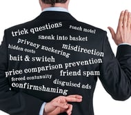
1. Trick Questions
Trick questions are intentionally misleading questions to get website visitors to give an answer they didn’t mean to give, usually when filling out forms.
Example: Leave this box unchecked to subscribe to our newsletter.
Most newsletter subscriptions ask you to check the box to opt-in. The dark UX designers know that and use it to their advantage. You might not want to subscribe to that daily newsletter, but a confusing checkbox description might sign you up anyway.
2. Sneak into Basket
Some eCommerce websites sneak extra items into your shopping cart without your knowledge. When you’re purchasing technology or equipment, always check for that sneaky three-year warranty before hitting checkout. You might pay more than anticipated!
3. Roach Motel
You clicked on the “premium subscription” tab just to see the features, and now you can’t leave without checking out. You’re stuck in the “Roach Motel.” This tricky dark UX design works just like a bug trap. It’s easy to get into a situation, but you can’t leave once you’re there.
Amazon and Facebook are notorious for this tactic. They make creating a profile simple, but deleting your profile is a completely different story.
4. Privacy Zuckering
Who has time to read all those terms and conditions? Most people simply click “agree” and move on with their lives. Some companies—like Facebook (the pattern is named after the CEO Mark Zuckerburg)—include sneaky verbiage that forces users to give up their rights or additional information without their knowledge. This allows brands to sell private data, track users across sites, and whatever else they decide to include.
5. Price Comparison Prevention
Some brands intentionally make it difficult to compare prices of products or services, forcing visitors to make uninformed decisions.
LinkedIn uses this dark UX tactic with their premium subscriptions. You can see the different plans and features, but the prices aren’t revealed until later in the checkout process.
6. Misdirection
Have you ever visited a site with a big, bright button to sign up for their newsletter, and the “no thanks” button is hidden in the corner of the box? This is misdirection: using design elements to focus your attention on the option that benefits the business while distracting you from other options.
There’s nothing wrong with drawing attention to the opt-in buttons with bright colors. Just make sure the alternative choice is also easy to identify.
7. Hidden Costs
This is similar to the “Sneak into the Basket” pattern except instead of an actual item, there’s an extra charge that wasn’t previously mentioned like additional delivery charges, sales tax, convenience fees, etc.
8. Bait and Switch
You think you’re closing the pop-up, but really, you just initiated a download. This is a bait and switch: when you mean to do one thing, but something else happens.
The most famous instance of the bait and switch comes from Microsoft. When Windows 10 was released, Microsoft wanted users to download it, so they sent pop-ups to millions of PCs worldwide. Many people chose not to download and closed the window. After some time, Microsoft got frustrated with the holdouts and simply swapped the “close” button with the “download” button. When people clicked to close the pop-up, they initiated the download.
9. Confirmshaming
Guilt is a powerful emotion, and many brands use it to convince users to take actions they don’t really want, like subscribing to a newsletter. This is called confirmshaming.
You can find this all over the internet. An example is when a brand asks you to create an account for additional savings and gives you the options “sign up” and “no thanks; I don’t like saving money.” The goal is to make you feel bad if you don’t do what they want. It’s one of the most common dark UX tactics on the internet.
10. Disguised Ads
This is less about web design and more of an advertising tactic. Disguised ads appear when brands design their advertisements to look like navigational buttons. When displayed on a website, users think it’s a part of the website and click it as a navigational tool. Then, they’re whisked away to the advertiser’s website—which isn’t where they wanted to go.
11. Forced Continuity
Tons of websites use free trials to attract users, and there’s nothing wrong with that. The problem comes from brands that sneakily start to charge your credit card without notifying you the trial is over. This is called forced continuity.
Brands that practice forced continuity also like to match it with other dark UX tactics like the roach motel to make it difficult to cancel your membership.
12. Friend Spam
Some brands ask for access to your contact list or social media. In most cases, it’s for positive reasons like software integrations or finding new networking opportunities. Other brands, however, use this information to spam all your contacts with advertising messages.
The Dangers of Dark UX
In the end, all a dark UX does is frustrate your audience and prospects until they ditch your brand for good. If you’re discovered using dark patterns, it could irreparably damage your image.
Good web design focuses on creating a helpful, positive user experience. Don’t earn a spot on the Dark Patterns Hall of Shame. Put in the work and give your website visitors what they want. It’s the best way to build a successful website.