

It may come as no surprise that more people access the internet through mobile devices than desktops. And that’s a global reality, not just for the United States. According to Perficient, a market research firm, the percentage of users reaching the internet via mobile devices in the US increased from 57% in 2019 to 61% in 2020 while globally, that shift increased from 63% in 2019 to 68% in 2020.
Given the statistics, this means that when you’re designing a website, you need to adopt a mobile-first strategy. In particular, you should take advantage of a few mobile UX tips to ensure that website visitors have a positive experience, especially if they arrive via mobile devices.
Streamline Your Mobile Design
Always remember that working with mobile devices means that there are a few inherent constraints. The main issue is screen size. Even the largest mobile phone can't compete with a standard-sized tablet or laptop computer.
The mobile experience should be similar to what desktop users enjoy, a concept known as mobile parity. But too many design elements, colors, and animations can lead to a cluttered design on a mobile device. Also keep in mind that all those features can slow load times and encourage page abandonment.
Try to avoid layouts or add-on elements that make it hard for users to focus, navigate, and follow the calls to action (CTAs). Less is more here, but that doesn't mean you need to strip your site down to a bare-bones experience.
Prioritize Search and Navigation
Mobile and search go hand in hand. Mobile visitors to your website shouldn’t have to struggle to navigate between pages or search for key information. At the same time, you aren't able to present your navigation bar to mobile users like you would with desktop visitors because you have less screen space to work with.
Instead of creating a messy header, use recognizable features like the hamburger and magnifying glass icons. These recognizable symbols are synonymous with menus and search respectively. More importantly, they free up precious screen real estate and still provide value when your website visitors need to navigate or search for information. Conversely, if you’re concerned that users might get lost with hamburger icons, consider lower panel tab navigation with clear icons and descriptions for core navigation and search.
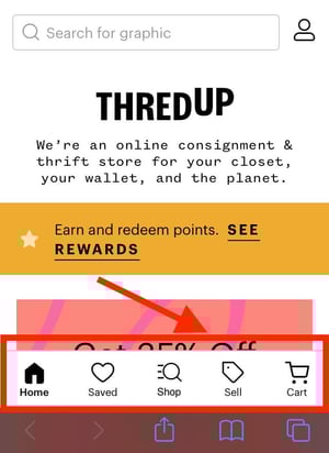 ThredUp uses lower tab navigation in it's mobile UX design.
Make Interacting with Your Website Easy
When you’re on a mobile device, you usually don’t have access to a mouse. All you have are your thumbs—or fingers if you’re a finger scroller. The point is, your website needs to be easy to use with one finger or thumb. Keep these best practices in mind:
- Avoid forms or page layouts that require a user to pinch or zoom.
- Keep forms short. No one wants to write a dissertation on a mobile phone.
- Action buttons should be large and easy to tap.
- Make text slightly larger so it’s easier to read on smaller screens.
 Embrace Responsive Design
In a perfect world (from a web development perspective), there would be only one type of mobile device. This would mean that you’d only have to worry yourself with restrictions like screen size with one type of device. But in this imperfect real world, there are a wide array of mobile devices, each with varying screen sizes, resolutions, and more.
From a design perspective, leveraging a responsive design is the best route when you’re implementing a mobile-first strategy. Responsive design relies on cascading style sheets (CSS) to automatically adjust how your website displays to meet device specifications or limitations so that every page is optimized regardless of the device.
One of the biggest benefits of using responsive design is that you can achieve mobile parity. This is because responsive elements are applied to desktops, tablets, and mobile devices with screens of all sizes. In terms of easing developer workloads, responsive design allows your team to create one design rather than separate designs for all the screen sizes and resolutions on the market—which is a tall order.

Get to the Point
With attention spans getting shorter, mobile browsing puts what little is left to the test. Don't make mobile visitors scroll endlessly to get through your content. And your desktop visitors shouldn’t have to endure a scroll fest either. One way to get to the point is to put your CTAs or key selling points up-screen so that they’re impossible for viewers to miss.
As far as conquering the actual copy, here are some tips:
- After writing webpage copy, test the experience by viewing the page on your phone. Putting yourself in the shoes of your customers always quickly reveals if there are areas for improvement.
- Can you replace some words with an image, gif or video that gets the message across faster (while still keeping load speeds in mind – see below)?
- Develop desired actions you want prospects to take on each page, and focus your words on providing the information that would compel someone to take those actions.
Mind Your Load Speeds
We mentioned earlier that a media-rich mobile website may suffer in terms of performance. This is because the more elements you add to a page, the more you increase load times. And it can’t be stressed enough that slow load times can hurt your page rank.
Consider incorporating backend hacks like “lazy loading” to speed up load times. Lazy loading means that media elements like images and videos won’t fully load until they’re visible on the screen. The result is a page that loads faster.
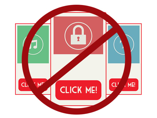 Avoid Using Pop-Ups
Even desktop users don’t like pop-ups. But the larger screens mean they’re more willing to forgive the transgression as long as they can easily remove it. On mobile devices, pop-ups tend to completely block a page. In some cases, they can be obtrusive and difficult (if not impossible) to close.
Such interactions will cause people to abandon your website, driving up bounce rate and decreasing overall engagement. Instead, avoid bombarding mobile visitors with a pop-up the minute they land on your website. It’s unnecessary, and if it’s their first time visiting, you’re sure to annoy them.
Remember Your Audience
At the end of the day, good web design always comes down to putting your audience members and their needs first. Know what your customers are searching for, how they interact with your website, and what motivates them. You don’t need the coolest website in town. But you do need something that is functional, is comfortable for mobile users, and helps them take the actions they need without frustrating them.
Optimize Your Site for Mobile for a Better User Experience
Mobile is not the future. It’s now.
It’s already here and as market research has shown, it continues to surpass desktop browsing year over year. With Google prioritizing mobile websites in search results, skipping a mobile-first strategy is a serious misstep.
Need additional help beyond what this article provides? The Creative Momentum is adept at building out not just functional but effective mobile designs that offer mobile parity and support your business goals.