
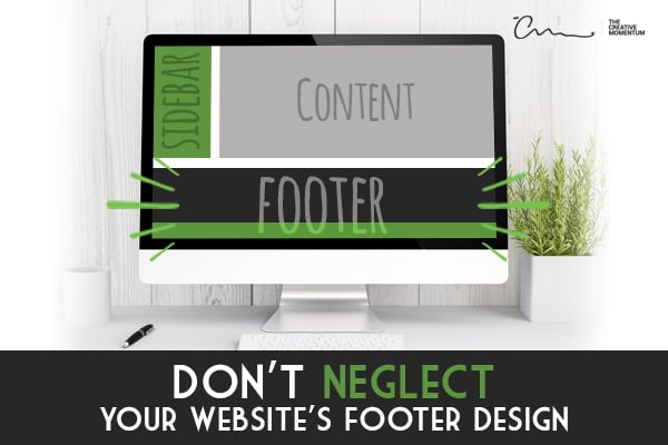
When you’re designing a website, it’s easy to overlook the footer. It’s just stuffed at the bottom of the page, and it’s the last thing you really bother designing. But just because it’s called a footer doesn’t mean it’s a footnote. In fact, the footer can have a major impact on your website’s success—if it’s designed correctly.
Your footer shows up on every page of your website, so make sure it includes all the right design elements. Keep reading for design tips on how to make sure that your website footer is powerful.
What You Need to Include in a Footer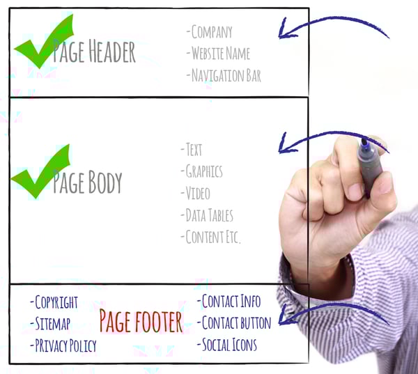
Before we jump into design, there are a few basic elements you should include to start your footer design off on the right “foot.” Since your footer can be found at the bottom of all your pages, you want this information to be basic and universal:
- Copyright – Include your company name, the year, and copyright symbol (or the word “copyright”). It might be weak, but it’ll help to protect you from plagiarism. If you don’t want to remember to update your copyright every year, a simple bit of code will automatically update it when the calendar rolls over.
- Sitemap – When a user clicks the sitemap button, it’ll pull up an HTML outline of your website with all the individual pages listed. While it might not be a popular feature with users, it can help search engine crawlers navigate your site, which is always helpful.
- Privacy Policy – If you collect cookies on your website through Google Analytics or other tools, you need a privacy policy (amongst other legal requirements.) It's conventional and customary to provide a link to your privacy policy in the footer for quick and easy access.
- Basic Contact Info – Since footers are found on all your website’s pages, it’s the perfect place for your contact info. Include your phone number, email, and address so visitors can always find ways to reach you, no matter which page they’re on. Search engines will also use this information to help visitors in your area find your business.
- Contact Button – Not all visitors will call you from the number in your contact info. Include a “contact us” button to make it easy for visitors to reach out with a single click. Make the button call to action (CTA) catchy to entice people to learn more about your business.
- Social Icons – Before your visitors leave your site, make sure you offer them a way to stay in touch. Including social icons in your footer design is a great way to remind users to connect with your brand. It ensures your business isn’t forgotten the minute they leave your website.
Once you gather all this information and put it in your footer, it’s time to start designing. The way you lay out your footer information is almost as important as the information itself!
Keep It Simple, Stupid
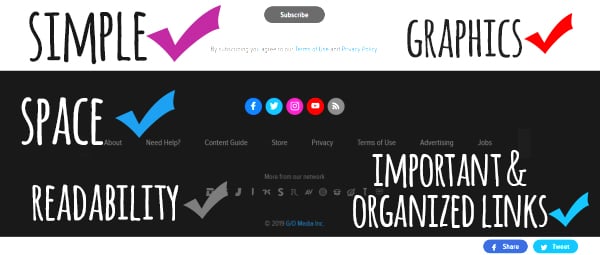
Rule number one for all website design: keep it simple. If you make it too complicated, it’ll just confuse your website visitors and cause them to leave. This universal truth also applies to your footer design.
Your footer will have a lot of information crammed into a small space. It can get cluttered fast if you’re not careful. Since you have such limited space, make sure every element has a reason to be there. If you can’t figure out why visitors would need to see that information, link, or graphic on every single page, then you probably don’t need it. Limit information to the essentials.
Also, be sure to use clean graphics and color schemes. Your footer isn’t the place for fancy, elaborate patterns and high-definition pictures. Stick with one or two colors and simple shapes that are easy to see when the size is reduced.
 Space Is Your Friend
One of the best ways to keep your footer design clean and simple is to include plenty of space. Put space around every individual element in your footer to help it stand out in such a tight space. You can group like elements together—like links to webpages—but make sure there’s enough vertical space between the links so visitors can read them easily.
If you’re a visual learner, the check out the footer for L'Arche. The simplicity in their design is bought to you by efficient use of empty space.
Include Links to Important Information
Your footer isn’t just a source of information; it can also help people navigate your website. Be sure to include links to the most important website information like an “About Us” or “Contact Us” page.
You can also duplicate your header links in the footer or even expand on some of the sections. For instance, if you have a page for services, your footer could include links to various services you offer. Just don’t include too many links, or it could clutter it up.
Organize Your Footer Links
If you do decide to include a lot of links, make sure they’re well organized. Group similar links under headers to help users easily find the information they’re looking for without reading through a hodgepodge of links.
For a good example of footer link organization, check out Lucas Group. They include a whopping 47 links in the footer, but they’re organized so well it’s easy to find what you’re looking for.
Think About Readability
Footers are small. As such, all the text and graphics you use will be small too. Typically, footer text is a couple of points smaller than your standard website content. With shrinking text comes less readability.
To ensure people can still read your text at the microscopic level, be sure to use clean, sans serif fonts with medium weight and a high-contrast color scheme. Choose either a dark background with light font or a light background with a dark font. This isn’t the place for fancy fonts and alternating colors. Otherwise, your footer might as well be blank because nobody will be able to read it!
Use Graphics to Draw Attention
In tight spaces, text is certainly efficient. Unfortunately, it’s also boring.
Instead of using only text, throw in a few graphics as well. They’re a great way to break up the text monotony and attract visitor eyes to your footer. Use universally understood icons like maps, phones, and social media logos so users can understand their meaning, even at such a small size.
Harness the Power of the Footer
You website's footer is a powerful tool to help users navigate your site and contact your business, and can boost your website's SEO. However, the only way it can be effective is if it's properly designed.
By following these helpful footer design tips above, you’ll have the best-looking and most-effective footer around.