
Your website is the online face of your business, and first impressions count! Make sure you start on the right foot with potential customers by creating a clean, user-friendly website.
According to research, it takes users a total of 50 milliseconds (yes, 0.05 seconds) to create an opinion about your website and, by association, your business. If they don’t like what they see, there’s a good chance they’ll leave, never to return again.
If you want your website to make a positive first impression, avoid these common design mistakes at all costs. They could cost you sales!
Too Much Clutter
Visitors go to your website for one thing: to find the information they need. Whether it’s top-of-the-funnel information about your business or to purchase a product, the easier it is for visitors to find their way, the more likely they’ll make it to the end.
It might sound like a good idea to give users EVERYTHING they could possibly want and let them follow their own path. But unless you're following web design best practices and UX principles, this can make things confusing.
If a user goes to your website and gets bombarded with images, text, videos, menus, and calls to action, they’ll be overwhelmed and probably leave for a competitor’s site.
Keep your web design simple. Present them with a clear path to find the information they want, without needing a map and a tour guide to get there.
Not Enough Whitespace
Along with keeping your website uncluttered, include enough whitespace.
Whitespace is exactly as it sounds: empty space. When you include blank spaces around certain design elements like text or images, it makes the blocks stand out. You can use it to emphasize important pieces of content to nudge users where you want them to go.
Whitespace is also important for the overall organization of your site. Users don’t want to see giant walls of text. Not only does it hurt the eyes, but nobody wants to read all those words! Break up text with plenty of whitespace to make things clean, organized, and easy to read.
Using Unrelated or Boring Stock Images

Images are an important part of the design. According to research, articles with images get 94% more views, Facebook posts with images get 2.3 times more engagements, and people remember 55% more information from images than they do from text alone. Viewers love images, but there is a wrong way to use them.
Since creating high-quality and relevant images can often be challenging, many business opt to use stock photos. While they might be easy, users know when a business is “phoning it in.” The wrong stock photos may cheapen your brand - looking cheesy and inauthentic. It’s best to stick with original images if you can. You can customize them to suit the content exactly, which brings us to the next image faux pas.
When choosing images for your site (whether they’re stock or original), make sure they’re relevant to the content. Why would you want a picture of a couple eating ice cream on the front page of your lawn care homepage? It doesn’t make any sense and creates a cognitive dissonance with users. It's confusing, causing visitors to bounce from your website.
Make sure all the content (visuals and text) is relevant to your message.

Forgetting to Optimize Images

Speaking of images, they’re the most data-hungry elements on your website, and people don’t like to wait for pages to load. The longer they take to load, the fewer visitors you’ll have by the time the page finally appears.
According to research, the average bounce rate for a page that takes two seconds to load is 9%. If you increase the load time to five seconds, bounce rates reach a staggering 38%.
The best way to keep load times to a minimum is to optimize your images. Avoid massive, high-quality images. They might look great, but they’ll slow load times to a crawl. Here are some tips to optimize images for the web:
- Use the right file type – JPEG is best for pictures with lots of colors, PNG for simple images, and GIF for animated images.
- Compress images – Use a photo editor to compress images to make the files smaller. But be careful; the more you compress, the lower the quality. Find the happy medium between image quality and file size.
- Adjust image dimensions – Similar to compression, you can reduce the dimensions of an image to further decrease the file size. Instead of 4900 x 3200, reduce dimensions to 1200 x 795 to maintain enough quality, and reduce the file size by up to 94%!
The faster your page loads, the more users will stick around.
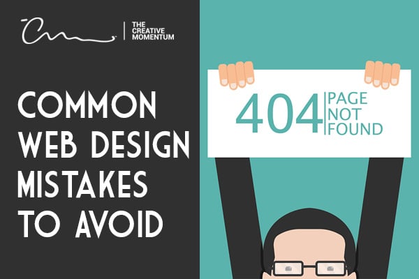
Underutilizing the 404 Page
What happens if a user visits your website from a broken link? They’re sent to everyone’s favorite webpage, the 404-error page. But what most website designers think of as a “necessary evil” is actually an opportunity in disguise.
Your 404 page doesn’t have to follow the standard, boring template. You can customize it to include information that’s relevant to your website. Instead of being an error message that tells users, “This website doesn’t exist; try somewhere else,” you can use the 404 page to point users to other relevant information they might be interested in or link to another page altogether. Instead of bouncing to a new site, they might stick around and explore yours.
Besides keeping users around, a customized 404 page can boost your website’s SEO. Google doesn’t like websites with broken links. If you use a 302 or 301 redirect on your 404 page (links to another page on your site), it doesn’t count as a broken link and keeps the SEO gods happy.
Don’t Fall Victim to Website Design Faux Pas
Your website is an essential part of your marketing strategy. It's the face of your business online. When you’re designing your site, stay away from these common web design mistakes to keep visitors on your website.
If you need help designing a top-notch website, we can help. We’ll make sure your website uses design best practices so your business can get all the sales and conversions you deserve. Contact us and tell us about your business.