While digital media is certainly dominant in the marketing sphere these days, print media isn’t dead. In fact, it’s still an effective marketing tool that’s often not utilized to its full potential. Studies have shown that print media and direct mail are 20% more persuasive than digital marketing tactics.
If you want to make great brochures to explain your services and persuade potential customers, keep reading for to learn some basic design elements and best practices.
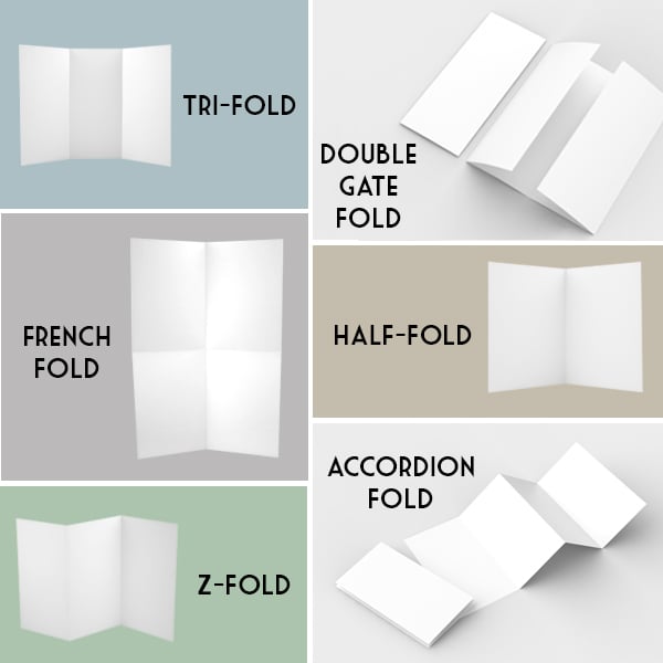
Brochure Folding Techniques
Before you start creating content, you need to know how the content will fit in the brochure. For example, if you need a lot of white space to show off big pictures, a tight tri-fold might not be the best option. Think about what your brochure needs to accomplish and choose a format to suit that purpose.
How many ways are there to fold a brochure? More than you might have thought:
- Tri-Fold (Letter Fold) – Fold the paper into three equal parts with both edges inward, so they’re overlapping in the middle. Because of how it’s unfolded, tri-folds are great for unveiling your information in steps. This is the most common type of brochure fold.
- Half-Fold – Fold a piece of paper in half; it’s that simple. Half-folds are great for when you need plenty of space for pictures or uninterrupted information blocks. But be careful; it probably won’t fit in standard brochure holders.
- Z-Fold – Fold the paper into thirds. The left side comes forward to form the cover, while the right side is folded back, making the paper into a “Z” pattern. Z-folds are great for getting customers to read the entire brochure. They have to open it completely right away to get the information they want.
- Accordion Fold – The same as a z-fold but with an extra panel (four). Accordion folds look cool and make great presentations, but they’re not very good at staying closed.
- French Fold – Fold the paper in half, then fold it in half again perpendicularly. It should look like a note you passed to your friend in grade school. While French folds might not have a great initial presentation, they allow for large, full-page spreads when opened—perfect for promotional newsletters. French folds need to be printed on only one side, which could save you money on printing costs.
- Double Gate Fold – Both sides are folded in so they almost touch in the middle. Then, the page is folded in half, so the two flaps are inside the center fold. Double gate folds are great for wowing your audience. Opening this type of brochure is like getting a present. You open it to find great information, only to realize there’s even more hidden under the inside flaps!
This list is by no means exhaustive. You can even create custom options to really make your brochures stand out. Consider the pros and cons of each and choose the fold that best suits your content and your marketing goals.
 Eye-Catching Cover Design
You’re always told not to judge a book by its cover, but most people do anyway.
Similarly, the cover is the most important part of your brochure, so make sure it pops!
You want the brochure to stand out, but you also don’t want it to be overwhelming. Make your cover simple with a single picture or your company’s logo and a line of text that makes people want to learn more.
Keep the font large and clean so that people can read it from a distance. Limit it to ten words, and put the text at the top of the brochure, so it can be read when it’s in a brochure stand.
Set the Mood with Appropriate Colors
Color does more than catch people’s attention. It defines your brand. So, don’t cover your brochure in highlighter yellow. Yes, it would certainly stand out, but probably not in the way you want. The key word is “appropriate.”
Use colors that suit your message. If you’re going for “fun and playful,” use plenty of bright colors. For a more professional tone, stick with neutral tones. Whatever you choose, make sure it fits with your logo and overall branding. McDonald’s would never use green brochures!
Leave Some White Space
White space is just a fancy term for “blank.” Leaving open space in your brochure is essential for keeping it clean and organized. If you cram too much information into the tiny folds, it’ll overwhelm your readers, and the brochure will lose all effectiveness.
Leaving white space is much trickier in print because you have limited space to work with. Resist the urge to fill it with information, and keep the layout clean. It might mean taking the time to edit your message down to the bare minimum, but this will pay off in the end.
Fonts – Size and Style
With brochures, readability is key. Since it’s not digital, people can’t adjust font sizes and styles to make it easier to read. They’re stuck with your choice, so make it pleasing.
Choose clean, clear fonts that are large enough for the average person to read. Lay out your brochure like a website page with different-sized headers to organize the information. Put the most important information in the larger headings and subheadings and add detail in the smaller sections below.
Pictures and Graphic Design
No one likes to read giant walls of text, so break up your brochure’s content with compelling pictures and graphics. Of course, because there’s limited space, don’t go overboard. Two to four images are plenty for an average brochure. Depending on the fold pattern you choose, you might be able to add larger graphics without overwhelming the content.
Remember to Account for Page Bleed
Brochures need to be printed on actual paper (Paper? What’s that?). Page bleed is when an object like a picture or text block extends beyond the edges of the printed page. Basically, they “bleed” off the page. If you have too much page bleed, you’ll cut off the edges of the pictures or paragraphs. If you don’t allow enough page bleed, there will be a thin white border around your brochure, which looks unprofessional.
Most printers need about 1/8-inch of page bleed to ensure all your graphics go to the edge of the page, but it can vary depending on the equipment. Make sure you account for page bleed in your initial brochure design so there aren’t any surprises when you get them back from the printer.
Brochure Design Not Your Thing? Leave It to Us.
We here at The Creative Momentum offer full-service advertising solutions, including print and direct mail campaign management. We can harness the elements of brochure design and help you distribute amazing content to wow your customers.
Contact the pros at The Creative Momentum to get a free estimate for all your marketing needs by clicking the button below.