
Blogs have significantly evolved over the years - from their humble beginnings as little personal diaries, they are one of the most powerful tools for online content today. They are serious money makers for some, and for many influencers and traditional businesses, blogs are the primary drivers of organic traffic.
A good blog builds engagement with your target audience and establishes trust and credibility on the part of the brand or individual.
In addition to having quality, relevant content, your blog layout impacts your brand’s visibility and whether you’ll see repeat visitors. With that in mind, we’re sharing a few of our favorite blog design layouts to inspire you.
Key Elements of a Great Blog Design
Before we reveal our picks for top blog designs, we want to quickly discuss why these layouts are winners. There are a few key elements that all of the blogs in our shortlist have in common.
Grid Layout
A grid layout is always easiest for people to navigate. Whether you choose to offer a “load more” button at the end or create a dynamic system that automatically refreshes as the user scrolls, a larger grid with images and titles is easier for people to process.
Negative Space
Busy backgrounds and blogs with elements too close together don’t mix. Typically, people go to a blog to read, so if a background is distracting or the layout is cluttered, that’s hard on the eyes. And you’ll encourage higher bounce rates. Use plenty of negative space between design elements to create visual harmony. A simple white background is always a safe and smart choice.
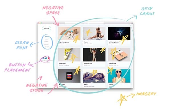
Imagery
If a picture is worth a thousand words, make sure that every image you use to draw a viewer to click on a post is effective. Opt for higher resolution images that are crisp and vibrant to help draw the reader in.
Button and CTA Placement
Whether you’re trying to get people to subscribe to your email list or push a lead generation campaign, you’ll want to think about where those buttons and CTAs sit on your page. Will they be static at the header or footer, or do you want something dynamic that shifts with the scroll movement? Also, keep this in mind as you consider social media “share” or “link” buttons.
Clean Font
Just like with negative space, your font needs to be legible. Stylized fonts are nice for logos or special flyers, but they’re not effective for blog post titles and especially not for the actual content. Sans serif (without the little feet on each letter) is a favorite because it’s legible and compatible with most browsers and mobile devices.
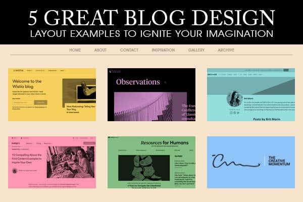
Our 5 Favorite Blog Design Layouts
1. Brit & Co
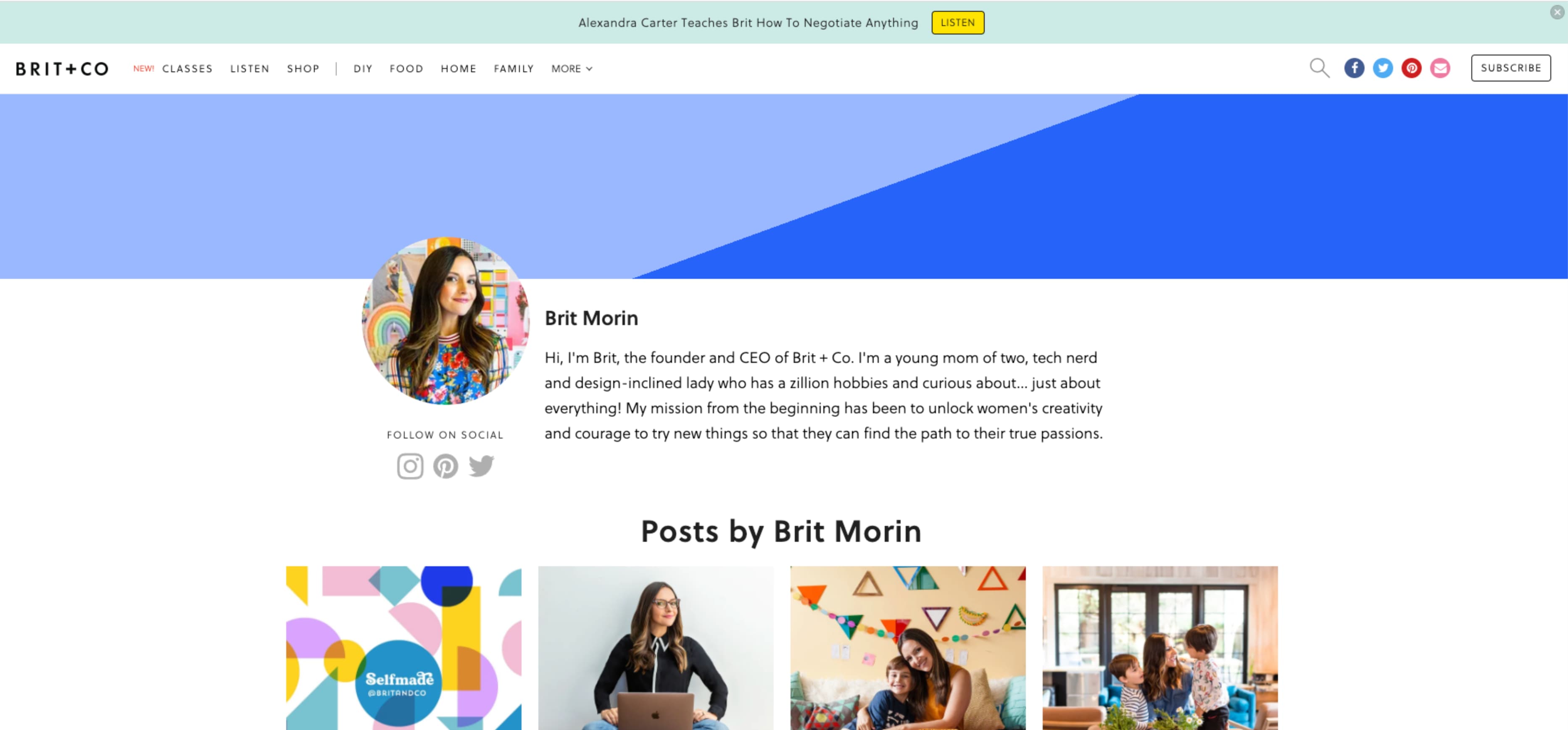
Brit & Co is a destination site for all things creative. Whether you’re trying to learn about crafting or nailing product photography for your home design business, Brit & Co is the place for that information. In addition to the educational side, it’s also a clean site that’s easy to navigate. It's pleasant design aesthetic carries over to their blog, which is helmed by the founder, Brit Morin. The blog maintains a simple grid layout that labels each post with a clear, relevant tag and title, and it relies on vivid imagery to help draw the reader in.
2. Adobe Blog
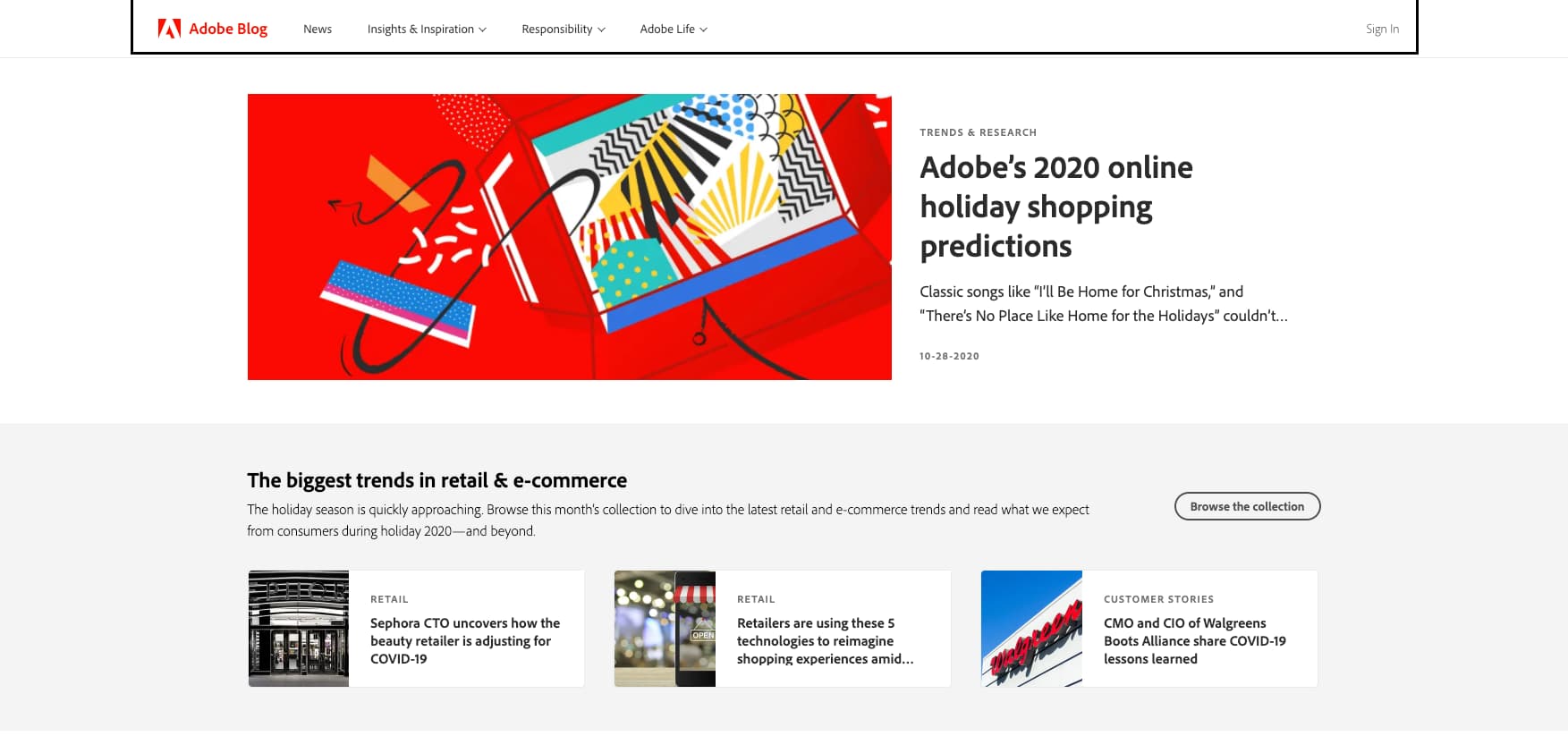
You'd expect a brand that’s made a name for itself around visual imagery and creativity to have a blog that reflects those values, and Adobe’s blog doesn't disappoint.
It creates real-world correlations between the services they sell and how they can be useful in everyday life. This is another clean design that relies on imagery to tell its story. More importantly, we like that they feature a header story, a call to action (CTA), and the first row of the post grid above the fold to help drive relevance and interest.
3. Wistia’s Blog
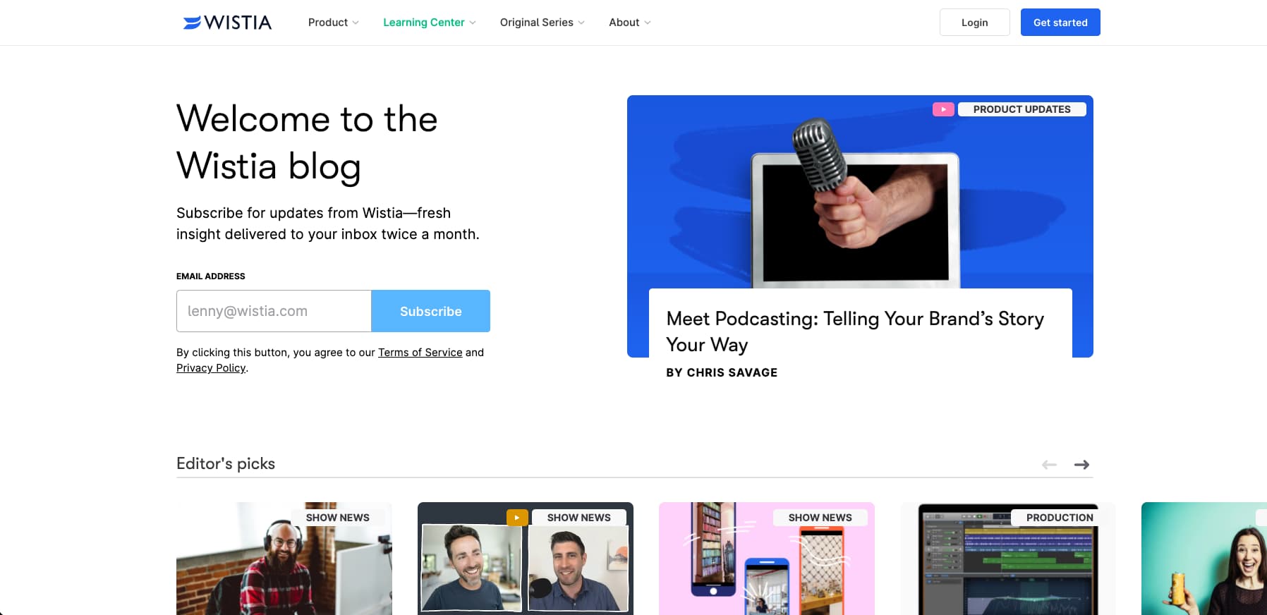
Wistia is a company that’s best known for providing video production and hosting services with a focus on the entrepreneurial demographic. As compared to some of the other blogs we’ve featured, Wistia’s blog is laid out with a variety of design blocks throughout the home page. But the brand still capitalizes on key principles like a clean font, negative space, and an emphasis on vivid imagery over text. When you land on their blog, the first thing you see is a pinned article in the right column and a subscription CTA on the left.
4. Atelier and Avenue
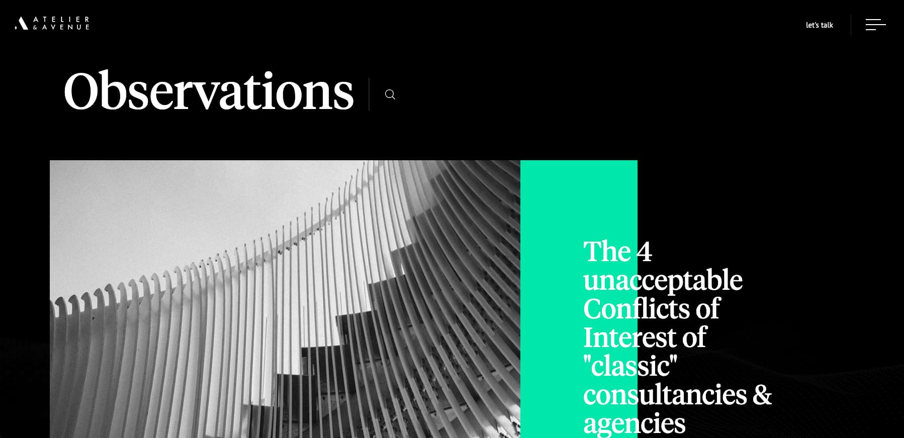
When you know your target audience, you can be more creative and don’t need to feel confined to the more traditional iterations of classic grids, clean fonts, or white-based negative space. Atelier and Avenue is an agency that works on building eCommerce and digital marketing strategies for luxury beauty and fashion brands. And because of that, they’ve taken an unconventional approach with a more stylized blog that looks like something out of Vogue or Harper’s Bazaar. Although the Atelier and Avenue blog does technically still rely on key principles such as a grid layout, clean fonts, and negative space, it’s done in an edgy way that’s reflective of their target audience.
5. Lattice
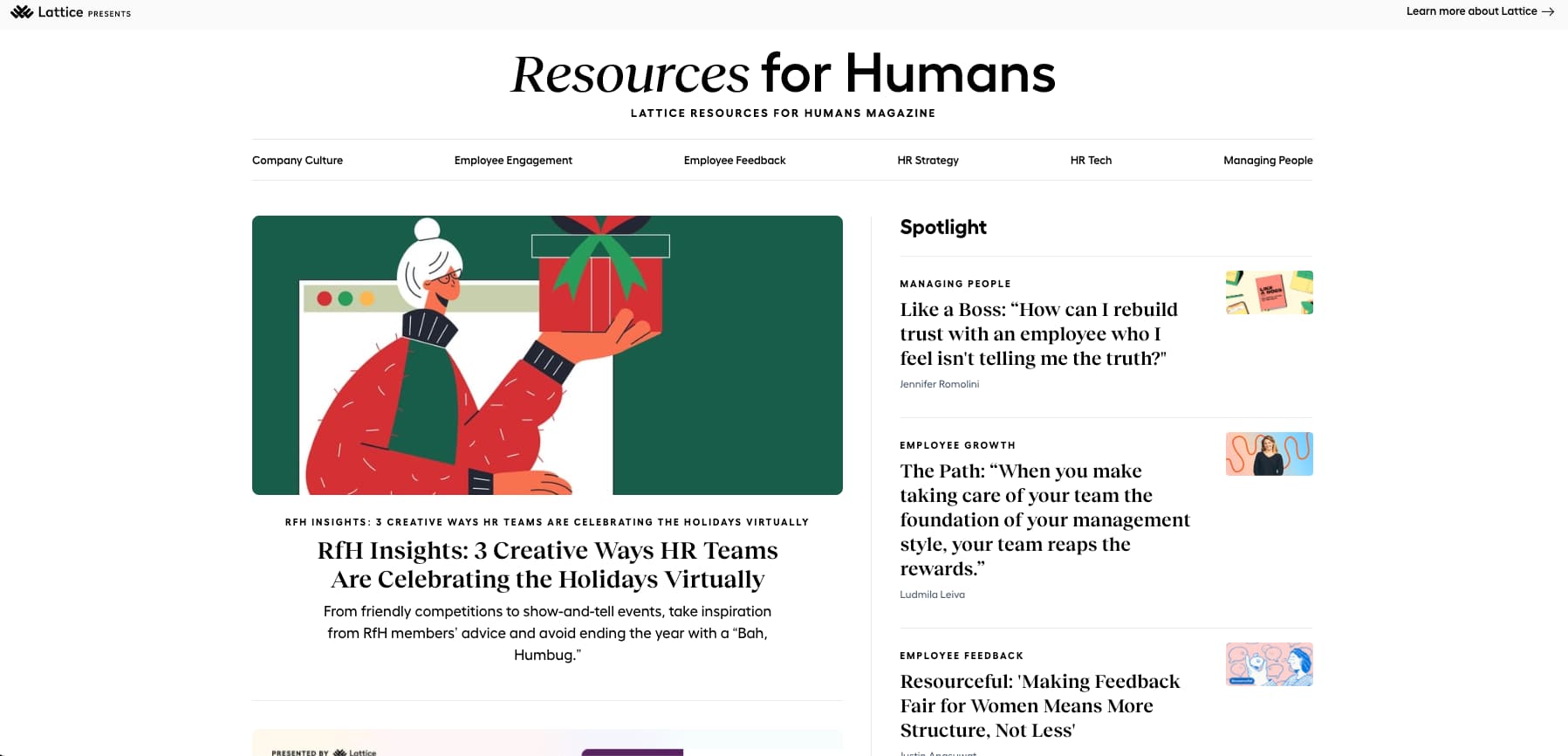
Lattice is a human resources company that caters to firms that employ remote workers. What makes Lattice’s blog interesting is that they were able to nail the combination of sidebars and grids and still maintain key design principles that make the blog easy to use. Lattice’s blog is called Resources for Humans, and as soon as you land on the home page, you’ll see the most recent post to the left and a sidebar with highlighted recent posts. Lattice also employs a static header so that readers can easily navigate back to the other key verticals within the site. And we like that while white negative space is used throughout the blog, a black background is placed in a strategic area to draw users’ attention to specific content blocks. This encourages higher engagement.
Applying Inspiration to Your Blog
While we love the blogs we shared, it’s important to keep your blog authentic to the style and voice that your brand has established. Be sure to maintain continuity between your main brand pages and the blog. Therefore, color schemes should be consistent. Likewise, you’re trying to keep readers on your blog, so be sure to use white negative space. Remember that dark but clean fonts are always a good choice. When you’re ready to build or rebrand your blog, the team at The Creative Momentum is here to translate your design goals into reality.