
 No matter where they came from or what device they’re using, modern companies want to keep website visitors engaged through increasingly flexible, personalized content delivery. This brings us to what has become a modern staple of web design over the past ten years: responsive web design.
Responsive web design creates consistent, engaging experiences for customers across channels, with particular focus on the mobile market. No matter which device or screen size dimensions the end user chooses, responsive design provides the best possible display option.
Fun fact: In 2021, mobile usage accounted for over 55% of total web traffic, with a full 90% of the global internet population using a mobile device to go online at some point.
As one of Atlanta’s best web design companies, we decided to develop this comprehensive guide on this fundamental tenet of web design. If you’ve never heard of responsive design, are a seasoned pro looking for some facts on responsive design, or you’re somewhere in between, this article is for you.
Let’s unfog the world of responsive design. After reading this article, you’ll know:
- The origins of responsive design and how it entered the web design mainstream;
- How responsive web design differs from mobile-first and adaptive methodologies;
- The top benefits of responsive design for business owners;
- Which tools can help support your responsive redesign;
- Common challenges to overcome through the development process
Table of Contents
- What is responsive web design?
- Where did responsive web design originate?
- Difference between responsive and mobile design
- Difference between responsive and adaptive design
- Benefits of responsive design
- Tools to support a responsive website redesign
- Common challenges you may encounter with responsive design
- Additional resources on responsive design concepts
 What is responsive web design?
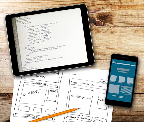
Responsive web design is a design methodology intended to give users the best possible experience, no matter what device they’re using. A responsive website automatically adapts to fit the device used to access it without any need to manually adjust features or create mobile-specific layouts.
On-site page elements, form fields, and images will all scale dynamically to the user’s device, no matter if it’s a desktop monitor, laptop, mobile phone, or tablet. This methodology helps create a consistent UX across devices and makes it easier to create seamless cross-channel marketing experiences.
Where did responsive web design come from?
The term itself was coined by independent web designer Ethan Marcotte back in 2010, an idea borne from the emerging concept of “responsive architecture”. This concept suggests that physical spaces like buildings can be made to adapt and respond to the people passing through, creating a unique experience for each and every visitor.
For physical architecture, this idea is possible only through the use of cutting-edge adaptive technologies and some truly impressive creativity. But for web architecture, it’s a little more straightforward.
You could say that our website architectures are purpose-built for this very thing. Marcotte suggested that responsive web designs are based off of three essential elements:
- Fluid grids: tables of data columns/rows that can be automatically or manually adjusted
- Flexible images: visuals that automatically scale based on layout needs
- Media queries: backend functions that get info from the user’s device and activate layout “breakpoints”
The concept of responsive web design was born from a single bit of inspiration: Rather than forcing each visitor into the same stock experience, why not leverage our adaptable technologies to give users something more personalized to their usage?
What happened to mobile design?
Those in the design world may be asking “how does this concept align with mobile design strategies?”
In the past, websites were built primarily for desktop users and adapted to fit mobile devices later. As mobile use progressed from “exception” to “norm”, developers began designing experiences directly for these handheld devices: so-called mobile-first design. Under this paradigm, experiences are built for mobile devices first and then scaled up to fit other use cases as needed – sort of the opposite of what we used to do in the past.
So how does responsive design factor in? Essentially, responsive design is a more technical approach that leverages Cascading Style Sheets (CSS) to automatically detect and present content in an optimal fashion, regardless of what device it’s on.
While mobile-first designs are ideal for audiences/markets who do most of their browsing on handheld devices, responsive designs aim to sidestep the issue altogether by automatically adapting the content to any device used.
This allows your site to present in the best way possible and ensure all on-site elements, visuals, and functions work as they should.
Is responsive design the the same thing as adaptive design?
Not quite. Responsive design uses CSS media queries to detect device height, width, etc. and then display content tailored to those dimensions. Adaptive design involves creating static layouts based on pre-set dimensions and then automatically serving an appropriate layout to each device.
The two are similar in that they both work toward better browsing experiences for viewers across devices, but adaptive methodologies require developers to maintain multiple sets of HTML/CSS code for different layouts. Though this method does provide control, it tends to be more cumbersome and less automated than newer, responsive strategies.
What are the benefits of responsive design?
We’ve covered the basics of responsive website design. Now, let’s look at why so many companies opt for responsive website creation.
1. Responsive design creates better, simplified user experiences
Primarily, responsive web design produces better experiences for your target audience. You won’t need to worry about creating and presenting multiple templates across devices. No matter the device, you can rest easy knowing that your design will be presented in the best format possible.
It also eliminates the need for redirects, which ensures your viewer can access the content they want as quickly as possible.
2. Responsive design provides omnichannel marketing consistency
Part and parcel with the above is how responsive design supports brand cohesion across channels.
No matter what device is used or where users arrive from, responsive designs ensure functional, consistently-presented brand experiences. This is an important feature for customers who may bounce back and forth across channels before committing to a purchase. (Which is quite common these days – research by HBR shows that as many as 73% of retail customers prefer an omnichannel shopping experience.)
3. Responsive design simplifies development needs
Responsive designs bring simplicity to your website design goals. Developers won’t need to worry about managing multiple versions of your site across desktop/mobile. Everything is managed and presented through one framework. Of course, setting up a responsive website comes with its own technical challenges, but long-term maintenance tends to be easier when compared with juggling multiple site versions.
4. Responsive design is good for SEO
Having just one site to maintain means that SEO analysts need only build one set of links as opposed to different sets for each viewing “experience.” This means simpler web architecture, which in turn generally means improved site performance, faster load times, and reduced maintenance needs. All of these translate to improved SEO value across the board.
 Tools to help you get started with responsive web design
If you’re setting up your responsive layouts, there are several things you can do to help keep development on the right path.
Start by making sure your developers have the right tools for the job. Consider free options that allow you to test and review features. You can leverage Google’s inspect tool, for example, to view page dimensions and see how a website appears at different sizes – an easy way to review the scalability of different designs.
Another of these tools worth mentioning are wireframing tools and the responsive features they may have built-in. These have become more common these days with the proliferation of template-based and DIY websites. These tools (often called “responsive wireframes”) are built from HTML/CSS markup to provide a layout that’s more easily adjustable than one built with traditional static design artifacts.
Of course, the nuts and bolts of designing your own responsive wireframe are too big for the scope of this article. Platforms like Adobe XD make it possible, but doing so requires a thorough understanding of backend development best practices. For the best results, we recommend that companies work with experienced developers who can walk them through the steps.
Get web development help
Get help on your next design project! TCM can help turn your static website into a fully responsive one that will drive viewer engagement.
Challenges to avoid when implementing responsive design
Keep in mind that responsive website design includes many moving pieces that must work in concert. Broken elements in a responsive layout can be even more destructive than those you’d find in desktop-first architecture, so it’s important to stay one step ahead of these issues – both for companies working with development partners and for those working alone.
- Avoid adding elements that detract from the user experience. These may include on-site elements that annoy users or detract from performance (think autoplaying video/sound clips) or possibly keeping outdated elements that are no longer supported – like Flash.
- Be aware of how adaptability in screen sizing will affect presentation. Remember how “flexible images” were one of Marcotte’s top three responsive elements? Use scalable vector graphics that will automatically adjust to site constraints to prevent display issues.
-
Be mindful of how UX changes across devices. While your responsive backend will ensure the optimal presentation, you’ll still need to make deliberate choices about which on-site elements should be included. For example, consider how your linking structures will look on both desktop and mobile devices and whether your links are easily “tappable” on touch screens.
Learn more about responsive web design! 🤓
- Why Responsive Web Design Is No Longer Optional
- Boost Responsive Design With These Tips
- Mobile Design vs. Responsive Design
- How 2020’s Responsive Website Design Will Carry Over to 2021
- 5 Responsive Web Design Best Practices
A final word on responsive website design
Responsive builds have become an inseparable part of omnichannel marketing. Responsive design lets developers create powerful experiences for users without the substantial effort and overhead required to do the same in traditional web architecture.
Of course, building responsive websites can be challenging, which is why we recommend working with a company like ours for help. We’re an Atlanta-based web design & development firm with decades of experience in website creation and digital marketing. If you’d like to get started, contact us now for a free quote.